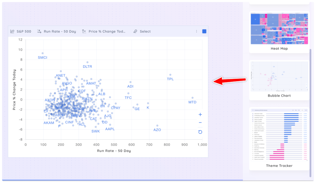
Drag and drop the ‘Bubble Chart’ app onto your Dashboard. You may need to scroll down the Add App Menu to find ‘Bubble Chart.’
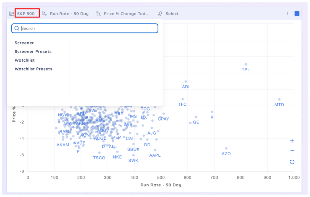
Select any Screener, Watchlist or preset from the first drop-down menu. The default is set to S&P 500.
Select a data point from the next drop-down menu to select a data point for the X-axis. The default is set to Run Rate 50 Day.
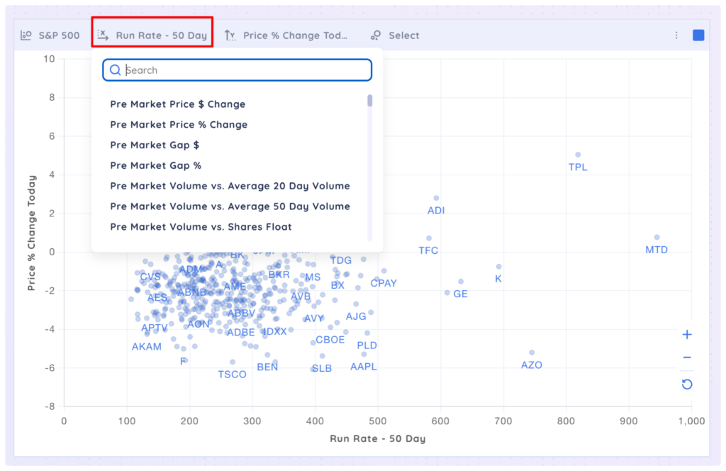
Select a data point from the next drop-down menu to select a data point for the Y-axis. The default is set to Price % Change Today.
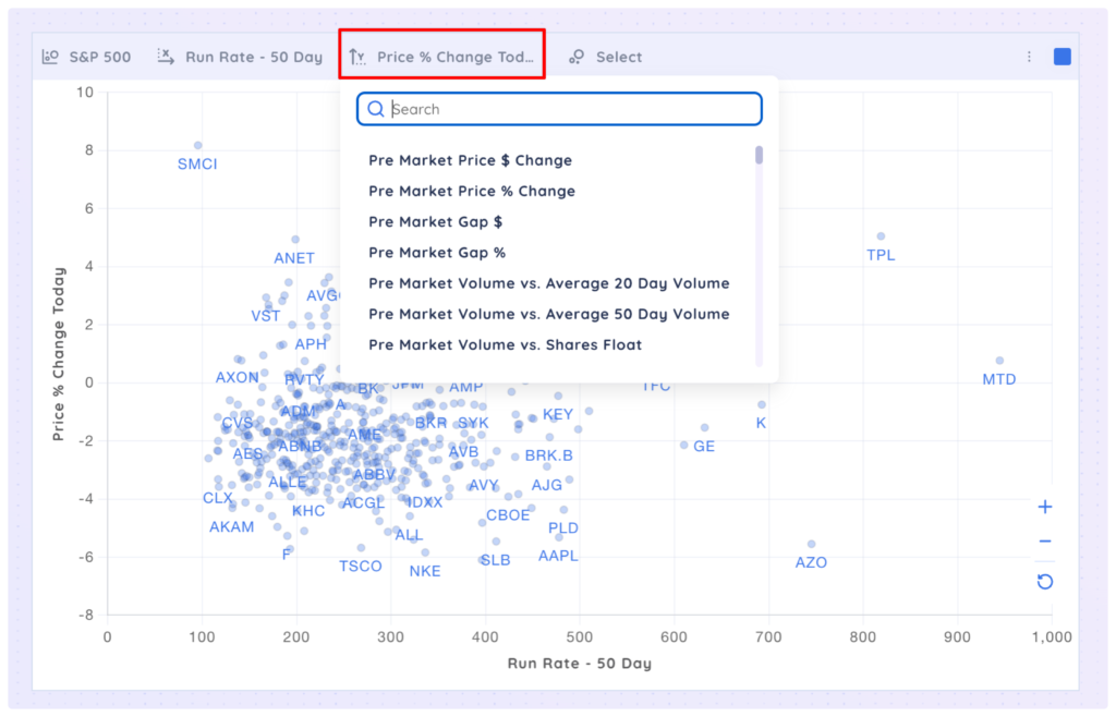
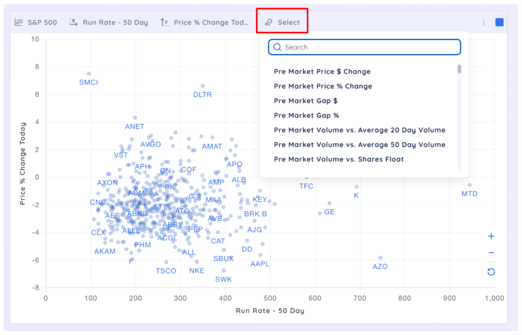
Select a data point from the last drop-down menu to select a data point for the size of the bubbles. There is no default set so all bubbles will be the same size unless you select a data point.
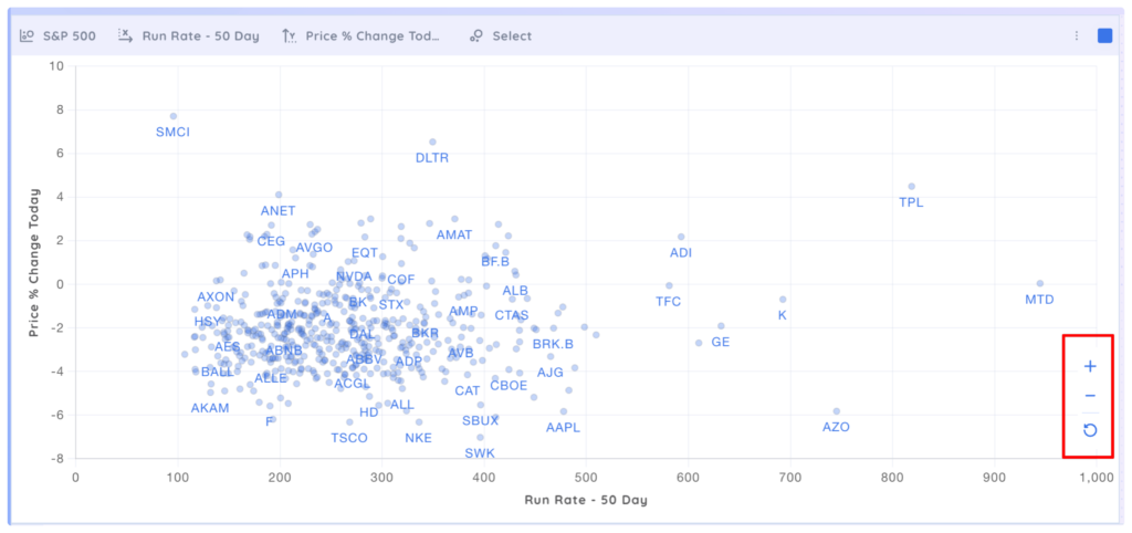
You can zoom in/out and reset the bubble chart view with the controls on the right hand edge. You can also click and drag inside the bubble chart to pan around.
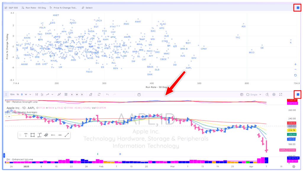
If you add a chart app the dashboard and colour group it with the bubble chart, when you select a bubble the corresponding chart will be displayed.
