Deepvue Performance Chart: Rank an Entire Screen on One Data Point
The Performance Chart is a Deepvue app for dashboards that ranks every stock in a universe you pick as a horizontal bar, sorted on a single data point. Point it at a screen, a preset, a watchlist or a curated list, then choose the measure, from today’s percent move to change off the low to Volume.
Gains draw blue, losses pink, the bars reorder as prices move, and clicking any row sends that symbol to a linked chart.
and turn your best screen into a live leaderboard in two clicks.
The Deepvue performance chart, in numbers:
Key Takeaways
Every screen hands you a table, and a table is the honest way to show forty columns at once. It is a slow way to answer one question. Which of these names is up the most today? Which ETF in my theme list is leading? Which position came furthest off its low?
The Deepvue performance chart does that ranking for you and draws it: one universe, one data point, one bar per stock, longest on top. A question that used to cost a minute of scanning now takes a glance, and you can ask it again every hour.
- ✓One universe, one data point, drawn as a stock ranking chart with the strongest name on top.
- ✓It ranks whatever you point it at: a screen you built, any of the 169 screener presets, a watchlist you keep, or a curated watchlist preset, all from one search box.
- ✓Blue for gains, pink for losses, with the exact value at the end of every bar and a live results count in the footer.
- ✓Eight measures before you scroll, from the day’s move to change off the high or low, Volume and premarket change, with search reaching deeper.
- ✓Templates save a setup you use often under My Templates.
- ✓Every bar is clickable, and a chart sharing the app’s color group redraws to whatever symbol you pick.
- ✓Nothing extra to pay for. Rank your first screen in Deepvue.
Performance Chart at a Glance
- Universe control
- Left header menu, searchable, drawing from Screener, Screener Presets, Watchlist and Watchlist Presets
- Data point control
- Second header menu with eight measures in view and a search box into the wider library
- Sort direction
- Arrows beside the data point name flip the order
- Bars
- Scaled against the largest reading on screen, blue for positive and pink for negative
- Row detail
- Company logo, ticker, bar and the exact value at the bar’s tip
- Templates
- A My Templates menu on the right of the header, with Default and Save New Template
- Footer
- A running count of the results the universe returns
- Color group
- Links clicks to a Chart app carrying the same colored square
- Where to find it
- Visualizations group in Add Apps
- Cost
- Bundled into Deepvue’s one plan, $49 per month
What Is the Deepvue Performance Chart?
It is a performance chart widget from the Visualizations group. Hand it a list of stocks and one measure, and it returns a bar chart sorted by that measure, longest bar on top. That is the whole idea. The value is in what you can point it at: any universe on the platform, ranked on the data point you choose, as a stock performance chart that updates while you watch.
How It Differs From the Other Visualizations
Deepvue’s visualization apps each answer a different question. The Heat Map groups a universe by sector and shows weight as area. The Bubble Chart plots two measures against each other. The Mini Chart follows a single symbol. The Performance Chart ranks: it strips a universe to one number per stock and orders the list by it, which is exactly what you want when the question is who is leading, and by how much.
Who the Performance Chart Is For
Traders who ask ranking questions over and over through the day and would rather see the answer than sort for it. Deepvue serves holds measured in weeks and months, and this app is built for that horizon.
- ✓Swing traders using a stock performance chart to scan a screen for the day’s strongest movers before deciding where to spend attention, a routine Deepvue for swing traders builds out in detail.
- ✓Position traders keeping a theme ETF list ranked, so rotation between groups shows up as bars changing places. See Deepvue for position traders.
- ✓CANSLIM® traders running a fundamental preset who want to know which members the market is rewarding today, as covered in Deepvue for CANSLIM® traders.
- ✓Theme traders ranking a single theme list, from solar to cybersecurity, to find its leaders on the day.
- ✓Anyone who has ever exported a screen just to sort one column, the habit this app replaces.
Reading the Ranked Stock Chart
Everything on screen belongs to one of four zones, and a broad screen ranked on the day shows them all.
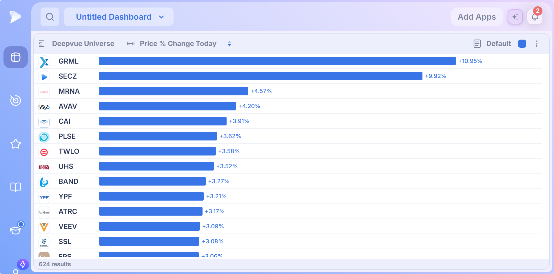
| Zone | What it carries |
|---|---|
| Header, left | The universe name, then the data point name with an arrow control beside it |
| Header, right | The template menu (Default until you save your own), the color group square, and the three dot menu |
| Rows | Company logo, ticker, a horizontal bar scaled to the reading and the exact value at the bar’s tip |
| Footer | How many results the universe currently returns |
Bars scale against the largest reading on screen, so the top row runs longest and everything below is drawn in proportion. That makes the shape readable at a glance. A top bar twice the length of the fifth row means one runaway leader; a gentle taper means broad participation, a healthier tape to buy into.
Blue Up, Pink Down
Positive readings draw blue, negative readings draw pink, and every value carries its sign.
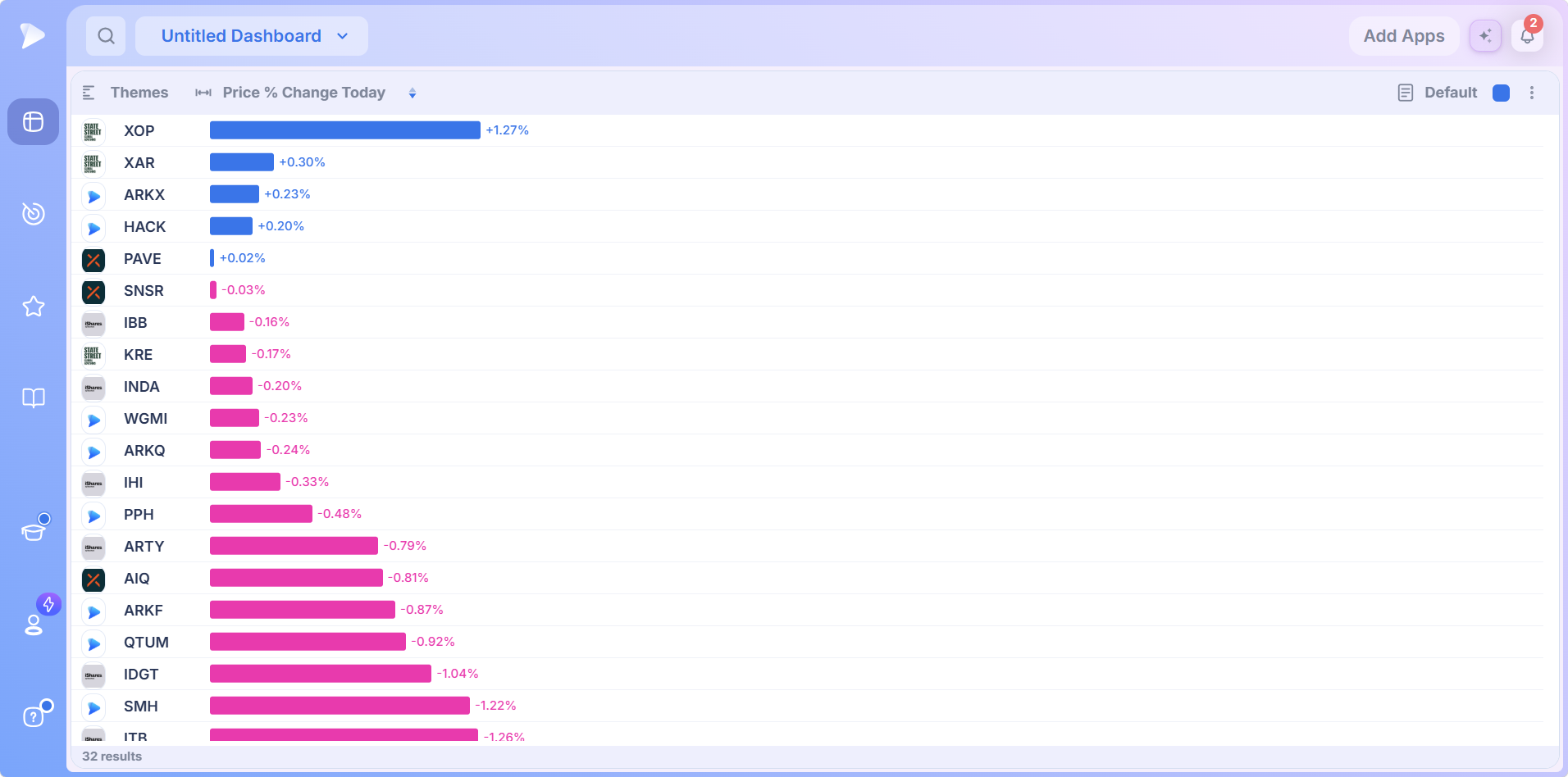
On a mixed universe the two colors meet partway down the list, and where that line falls is a breadth read in itself. On a strong day it is far down the list; on a weak one there may be almost no blue at all. A screen where only three names are green is telling you to size smaller, whatever the top bar looks like.
A Live Ranking, Not a Snapshot
The readings are not frozen. Values tick, names trade places, and the footer count drifts as a live screen gains or loses members.
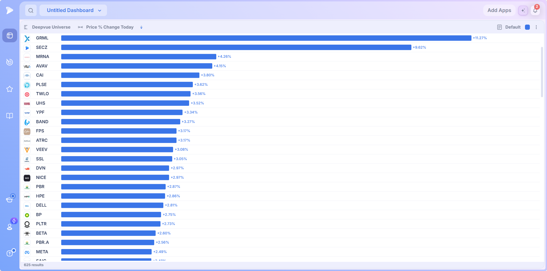
Your ranking is the ranking as of now, not as of the last refresh you remembered to trigger. With 568 of Deepvue’s 1,152 data points arriving live over WebSocket, this performance chart dashboard app keeps pace with the tape.
Open a Deepvue account and watch your own screen reorder itself in real time.
Control One: Choosing the Universe
Click the universe name and a picker opens: a search box on top, four sources on the left. Searching by name covers every screen and list on the platform at once, the quickest route when you already know what you want.
| Source | What it holds |
|---|---|
| Screener | A screen of your own, filters live, which makes this a screener performance chart in the literal sense |
| Screener Presets | Deepvue’s prebuilt screens, 169 of them across nine categories |
| Watchlist | A list you keep, turning the app into a watchlist performance chart for names you already follow |
| Watchlist Presets | Curated lists: trader lists, theme baskets, ETF groups and more |
Inside the Screener Presets
Hover Screener Presets and the categories fan out in a scrolling list, each opening into its named screens.
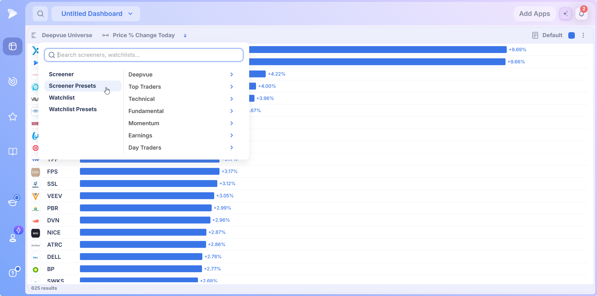
| Category | Screens |
|---|---|
| Top Traders | 83 |
| Technical | 29 |
| Deepvue | 17 |
| Fundamental | 16 |
| Day Traders | 10 |
| Earnings | 7 |
| Markets | 4 |
| Pre/Post Market | 2 |
| Momentum | 1 |
The Deepvue category holds the house screens.
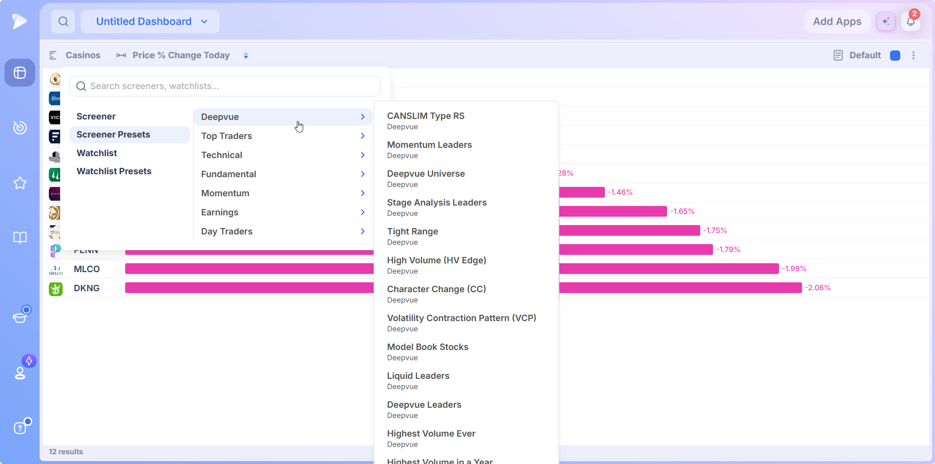
- •Deepvue carries the CANSLIM® and momentum leadership screens, the Deepvue Universe, stage based and tight range screens, the High Volume Edge and Character Change pair, Model Book Stocks, Liquid Leaders, Deepvue Leaders and the highest volume screens.
- •Top Traders is the deepest category, built from routines attributed to named traders: weekend and daily routines, flag and base screens, Doublers, Livermore Levels and more. Rank one on the day’s change and you see which of a well known trader’s candidates the market is backing right now.
- •Technical carries setup and chart action screens: pullbacks, tightness and breakouts.
- •Fundamental covers ownership, sales leadership, founder led situations, earnings surprises and acceleration, and a CANSLIM® screen. Ranked on the day, any of them answers the question growth traders keep asking: which qualifying names is price confirming?
- •Earnings organizes around the reporting calendar and its aftermath, and Momentum holds a Float Squeeze screen.
Inside the Watchlist Presets
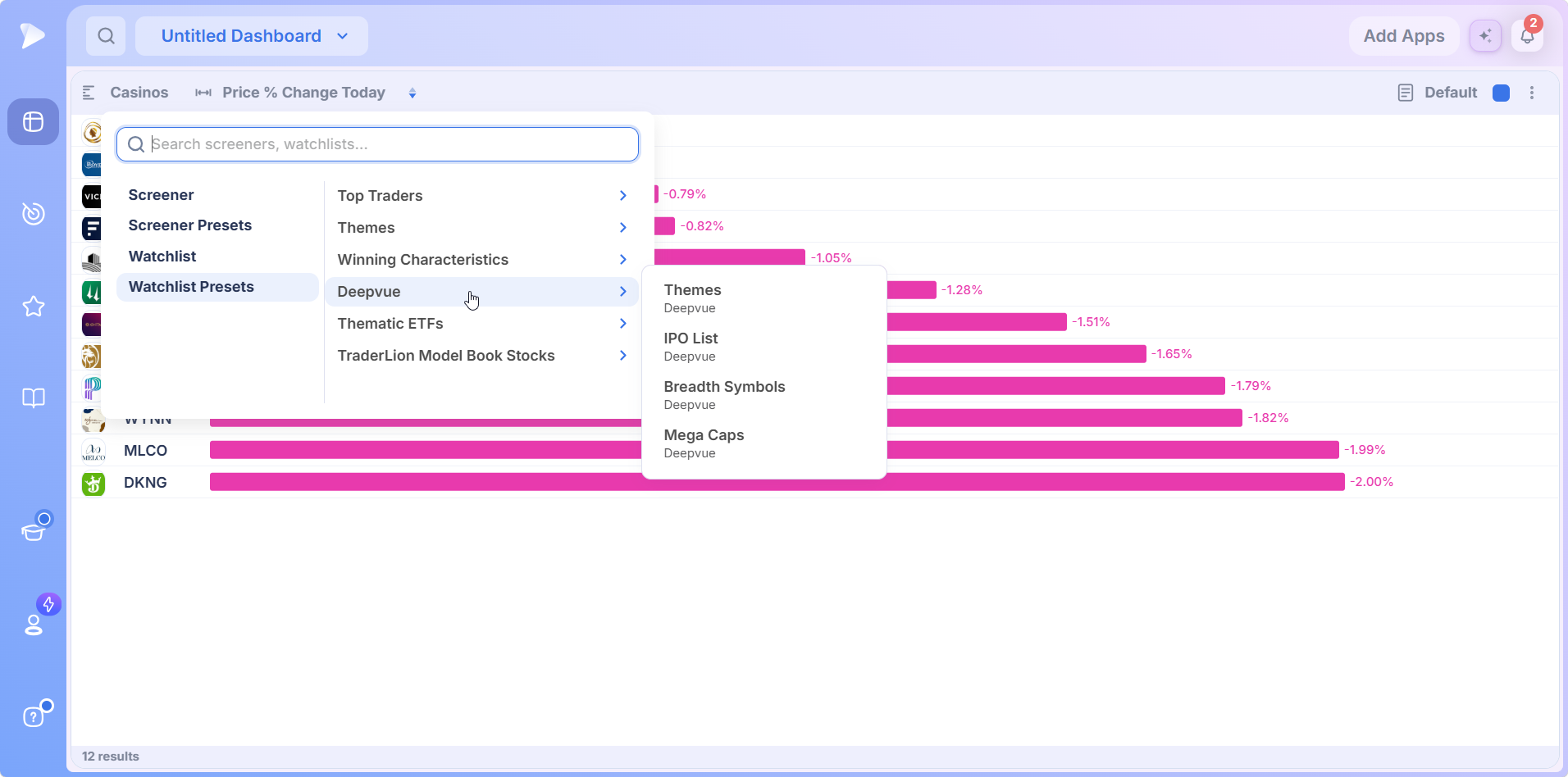
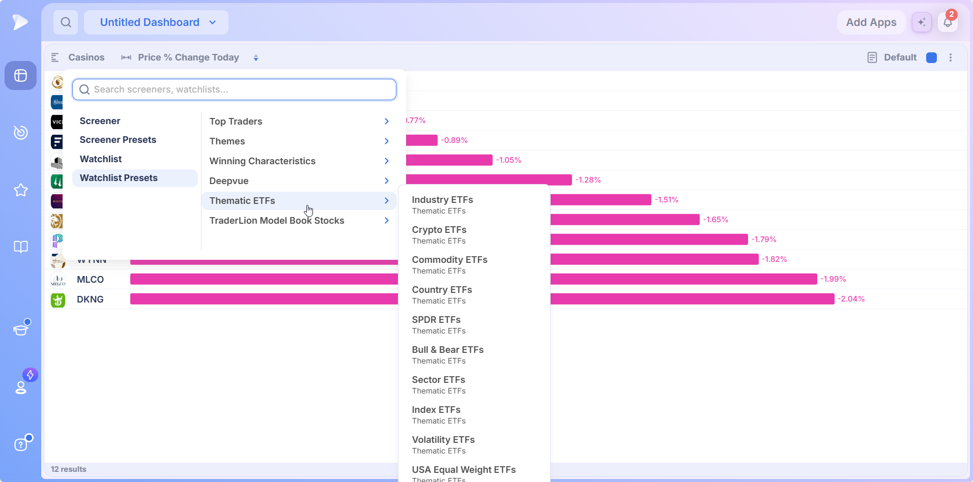
Watchlist Presets holds curated lists rather than filters, grouped into six collections.
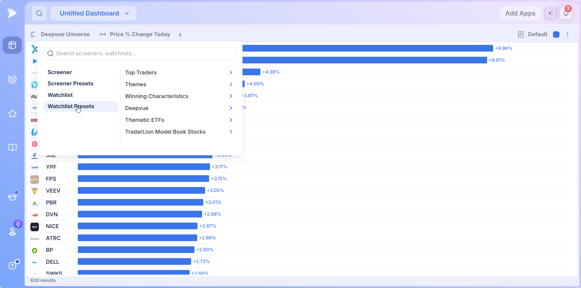
- •Top Traders: lists kept by named traders, such as Ross Haber’s universe and ETF lists from Richard Moglen and Jeff Sun.
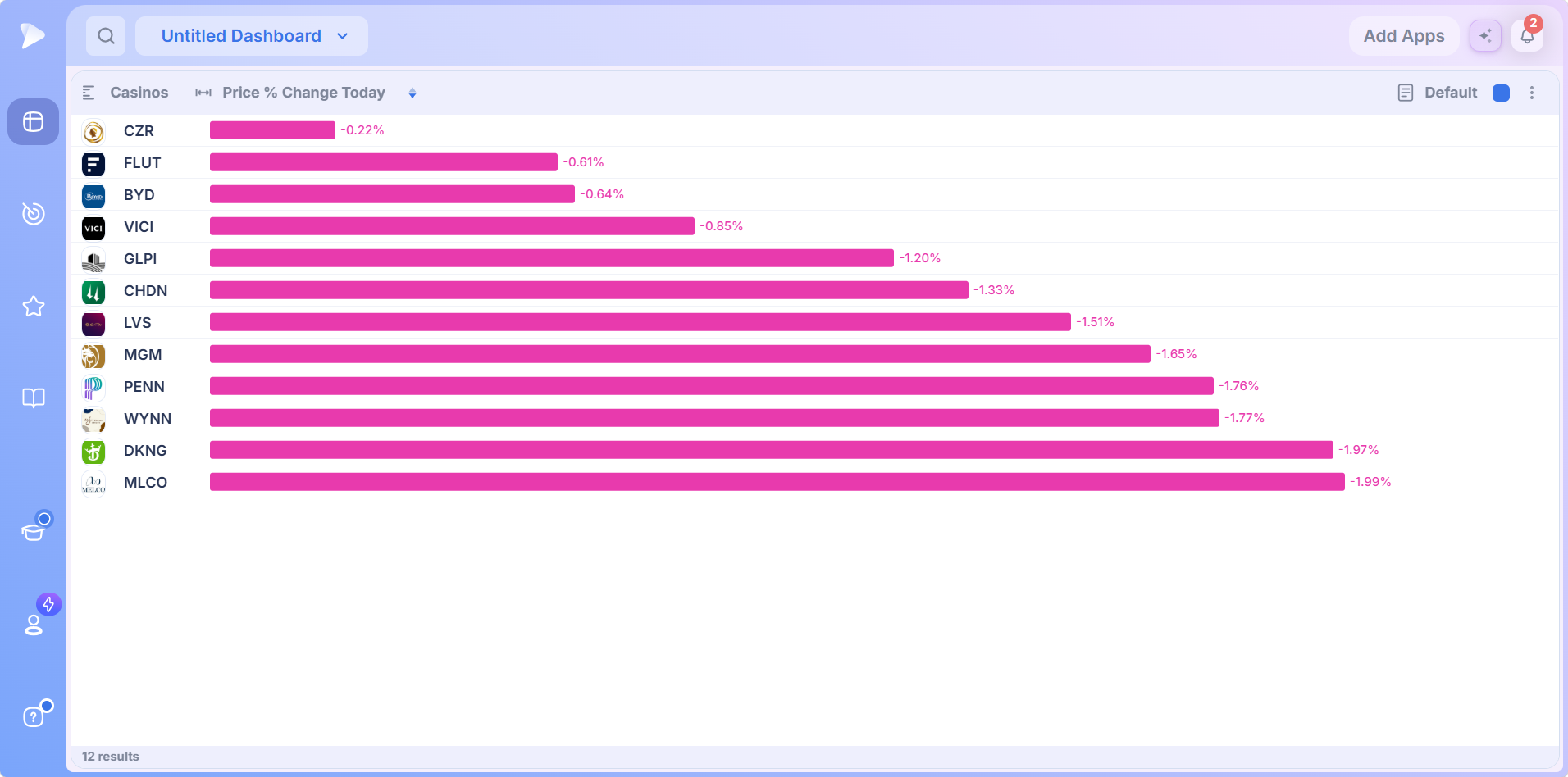
- •Themes: single theme stock lists, from Home Construction, Casinos and Solar to Cybersecurity, Aerospace, Bitcoin Miners, Space, Drones, Genomics, Blockchain, Nuclear and Robotics.
- •Winning Characteristics: the Founder-Led list.
- •Deepvue: Themes, a basket of thematic ETFs, plus the IPO List, Breadth Symbols and Mega Caps.
- •Thematic ETFs: Industry, Crypto, Commodity, Country, SPDR, Bull & Bear, Sector, Index, Volatility and USA Equal Weight ETF lists, among others.
- •TraderLion Model Book Stocks: model book lists for studying how past leaders behaved.
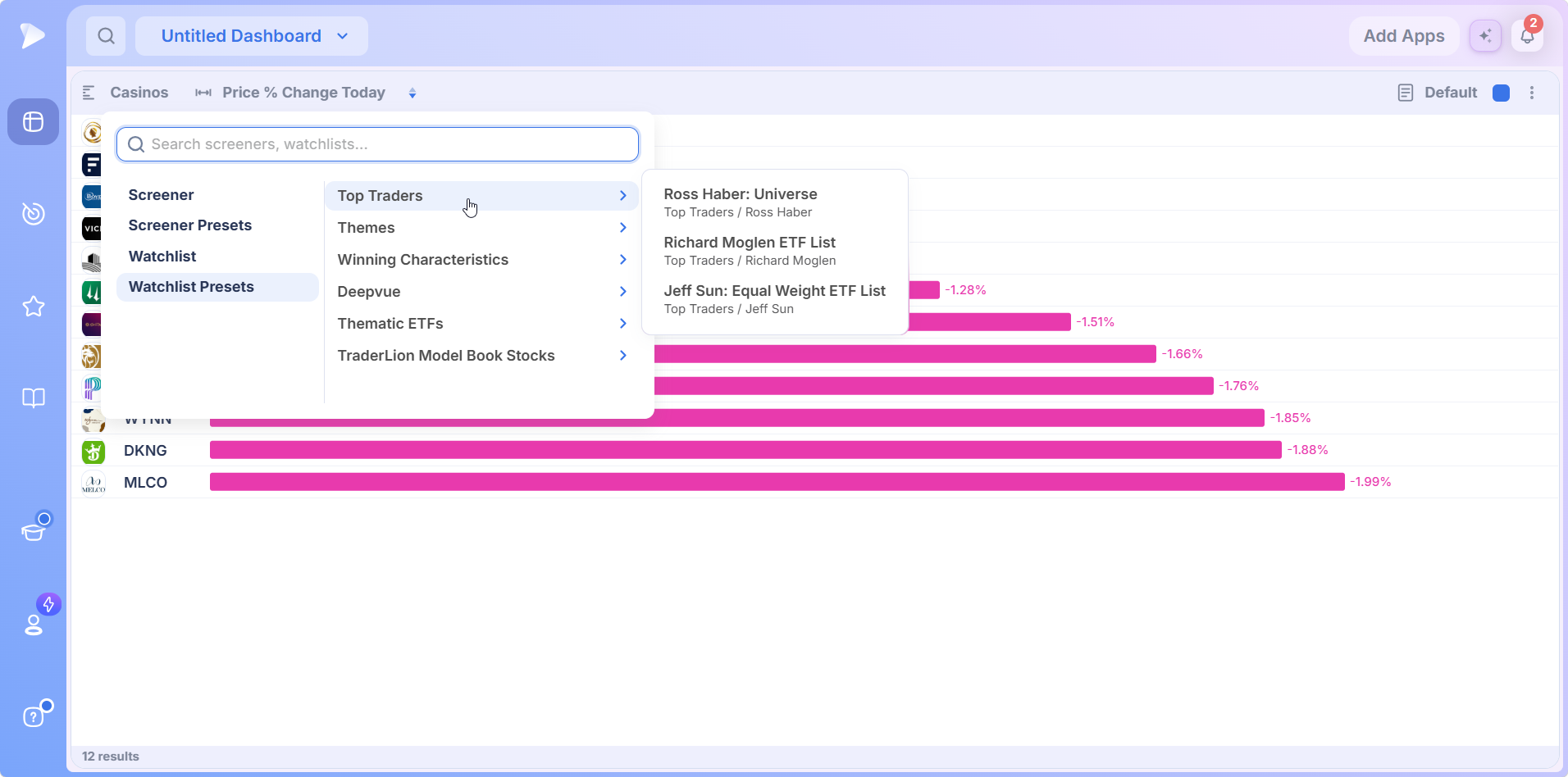
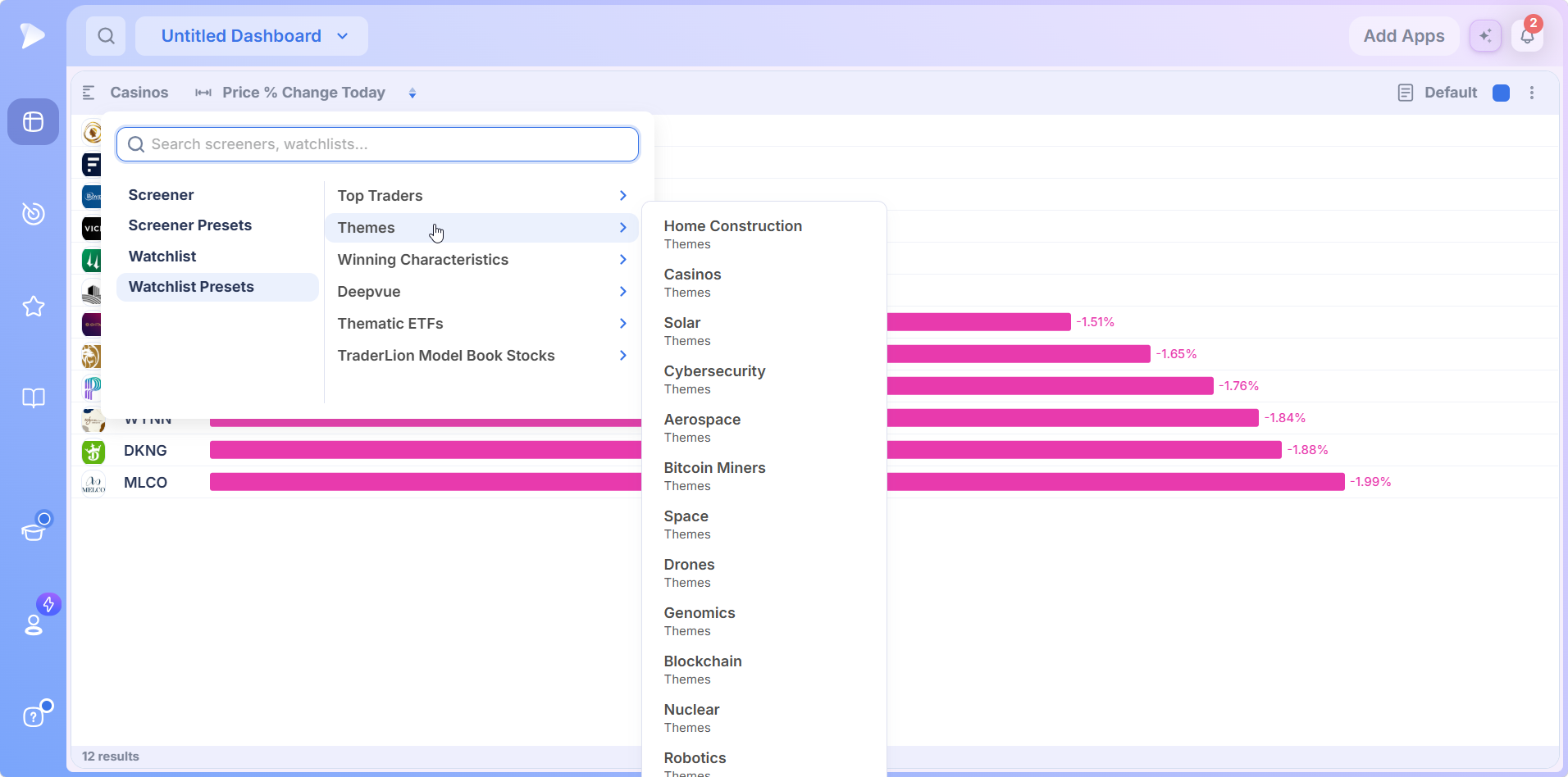
Pick a theme and the app ranks just that group. A small theme list ranks cleanly and shows at a glance whether the whole group is moving together.
Control Two: Choosing the Data Point
Click the data point name and a second picker opens with its own search box. Eight measures show before scrolling, and search reaches past them into Deepvue’s wider data point library.
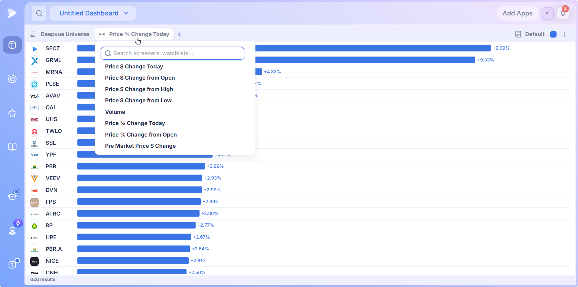
The choice matters more than it looks, because one universe tells a different story on each measure.
| Measure | What it includes | What it tells you |
|---|---|---|
| Change today | The overnight gap plus the session | Total move since yesterday’s close, gap and all |
| Change from open | The session only | Where buyers committed during trading hours, gap excluded |
| Change from high or low | Distance from the session extremes | Which names buyers defended, versus names that merely stopped falling |
| Volume | Activity regardless of direction | Where something is happening, even when price has not moved much yet |
| Pre Market Price $ Change | The move before the bell | Who is set up to open strong or weak |
On a hard reversal day, ranking on change from the low builds a better top performing stocks chart than the day’s raw gainers, because it separates the names buyers defended. Two practical notes. Dollar measures favor higher priced stocks, so switch to a percent measure when the universe spans a wide price range. And the arrows beside the data point name flip the sort, bringing the weakest readings to the top when that is the list you want.
Saving Templates
On the right of the header, the Default control opens a My Templates menu.
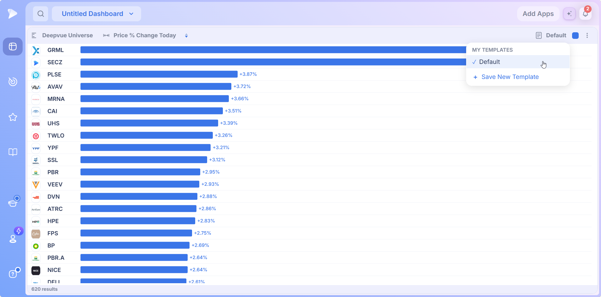
Save New Template stores the setup you are looking at, so a ranking you check every morning is one click away instead of two menus. The active template carries a check mark, and Default is what a new Performance Chart starts from.
Every Bar Is a Doorway: Linking to a Chart
The colored square in the header sets which group the app belongs to, and that is what turns a ranking into a review. Give a Chart app the same square and every row you click becomes the symbol it draws.
That is the workflow: rank a universe, click down the bars from the top, and read each chart as it loads. Deepvue’s charts bring Stage Analysis, AVWAP, the RS Line and Enhanced Volume to that click, so the judgment a bar cannot make happens one click away.
Two Rankings Side by Side
Nothing stops you adding the performance chart widget twice. Pair a theme ETF list on a dollar measure with a broad stock screen on a percent measure, each with its own footer count. The first tells you which groups are moving; the second tells you which individual stocks are. Read together, that is a top down routine on one screen.
How to Add a Performance Chart to a Dashboard
Head to Dashboards. With no dashboard yet, the welcome card offers Create Dashboard and a template link; otherwise reopen the board you use.
Open the Add Apps panel from the button in the board’s header.
Click Performance Chart in the Visualizations group, and the performance chart dashboard app appears on the board ready to rank.
Pick a universe with the left header control and a measure with the one beside it.
Match the color square to a chart if you want clicks to travel, and save the setup as a template if you will use it again.
Create your Deepvue account and have your first ranking on screen inside a minute.
Five Universes Worth Ranking
Your Leaders Screen on Change From the Open
Rank the screen you trust most on Price % Change from Open once the session is under way. The top of that top performing stocks chart is where buyers are committing today, not where the overnight gap happened to land, and the blue to pink line tells you how much of your universe is taking part.
Theme ETFs on the Day
The Themes list under Deepvue’s watchlist presets is a basket of thematic ETFs. Ranked on the day it becomes a rotation board, and kept in place for a week this watchlist performance chart shows rotation as bars changing places. The Theme Tracker confirms what the bars suggest.
A Fundamental Preset on Price
Rank Accelerating Earnings, Sales Leaders or the CANSLIM® screen on the day’s change and you have a screener performance chart with the fundamental work already done. Anything blue near the top with a constructive chart is a candidate; anything pink at the bottom is a name the market disagrees with for now.
A Watchlist Preset on Change From Low
On a reversal day, take a curated list and rank it on Price $ Change from Low. The leaders are the names bought hardest off the bottom, which is a better list than the day’s largest gainers more often than not.
A Top Trader’s Routine on Volume
Rank a Top Traders screen on Volume and the order reflects where activity is, regardless of direction. A name near the top with a modest price change is one where something is happening beneath the surface. Ask the AI Terminal what drove it when the chart cannot say.
Try Deepvue and rank a fundamental preset on the day to see which names price is backing.
What Makes the Deepvue Performance Chart Different
- ✓Any universe on the platform, your screens and lists or 169 screener presets and dozens of curated watchlist presets.
- ✓A measure menu with search, so the ranking is on the number you care about, not a fixed default.
- ✓Live ordering, with values streaming and bars reordering through the session.
- ✓Templates for the rankings you check every day.
- ✓One click to a chart, through the color group, so every bar opens straight into analysis.
To see how the wider platform measures up against Finviz, TC2000, TrendSpider, TradingView and MarketSurge, browse theDeepvue comparisons hub, which sets them side by side one capability at a time.
What Traders Say About Deepvue
Outside verdicts on the platform these rankings belong to, quoted as published.
“DeepVue’s dashboards are a lot more actionable and customizable than what most trading platforms offer.”
From Dave’s Deepvue write up at Day Trade Review. Go to the review
“It’s my favorite charting platform over everything else so far.”
A reply from u/lmaobihhhh in r/swingtrading. View the thread
“The interface is very well thought out and highly customizable.”
u/NeosDemocritus, comparing platforms in r/CANSLIM. See that discussion
“The enhanced volume indicator is awesome.”
A MarketSmith subscriber posting in r/CANSLIM. Read the post
Deepvue’s reviews wall holds more than 220 verified reviews with an average of 4.8; 97 percent of the people behind them would recommend the platform.
Where the Performance Chart Connects
- •The screener for building universes worth ranking, with the prebuilt approaches collected under stock screener by strategy.
- •Watchlists for the lists that make the best ranking universes, and for keeping the names that stand out.
- •Charts for the full look at anything near the top of a ranking, tied in by color group.
- •The Heat Map and Bubble Chart, which read the same universes by sector weight and on two measures at once.
What the Performance Chart Costs
The Performance Chart is part of Deepvue’s single plan at $49 per month, with monthly and annual options. There is no separate charge for dashboard apps, so you can add a ranking for every universe you care about.
That one plan covers:
- •The screener and its 1,152 data points.
- •Charts, watchlists, and alerts, all of them unrestricted.
- •Fully customizable dashboards, with every app in the catalog.
- •The Theme Tracker, Market Brief, and AI Terminal, the last with unbounded usage.
Deepvue has one plan, so there are no tiers to compare. For reference, MarketSurge, the legacy platform in this niche, runs $149 per month.
New subscribers also get a one on one onboarding session with a Deepvue team member, an onboarding email series covering platform features and use cases, and weekly live webinars that each go deep on one part of the platform.
Stop Sorting Columns and Start Reading Bars
A ranking is the simplest question a trader asks and the one a table answers worst. The Performance Chart answers it in the shape your eye already understands: one universe, one measure, longest bar on top, blue on one side of the line and pink on the other, live, and a click away from the chart that decides whether the leader is worth owning.
Start ranking with Deepvue today, add a stock performance chart to your first dashboard, and read your best screen as bars before the opening bell.
↑ Back to contentsFrequently Asked Questions
Common questions about the ranking app.
What is a stock ranking chart?
A stock ranking chart is a chart that reduces a list of stocks to one number each and orders them by it, strongest on top. The Deepvue Performance Chart is a live one, so the bars reorder through the session as prices move instead of freezing on a single snapshot.
How do I compare stock performance side by side?
You compare stock performance side by side by loading a universe with the names you want to weigh and picking one measure. The Deepvue Performance Chart draws every member as a bar on that measure and sorts them, so the comparison is the ranking itself rather than something you assemble from a table.
What is the best way to see which stocks are performing best today?
The best way to see which stocks are performing best today is to rank a universe on Price % Change Today for the full move, or Price % Change from Open for the session alone. In Deepvue the second is usually the better read on real demand, since a stock can gap up and sell off all day.
How do I find the strongest stocks in a sector or theme?
You find the strongest stocks in a sector or theme by loading that group as the universe, such as a list from the Themes watchlist presets, and ranking it on a percent measure. In the Deepvue Performance Chart the longest blue bars are the leaders, and the color line shows how much of the group is taking part.
Can I rank a single theme, like casinos or solar stocks?
Yes, you can rank a single theme, like casinos or solar stocks. Deepvue’s Watchlist Presets include a Themes collection with one stock list per theme, from Home Construction and Casinos to Solar, Cybersecurity and Robotics, and any of them loads straight into the Performance Chart.
Can I rank sector ETFs to see rotation?
Yes, you can rank sector ETFs to see rotation. Point the Deepvue Performance Chart at a Thematic ETFs list such as Sector ETFs, or the Themes ETF basket, rank it on the day, and the order becomes a rotation board that reshuffles as money moves between groups.
Should I rank on dollar change or percent change?
You should usually rank on percent change when the universe spans a wide price range, because dollar measures favor higher priced stocks. In the Deepvue Performance Chart, a dollar measure fits a universe tightly grouped in price, or when the absolute size of the move matters to you.
Can I compare a stock against its sector or an index?
No, you cannot compare a stock against its sector or an index directly inside the Performance Chart, which ranks the members of one universe. In Deepvue, build or load a universe that holds the names plus any proxy you want, and they rank together on the same scale.
How often does the ranking update?
The ranking updates continuously through the session. Deepvue streams 568 of its 1,152 data points live over WebSocket, so values and bar order change as prices move, and the footer count shifts as names enter or leave a live screen.
What is the Deepvue Performance Chart?
The Deepvue Performance Chart is a dashboard app that draws every stock in a chosen universe as a horizontal bar, ranked on one data point. The strongest reading leads the list, gains draw blue and losses pink, and the exact value prints at the end of each bar.
Which universes can I rank?
You can rank a screen of your own, any of Deepvue’s 169 screener presets across nine categories, a watchlist you keep, or a curated watchlist preset: trader lists, theme lists, thematic ETF groups and Deepvue’s own lists. A search box at the top of the universe menu finds any of them.
What are Watchlist Presets?
Watchlist Presets are curated lists in Deepvue, grouped into Top Traders, Themes, Winning Characteristics, Deepvue, Thematic ETFs and TraderLion Model Book Stocks. Unlike screener presets they are fixed lists rather than filters, and the Performance Chart ranks any of them.
Which data points can I rank on?
You can rank on eight measures shown before scrolling: dollar change on the day and from the open, high and low, Volume, percent change on the day and from the open, and premarket dollar change. A search box in the Deepvue data point menu reaches further into the library.
Can I save a Performance Chart setup as a template?
Yes, you can save a Performance Chart setup as a template. The Default control on the right of the header opens My Templates, where Save New Template stores the current setup and a check mark shows which template is active in Deepvue.
What do the colors mean?
The colors mean direction: blue bars are positive readings and pink bars are negative. On a mixed universe in the Deepvue Performance Chart the two meet partway down the list, a quick read on how many members are up versus down.
Can I click a bar to open the chart?
Yes, you can click a bar to open the chart. Match the colored square in the Deepvue Performance Chart header to the square on a Chart app on the same board, and clicking a row sends that symbol to the chart.
What does the results count in the footer mean?
The results count in the footer means how many stocks the chosen universe holds at that moment in this performance chart widget. Because a live Deepvue screen gains and loses members as prices move, the number drifts through the session.
Can I run two Performance Charts at once?
Yes, you can run two Performance Charts at once. Each keeps its own universe and data point, so in Deepvue a theme list and a stock screen can run side by side, and both can share a color group with the same chart.
How do the today and from open measures differ?
The today and from open measures differ in their starting point. Today starts from the previous close, so an overnight gap counts; from open starts at the session’s first print. After a gap, the two can order the same Deepvue universe in very different ways.
Does the Performance Chart suit day trading?
The Performance Chart suits holds measured in weeks and months more than day trading. Deepvue was designed for growth and momentum traders, and the ranking supplies leadership and participation context for those decisions rather than intraday timing.
Is the Performance Chart included in the standard Deepvue plan?
Yes, the Performance Chart is included in the standard Deepvue plan. Deepvue has a single plan at $49 per month that covers the Performance Chart along with the screener, charts, watchlists, alerts, dashboards, the Theme Tracker, the Market Brief, and the AI Terminal.
CAN SLIM® is a registered trademark of O’Neil Capital Management, Inc. (U.S. Reg. No. 3,081,940). Deepvue is not affiliated with, sponsored by, endorsed by, or licensed by O’Neil Capital Management, Inc., Investor’s Business Daily, MarketSurge, or their affiliates. Any reference to CAN SLIM® is for descriptive purposes only. Deepvue’s scores, ratings, and screeners are independently calculated by Deepvue and are not the proprietary ratings of MarketSurge or IBD.