Deepvue Bubble Chart: The Live Stock Bubble Chart for Growth and Momentum Traders
The Deepvue Bubble Chart plots every stock in a screen, preset, watchlist or preset list on an X and Y grid, using any two data points you choose, with an optional third setting the size of each bubble.
Bubbles update live during the session, carry ticker labels, show exact values on hover and are clickable, so one click sends any stock to a linked chart. Nothing shows a whole universe faster.
and let tomorrow’s strongest movers separate themselves from the crowd.
The Deepvue stock bubble chart, in numbers:
Key Takeaways
Most research still works one chart at a time: run a screen, open the first ticker, judge it, close it, open the next. A stock bubble chart flips that. Instead of reading fifty charts to find the three that matter, you plot all fifty at once and let the outliers separate themselves.
The names moving hardest on the heaviest volume drift away from the crowd, and your eye goes straight to them. You stop hunting and start noticing.
- ✓Two data points on the axes, a third sizing each bubble, so strength, tightness and volume become visible in one view.
- ✓Four universe sources: your own screens, Deepvue’s 169 screener presets, your watchlists and curated watchlist presets, with the S&P 500 loaded by default.
- ✓Bubbles move live while the market trades, so the day’s strongest breakouts migrate toward the top right as they happen.
- ✓Every bubble is clickable. Put the app and a chart in one color group and review a whole list of candidates with clicks instead of typing.
- ✓Zoom, pan and a Shift refit tame outliers, so one stock gapping on enormous volume never hides the rest of your list.
- ✓No add on to buy. Plot your first universe in Deepvue.
Bubble Chart at a Glance
- Universe
- Which stocks get plotted: your screens, screener presets, watchlists or watchlist presets; S&P 500 by default
- X data point
- Horizontal position, from a searchable menu of measures
- Y data point
- Vertical position, from the same menu
- Select
- Bubble size, from any data point, or None for uniform bubbles
- Hover
- The ticker with its exact X and Y values
- Navigation
- Plus and minus zoom buttons, pan, a Shift refit, and reset
- Header controls
- Default template control, plus a group color square and an options menu behind three dots
- Linking
- A colored group square that ties the plot to a Chart app
- Location
- The Visualizations list in Add Apps
- Cost
- Part of the $49 per month Deepvue plan, no add on
What Is the Deepvue Bubble Chart?
The Deepvue Bubble Chart is a stock market visualization app for the dashboard, a scatter plot at heart: each stock in your universe becomes a point, placed by two data points on the X and Y axes, with a third optionally scaling its size. Technical and fundamental measures both work, so one stock market bubble chart answers what would otherwise take a screen, a spreadsheet and a stack of charts.
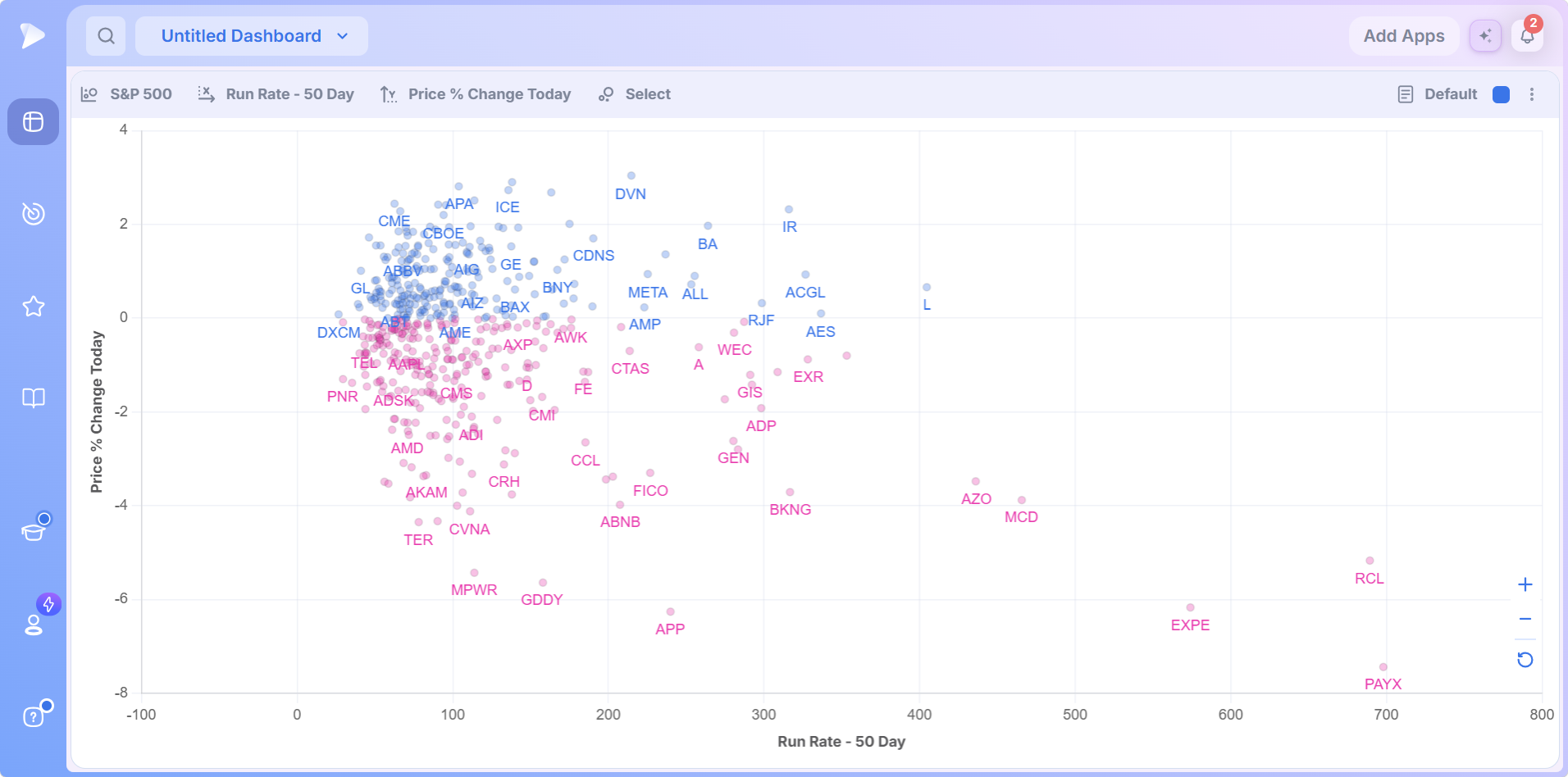
- •Toolbar, left: universe, X data point, Y data point and Select for bubble size.
- •Toolbar, right: the Default template control, then a group color square and the options menu.
- •Plot: labeled axes, a point per stock, tickers on the points that stand out.
- •Navigation: plus, minus and reset buttons in the lower right corner.
Why Position Beats a Sorted Table
The problem a stock market bubble chart solves is separation. A results table treats every row the same, so the best idea looks exactly like the tenth best. A trading bubble chart gives each stock a position and a size, which the eye reads instantly, so outliers stop hiding in rows and stand alone on the plot.
It is also a live view. Of Deepvue’s 1,152 data points, 568 stream over WebSocket, and during market hours the bubbles travel across the plot as prices and volume change.
Who the Bubble Chart Is For
The same trader the rest of Deepvue serves: growth traders blending technical and fundamental work, holding winners for weeks to months.
- ✓Swing traders who want to see, minutes after the open, which stocks are moving off their opening price on real volume. Deepvue for swing traders builds that into a routine.
- ✓Breakout traders who want a live map of where strength is concentrating, not a static list sorted by one column.
- ✓Position traders scanning for tight, quiet setups by plotting volatility across a full watchlist at once, the approach in Deepvue for position traders.
- ✓MarketSurge users who want a visual, live alternative to scrolling a static list.
- ✓CANSLIM® traders plotting the RS Rating against price behavior, a relative strength bubble chart in practice, to surface leaders early. Deepvue for CANSLIM® traders covers the method.
This is analysis, not execution: Deepvue places no trades, and nothing on the plot is a signal by itself. It shows you where to look; the decision runs through your own process on the full chart.
Every Control Explained
Four menus across the top define everything you see: universe, X axis, Y axis and size. A few toolbar and navigation controls handle the rest.
The Universe Selector
The first control sets which stocks get plotted. Click it and a menu opens with a search field and four sources, each opening into its categories.
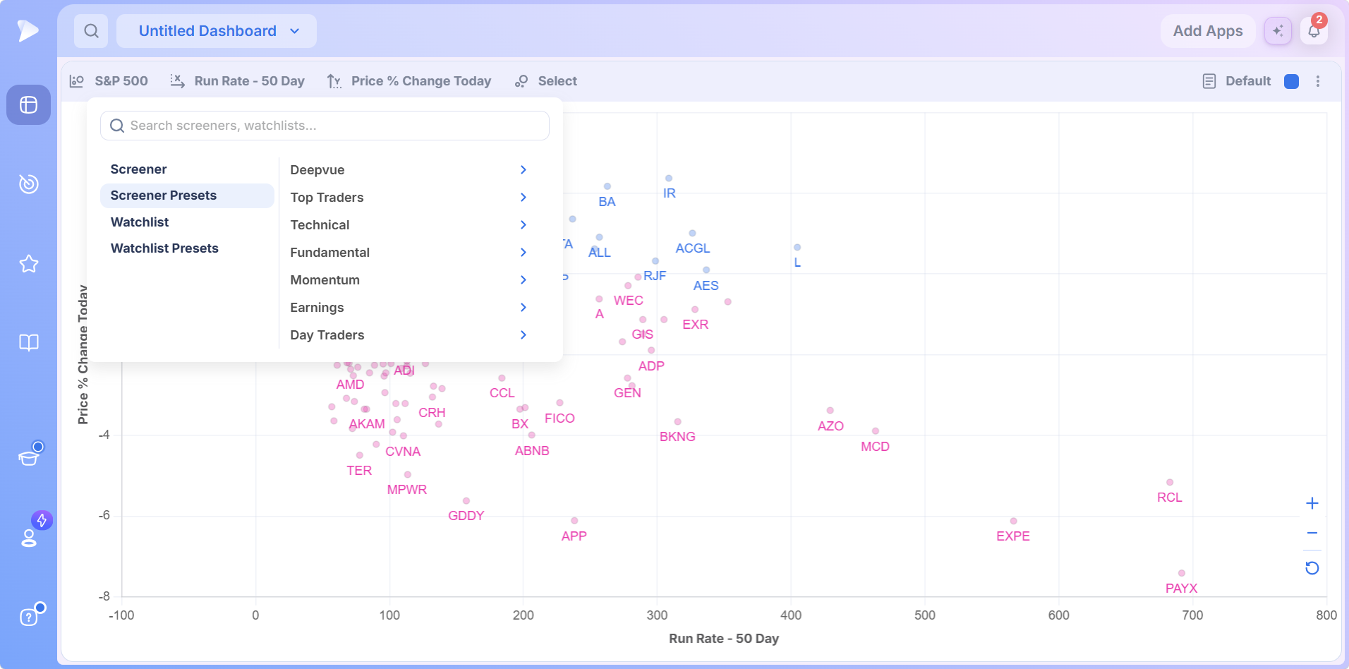
| Source | What it holds | Why you would use it |
|---|---|---|
| Screener | Any custom screen you have built | Turns the app into a stock screener bubble chart for that exact strategy |
| Screener Presets | Deepvue’s library of 169 preset screens across nine categories | A strategy defined starting point without building anything |
| Watchlist | Any watchlist you maintain | The plot reflects exactly the names you are stalking |
| Watchlist Presets | Curated lists such as themes, thematic ETF groups, trader picks and TraderLion’s model book | Study one corner of the market, a sector bubble chart for that slice |
Top Traders is by far the largest of the nine screener preset categories, with 83 screens; Technical has 29, the Deepvue house category 17 and Fundamental 16; Day Traders holds 10 and Earnings 7; Markets has 4, Pre/Post Market 2 and Momentum a single screen. The Markets category holds the major index lists, so one click plots an index as a universe, the fastest broad market read.
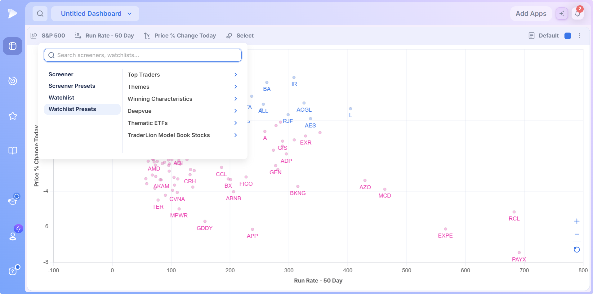
A preset stays read only until you duplicate it, and clearing your selection falls back to the S&P 500, the same universe a fresh Bubble Chart loads. The Deepvue team’s tutorial favorite is the Deepvue Leaders preset of high growth, high momentum names: plot an already strong list and every outlier that separates is worth a look.
The X and Y Data Points
The second and third controls set the axes, each from a searchable menu that lists eight common measures up front.
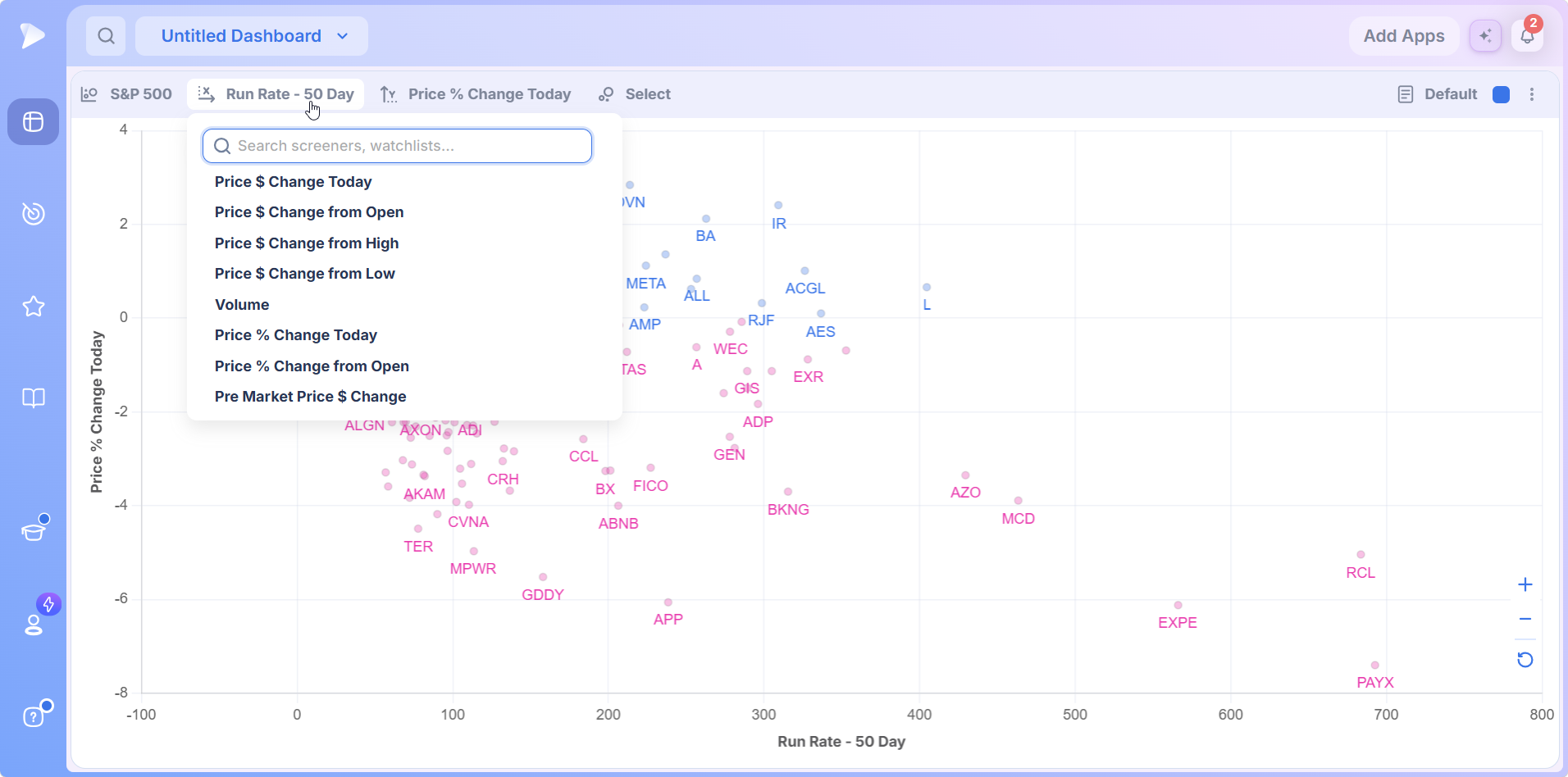
The search field reaches the rest of the library. The tutorial uses Relative Measured Volatility over 15 days, Relative Volume on a 20 day basis, the RS Rating over one week, and Run Rate over 50 days. This is where a stock performance bubble chart earns its place: a table ranks by one column, two axes rank by two at once, so a stock that is good on each measure but exceptional on the combination stands out in a way no single sort can show.
The Size Data Point
The fourth control, Select, assigns a third data point to bubble size, and its menu starts with None for uniform bubbles.
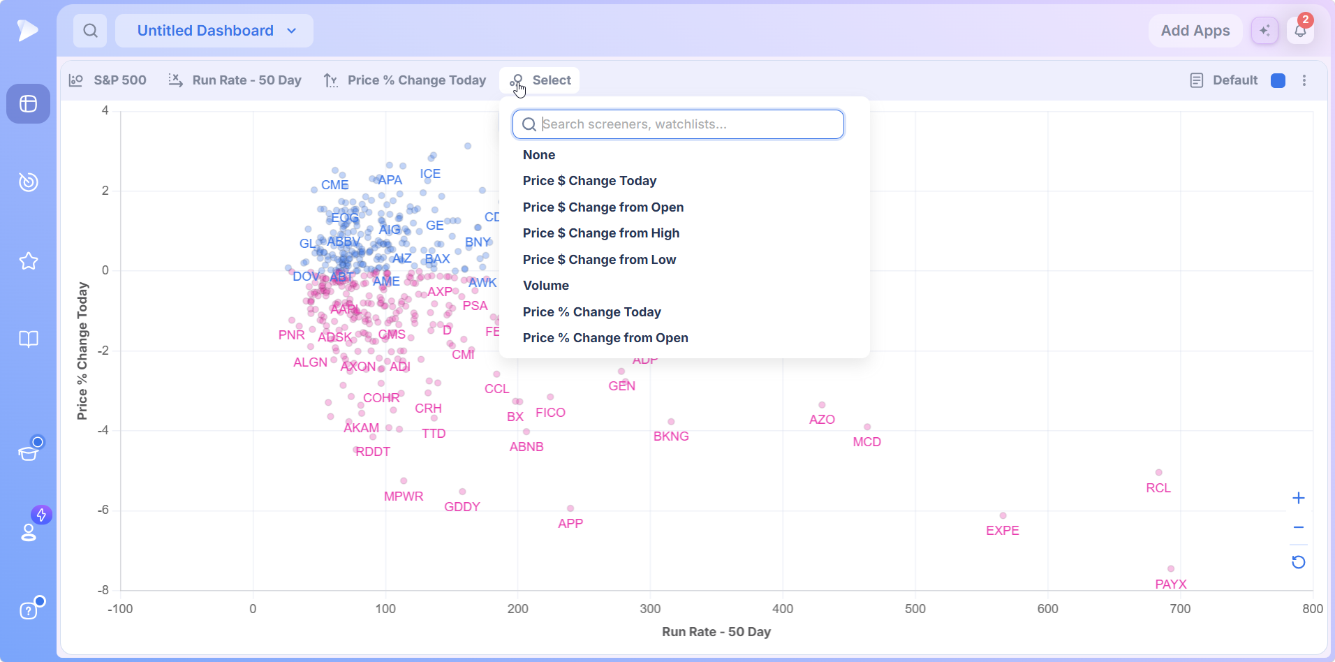
Assign a measure and the plot changes character: the stocks furthest out on that measure grow into the largest circles, so the extreme names are impossible to miss.
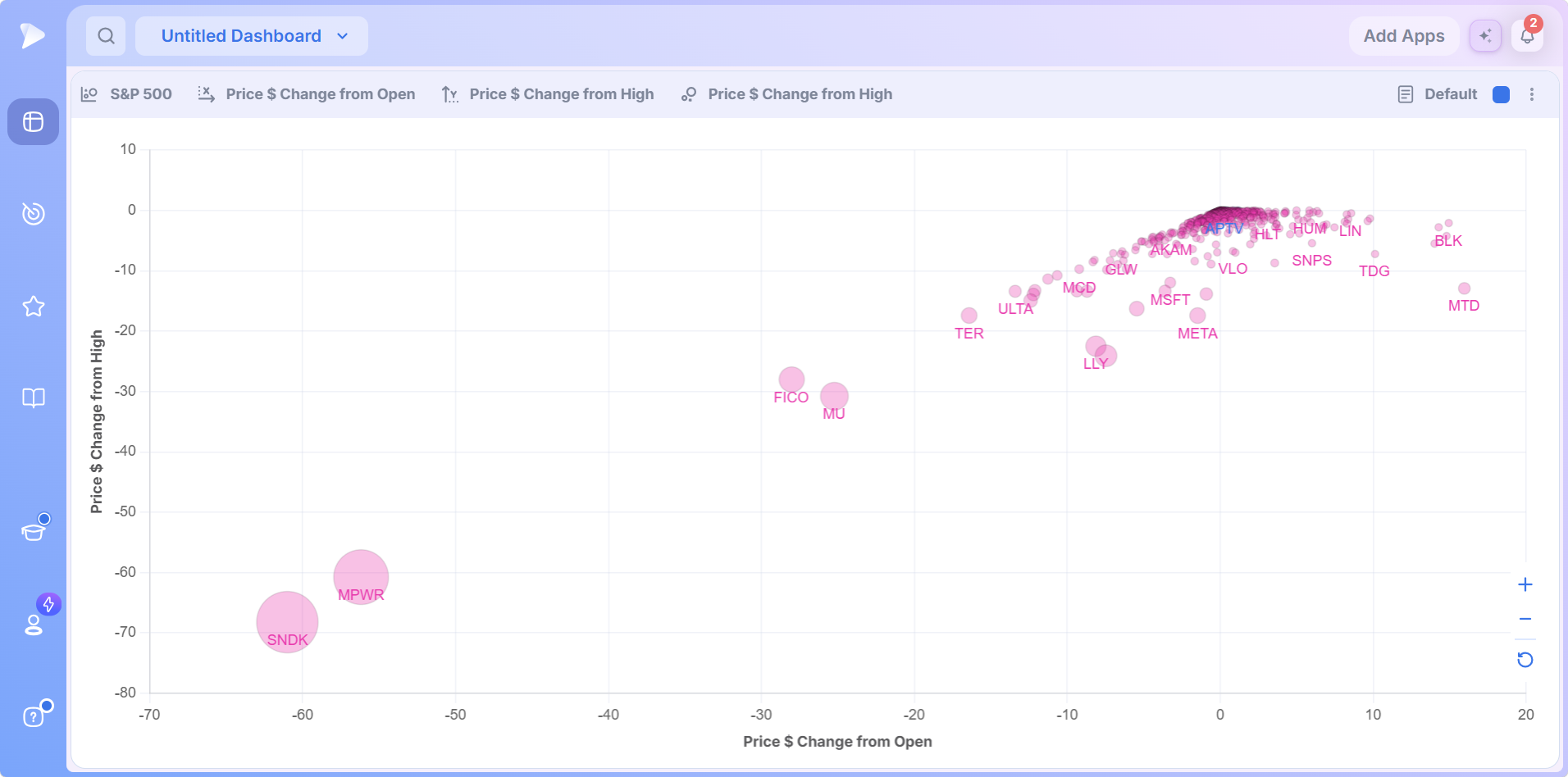
The Deepvue team sizes by relative volume, because volume shows the conviction behind a move, so the biggest circles are the stocks the market is voting on today. Financial media often defaults to a market cap bubble chart, where the biggest circle just means the biggest company. Sizing by behavior makes size reflect what a stock is doing now, which suits a momentum process far better.
Labels, Colors and Hover Values
Notable bubbles carry their ticker symbols on the plot, so you rarely guess which point is which. Advancing stocks plot blue and decliners pink, so the day’s direction reads across the whole universe at a glance.
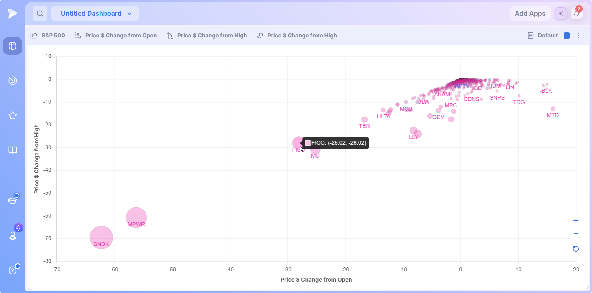
That takes you from visual impression to precise numbers without leaving the app. Hover before acting, every time.
Clickable Bubbles and Group Linking
Every bubble is clickable. Pair it with a Chart app carrying the same group square, and clicking any bubble loads that stock’s full chart instantly. A plot of forty candidates becomes forty charts reviewed in forty clicks: no typing, no tab switching, no losing your place.
Toolbar Extras and Live Updates
On the right of the toolbar, the Default template control, the group color and the options menu complete the header, and a share option posts the current view to X. Most importantly, the plot is live: bubbles move through the session as prices and volume update, which is what makes the morning configuration further down possible.
Try Deepvue and watch your own screen sort itself at tomorrow’s open.
How to Add the Bubble Chart to Your Dashboard
Head to the Dashboard module from the sidebar, then create a fresh dashboard or open one with free space.
Bring up Add Apps, using the button at the top right or the large circle on an empty board.
Click Bubble Chart in the Visualizations group, or search for it by name in the panel. The S&P 500 is already plotted when it appears.
Add a Chart app and match the two group colors, so clicking a bubble loads its chart.
A new Bubble Chart shows useful data immediately. From there, configuration is three menu choices.
How to Use the Stock Bubble Chart Step by Step
The sequence follows the tutorial: choose a universe, set both axes, choose a size measure, then read and navigate.
Choose your universe. Pick a source in the first control, or search a list by name.
Set the X axis. The second control fixes horizontal position for every stock.
Set the Y axis. Position reads bottom to top, so when both axes measure strength, the strongest names collect in the top right.
Choose the size data point. Assign a measure in Select, or None for uniform bubbles.
Three universes cover most workflows: a screener preset for a strategy defined starting point, your own watchlist for which of your names deserves attention today, and a watchlist preset such as a theme list to study one corner of the market. Feeding it your own screen is what makes it a stock screener bubble chart rather than a generic plot.
Reading the Plot
With three data points set, reading is quadrant thinking: decide which corner you want, then treat distance from the crowd as the signal.
- •Hover before acting to check the exact values behind a bubble’s position.
- •Watch the ticker labels for clusters. Several semiconductor or crypto related names traveling together is a theme moving in real time.
- •Click anything interesting to load it in your linked chart, judge the setup, then move on.
Navigating: Zoom, Pan, Focus and Reset
- •Zoom with the plus and minus buttons or the scroll wheel, and drag within the plot to pan.
- •Hold Shift and drag a box around any region to refit the plot to it and study those names up close.
- •Click reset to return to the full view.
The refit matters most when one outlier compresses everything else. In the tutorial, a stock that gapped on earnings with enormous volume stretched the scale until the rest bunched into a corner, and one Shift refit around the main cluster spread the names back into a readable map. Outliers deserve attention, but never at the cost of seeing everyone else.
Three Configurations From the Deepvue Team
Three setups from the tutorial, each answering a different question, and each worth saving as a template for a morning routine.
The Morning Momentum Map
Price % Change from Open against Relative Volume on a 20 day basis, with relative volume also sizing the bubbles. Run it right at the open.
Because the plot is live, the stocks moving strongest off their opening prices on the strongest volume migrate to the top right within minutes. You watch the day’s breakouts form instead of finding them after the fact. Quiet names stay near the origin; on a stock momentum bubble chart the top right is the action.
You also watch themes assemble as related names move together, which doubles the setup as an intraday sector bubble chart. Spot one worth acting on, click it, confirm the pivot on the linked chart, and this stock momentum bubble chart has taken you from map to decision in seconds.
The Tightness Scan
Relative Measured Volatility on a 15 day basis on one axis, to surface the tightest, most contracted names, the ones potentially coiling ahead of a move. Refit around the tight cluster, then click through each on the linked chart to see whose contraction lands in the right spot within its base. As a stock performance bubble chart it answers a question no percentage column can.
Tight and Strong
Relative Measured Volatility against the RS Rating over one week, a genuine relative strength bubble chart. In the tutorial, the tightest fast movers gather in one corner, other strong names appear nearby in visible price expansion, tight names that are not performing fall away, and the middle of the road names stand apart from all three.
It is a two question filter in one image: who is outperforming, and who is doing it quietly enough to still offer an entry? A table would mean sorting twice and holding one list in your head. Here the intersection is simply visible.
Start a Deepvue subscription and set up the morning momentum map before the next open.
Bubble Chart or Heat Map: Which Visualization When?
Deepvue’s dashboard includes both, for different questions.
| Bubble Chart | Heat Map | |
|---|---|---|
| Layout | Every stock gets coordinates on two axes | Sector grouped tiles |
| Third measure | Bubble size | Tile area |
| Best for | Relationships between two measures | Where money is flowing across groups |
| Typical question | Which strong stocks are also trading unusual volume? | Which sectors are green today? |
The Heat Map is the faster read on structure; the Bubble Chart is better for behavior, where the interesting stocks are the ones exceptional on a combination. The Performance Chart is the third option when you only need one measure ranked. Many traders run the visualizations together and let group linking send clicks from any of them into the same chart.
What Makes the Deepvue Bubble Chart Different
- ✓Plots whatever universe you choose, from the S&P 500 to your own screen or a single theme list.
- ✓Two axes and a size, so combinations of measures stand out that no single sort can show.
- ✓A live trading bubble chart that moves with prices and volume through the session.
- ✓Click through review into a linked chart, one bubble at a time.
- ✓Zoom, pan and refit so crowded plots stay readable.
For a platform level view, the Deepvue comparisons hub holds the head to head pages against TradingView, TrendSpider, MarketSurge, Finviz and TC2000, and the compare category gathers every comparison article.
What Traders Say About Deepvue
What independent reviewers say about the platform behind the plot.
“It’s my favorite charting platform over everything else so far.”
u/lmaobihhhh, in a thread on r/swingtrading. Visit the thread
“It’s powerful, simple, and SUPER clean/easy to navigate.”
A reviewer in financial services, writing on G2. Open on G2
“Deepvue consolidates all my information streams into one centralized hub.”
A testimonial Deepvue publishes on deepvue.com. Read on deepvue.com
“Swipe mode for going through charts makes it great when on the go.”
Linutor, on Deepvue’s iPad app. Apple App Store
Across more than 220 verified reviews on the Deepvue reviews wall, the average is 4.8, and 97 percent of reviewers recommend Deepvue.
Where the Bubble Chart Connects
The Bubble Chart is a discovery and monitoring layer. It replaces the flipping stage of research and hands its output to the rest of the platform.
- •Feed it from the screener. Any screen you build becomes a plottable universe, and every prebuilt approach is collected on stock screener by strategy.
- •Send its finds to charts through group linking, where Stage Analysis, the RS Line and AVWAP tell you whether the mover is worth your capital.
- •Park the keepers in a watchlist, then plot that watchlist tomorrow, so the app monitors the list it helped you build.
- •Hand the why to the AI Terminal. When a bubble rockets to the top right and you do not know why, the answer takes seconds.
A practical loop: the market opens, the momentum map moves, a cluster separates to the top right, you click through each on the linked chart, two go to the watchlist, one is buyable at a pivot, and the AI explains the catalyst behind a third.
What the Bubble Chart Costs
The Bubble Chart is not an upgrade or an add on. It is part of Deepvue’s single plan at $49 per month, with monthly and annual options, and nothing about the app is gated.
That one plan covers:
- •The screener and its 1,152 data points.
- •Charts, watchlists, and alerts, all of them unrestricted.
- •Fully customizable dashboards, with every app in the catalog.
- •The Theme Tracker, Market Brief, and AI Terminal, the last with unbounded usage.
Deepvue has one plan, so there are no tiers to compare. For reference, MarketSurge, the legacy platform in this niche, runs $149 per month.
New subscribers also get a one on one onboarding session with a Deepvue team member, an onboarding email series covering platform features and use cases, and weekly live webinars that each go deep on one part of the platform.
Put the Stock Bubble Chart on Your Dashboard
Screens find candidates and charts judge them. The step between, seeing how a whole universe behaves at once, is where most routines burn their time. A stock bubble chart collapses that into one live stock market visualization: two axes you choose, size that means something, colors that carry direction, and a click that turns any outlier into a full chart.
Join Deepvue at $49 a month, add the Bubble Chart to a dashboard, and watch tomorrow’s open sort itself in front of you.
↑ Back to contentsFrequently Asked Questions
Common questions before the plot becomes part of your routine.
What is a stock bubble chart?
A stock bubble chart is a visualization that plots each stock as a circle positioned by two chosen measures, one per axis, with its size optionally driven by a third. The Deepvue Bubble Chart shows how a whole group of stocks relates on several dimensions at once, which a ranked list cannot.
How do you read a bubble chart?
You read a bubble chart by deciding what each axis means and which corner represents strength, then treating distance from the crowd as the signal. If higher is better on both axes, the top right holds the strongest names. In Deepvue, hovering any bubble returns its exact values.
What is a scatter plot used for in stock trading?
A scatter plot is used in stock trading to compare two measures across many stocks at once. A sorted table ranks by one column, so a stock exceptional on a combination never rises to the top; the Deepvue Bubble Chart plots both measures and makes that intersection visible.
What should the bubble size represent?
The bubble size should represent whatever tells you how much a move matters. A market cap bubble chart only means the biggest company gets the biggest circle. The Deepvue team prefers relative volume, so size reflects current conviction rather than company scale.
Is the Deepvue Bubble Chart the same as a scatter plot?
Yes, the Deepvue Bubble Chart is functionally a scatter plot with an optional third dimension. Choose None in the Select menu and you have a pure scatter plot; assign a data point and each bubble’s size gains meaning.
Can I plot fundamental data on a stock bubble chart?
Yes, you can plot fundamental data on a stock bubble chart. Deepvue’s axis menus carry technical and fundamental measures, so you can plot the RS Rating against a growth or earnings measure and size by volume, weighing price behavior and company quality in one view.
How many stocks can I plot at once?
You can plot as many stocks as the universe holds, from a short watchlist to a full index like the S&P 500. When a dense Deepvue plot gets crowded, zoom, pan and the Shift refit isolate any cluster, so a large universe stays readable.
Can I plot a whole sector or theme?
Yes, you can plot a whole sector or theme. Load a theme list or thematic ETF basket from Deepvue’s Watchlist Presets, or a screen filtered to one industry, and the app becomes a sector bubble chart for that slice.
What does it mean when a stock drifts to the top right?
A stock drifting to the top right means it is strong on both measures at once, when both axes measure strength. On the Deepvue morning momentum map, that is a name moving hard off the open on heavy volume, exactly where breakouts form.
Which stocks can I plot on it?
You can plot any universe in the Deepvue selector: custom screens you have built, the full screener preset library, your watchlists, or curated watchlist presets such as trader lists, theme collections, TraderLion Model Book Stocks and thematic ETF groups. Clearing the selection plots the S&P 500.
What data points can go on the axes?
The data points that can go on the axes come from a searchable Deepvue menu. Eight appear before scrolling, covering dollar and percent change plus Volume and premarket change, and search reaches measures like Relative Measured Volatility, Relative Volume, the RS Rating and Run Rate.
What does hovering a bubble show?
Hovering a bubble shows the ticker with its exact X and Y values. In the Deepvue Bubble Chart that turns a visual impression into precise numbers, so you can check a position before clicking through to the chart.
Can I zoom in on part of the bubble chart?
Yes, you can zoom in on part of the bubble chart. Deepvue puts plus, minus and reset buttons in the lower right corner, the scroll wheel zooms too, and holding Shift while dragging a box refits the plot to that region.
Does the bubble chart update in real time?
Yes, the bubble chart updates in real time during market hours. Deepvue bubbles move as prices and volume change, which is why the morning configuration works: run it at the open and watch the strongest stocks migrate toward the top right.
What is the best setup for the market open?
The best setup for the market open, per the Deepvue team, is Price % Change from Open against relative volume, with relative volume also sizing the bubbles. Breakouts on real volume separate toward the top right within minutes, and one click loads each chart.
Can I open a stock’s chart from the plot?
Yes, you can open a stock’s chart from the plot. Every Deepvue bubble is clickable: give a Chart app the matching group square, and each click loads that ticker’s chart.
How is it different from the Deepvue Heat Map?
The Bubble Chart differs from the Deepvue Heat Map in layout. The Heat Map organizes stocks into sector grouped tiles for a structural view of where money is flowing; the Bubble Chart positions each stock by two data points and sizes it by a third, for questions about relationships between measures.
Is the Bubble Chart included in the standard Deepvue plan?
Yes, the Bubble Chart is included in the standard Deepvue plan. Deepvue has a single plan at $49 per month that covers the Bubble Chart along with the screener, charts, watchlists, alerts, dashboards, the Theme Tracker, the Market Brief, and the AI Terminal.
CAN SLIM® is a registered trademark of O’Neil Capital Management, Inc. (U.S. Reg. No. 3,081,940). Deepvue is not affiliated with, sponsored by, endorsed by, or licensed by O’Neil Capital Management, Inc., Investor’s Business Daily, MarketSurge, or their affiliates. Any reference to CAN SLIM® is for descriptive purposes only. Deepvue’s scores, ratings, and screeners are independently calculated by Deepvue and are not the proprietary ratings of MarketSurge or IBD.