Deepvue Mini Chart: A Compact Stock Chart That Stays on Your Dashboard
The Mini Chart is a Deepvue dashboard widget that keeps one symbol permanently in view. Search a ticker, pick one of eight time frames from 1D through MAX, and it draws price as an area chart or candlesticks, in blue and pink or green and red.
A dashed line marks the reference close, hovering any point returns that bar’s open, high, low, close and change, and every widget keeps its own settings, so one board can carry several.
and pin the index and your open positions where you can always see them.
The Deepvue mini chart, in numbers:
Key Takeaways
A full charting module is the right place to study a stock and a poor place to keep an eye on one. Think about the moments you actually need: how is the index trading while you work a screen, has your position moved since lunch? A chart that fills the whole window is the wrong shape for either.
The Deepvue mini chart handles that second job. It is a small, self contained widget on the dashboard next to whatever else you are doing, drawing one name on the horizon and in the style you choose. Put several on a board and you have a quote board built to your own specification.
- ✓One symbol per widget, found in the Visualizations group of Add Apps.
- ✓Eight time frames behind one button, from 1D to MAX, opening on 1D.
- ✓Color splits around a reference line, blue or green above and pink or red below, so a name’s standing reads before the number does.
- ✓A hover readout gives the date and time, open, high, low, close and change at any point.
- ✓A four entry menu covers sharing to X, area or candlestick, the color scheme, and deleting the widget.
- ✓Settings are per widget, so multiple charts on one dashboard never interfere with each other.
- ✓Covered by the one plan. Add a Mini Chart in Deepvue.
Mini Chart at a Glance
- Header pill
- Logo where available, ticker, last price, and the change in dollars and percent
- Symbol search
- A centered Search symbol panel listing tickers with company or fund names
- Time frames
- 1D, 5D, 1M, 6M, YTD, 1Y, 5Y, MAX, opening on 1D
- Chart styles
- Area or candlestick, toggled from the menu
- Color schemes
- Blue and pink, or green and red, toggled from the menu
- Reference line
- A dashed line splitting the plot’s color; on 1D it is the previous close, labeled Prev close
- Hover readout
- Date and time, O, H, L, C, and the change at that point
- Menu
- Share to X, style toggle, color toggle, Delete widget
- Per widget settings
- Symbol, time frame, style and colors are independent
- Where to find it
- Add Apps, Visualizations section
- Cost
- Covered by the one Deepvue plan ($49 a month)
What Is the Deepvue Mini Chart Widget?
It is a compact stock chart built as a mini chart dashboard app, the smallest app in the catalog by design. Where the platform’s Chart module fills the screen with indicators, drawings and multiple panes, the Mini Chart takes a fraction of the space and shows price alone, clearly, for a symbol you have decided matters.
How It Fits With the Other Visualizations
The Mini Chart is one of Deepvue’s visualization apps. The Performance Chart, the Heat Map and the Bubble Chart take a whole universe and draw it as a picture; the Mini Chart takes a single stock and does the same. A heat map shows you the market, and a row of mini stock chart widgets shows the handful of names you actually care about inside it.
Who the Mini Chart Is For
Anyone who wants a dashboard chart widget keeping specific names in view while working on something else, on a platform built for trades that run weeks into months.
- ✓Swing traders keeping open positions visible beside the screen they are working, so a move gets noticed without a module switch. Deepvue for swing traders lays out that setup.
- ✓Position traders watching a small book of long holds on the YTD or 1Y setting.
- ✓MarketSurge users who want a customizable quote board beside their charts and screens.
- ✓CANSLIM® traders with an index proxy and a couple of leaders pinned above their research tools, in the spirit of Deepvue for CANSLIM® traders.
- ✓Anyone who has kept a second tab open just to glance at one ticker, the habit this widget replaces.
What the Widget Shows
A fresh Mini Chart arrives as an area chart on the 1D setting, with a symbol pill top left and the time frame button and menu top right.
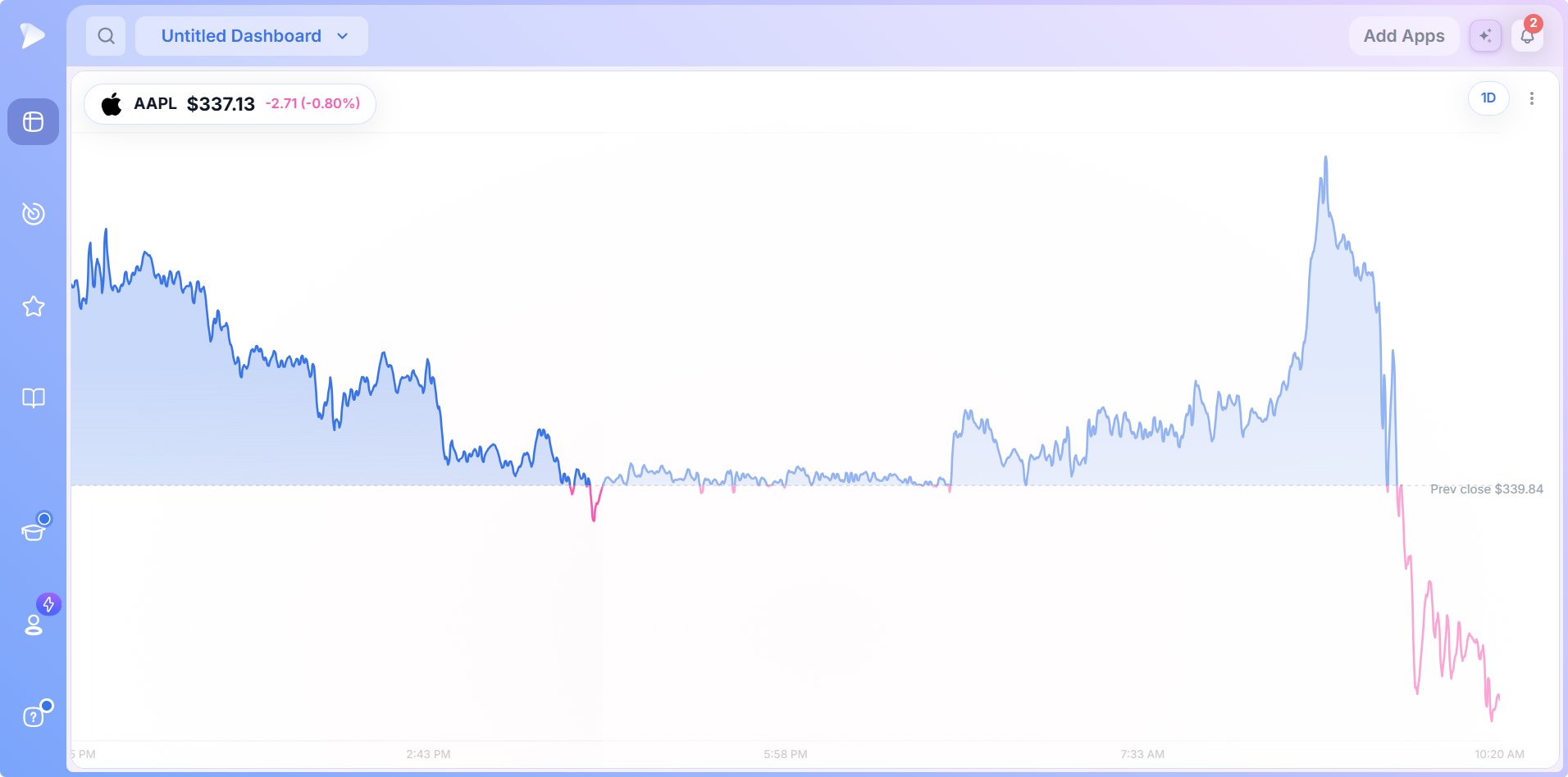
The Header
- •A logo where one is available, so you recognize the name without reading.
- •The ticker in bold.
- •The last price, so the widget doubles as a stock quote widget.
- •The change in dollars and percent, colored to match the plot.
The Plot and the Reference Line
On the daily setting a dashed horizontal line crosses the plot at the previous session’s close, labeled Prev close with its price. All the coloring hangs off that line: above it the area fills blue, below it pink.
That matters more than it sounds. A name that opened above yesterday’s close and slid beneath it shows both colors in sequence, which tells you the day was a fade. A single red number would not. A session spent entirely below the line reads as one color at a glance.
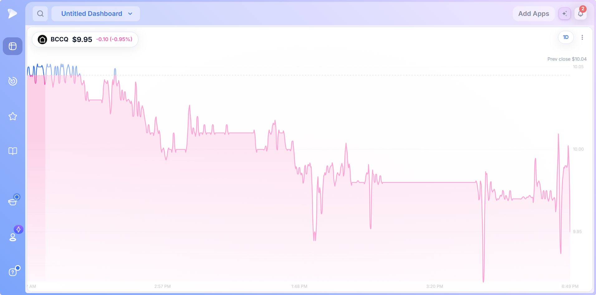
The 1D time axis also runs past the regular session in both directions, so premarket and after hours trading form part of the line rather than being trimmed off.
The Controls, One by One
Symbol Search
The symbol search opens as a centered panel over the widget. As you type, the list narrows to matching tickers, each in bold with its company or fund name alongside.
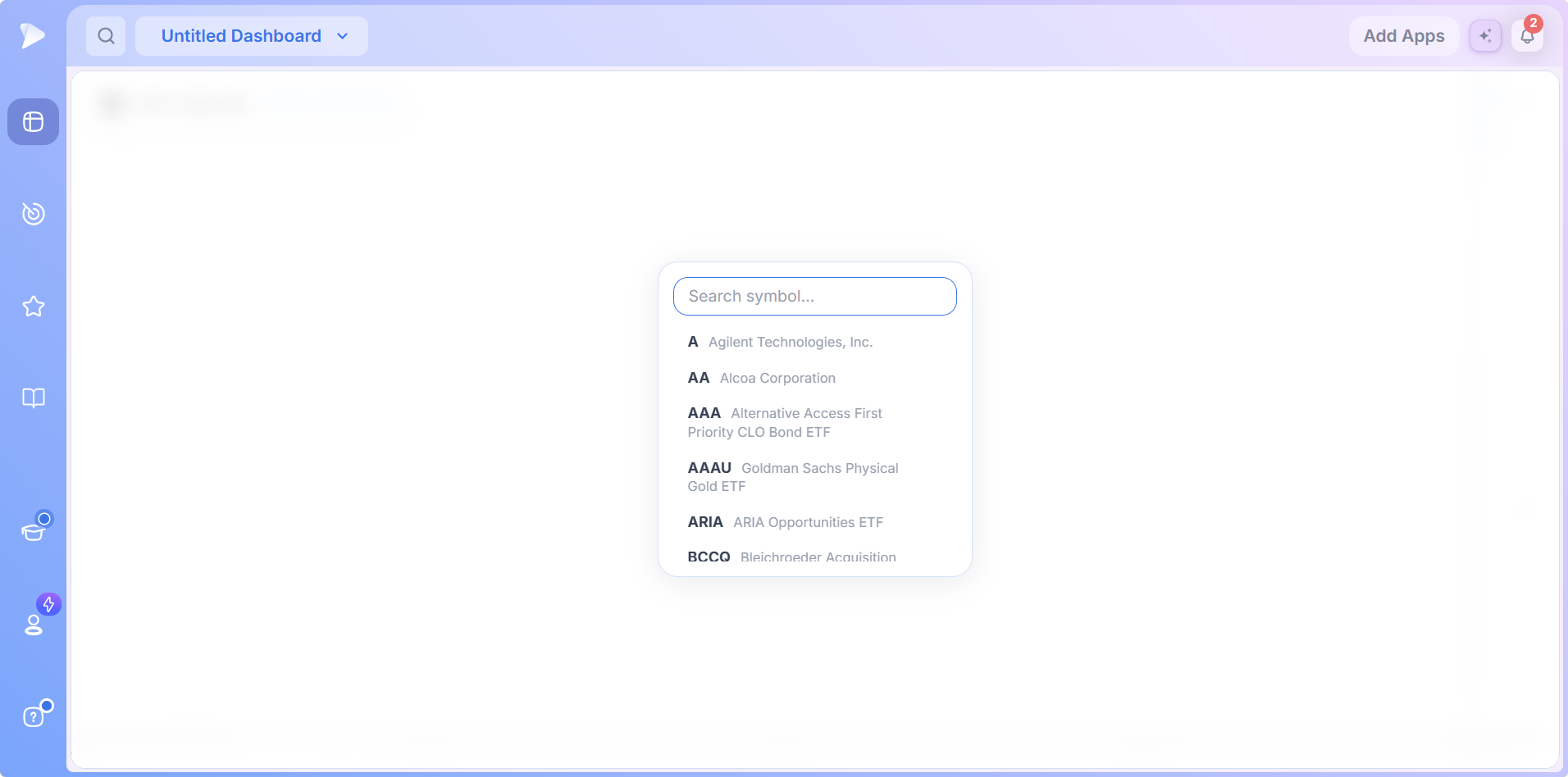
Stocks and exchange traded funds share the list, so an index proxy, a commodity fund and a single stock all reach the widget the same way, and an unfamiliar abbreviation is identified before you commit.
The Hover Readout
Move the pointer across the plot and a vertical crosshair follows, with a small panel for that point.
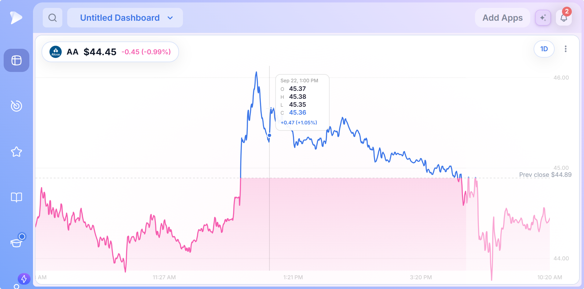
That is what keeps the widget from being decorative. A glance gives direction; a hover gives a precise number at a precise time, which is what you need when deciding whether a stop is close enough to worry about.
Open a Deepvue account and pin your open positions where you can see them.
Eight Time Frames
The button in the upper right opens the horizon menu, with the active setting highlighted.
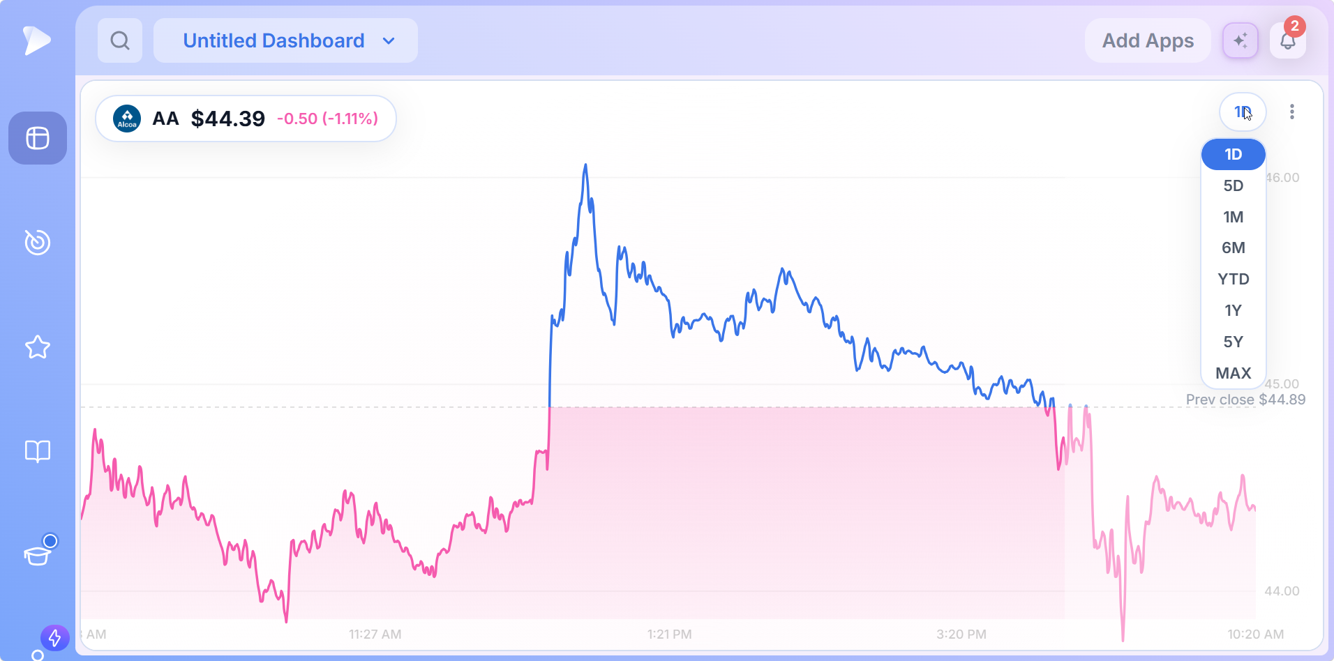
| Setting | Horizon | Typical use |
|---|---|---|
| 1D | The current session, extended hours included | Watching a position or an index during the day |
| 5D | The past week | Whether a move that started days ago has followed through |
| 1M | One month | Recent trend for a name you are considering |
| 6M | Six months | Where a swing candidate stands inside its wider structure |
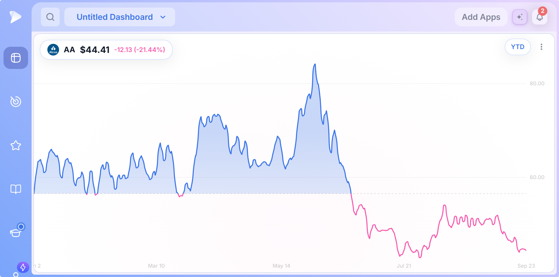
| YTD | Since the start of the year | How a longer hold is doing against its January starting point |
| 1Y | Twelve months | The full cycle for a position trade |
| 5Y | Five years | Long term context on an index or a core holding |
| MAX | The full available history | The complete life of a listing |
Changing horizon changes nothing else. Style and colors stay put, and the color split carries onto the longer settings, so a year of price becomes an instant read on whether the name is above or below where the period started.
The Menu: Sharing, Style, Color and Removal
Three dots beside the time frame button open a four entry menu. The middle two are toggles, labeled with the setting you would switch to rather than the one you are on.
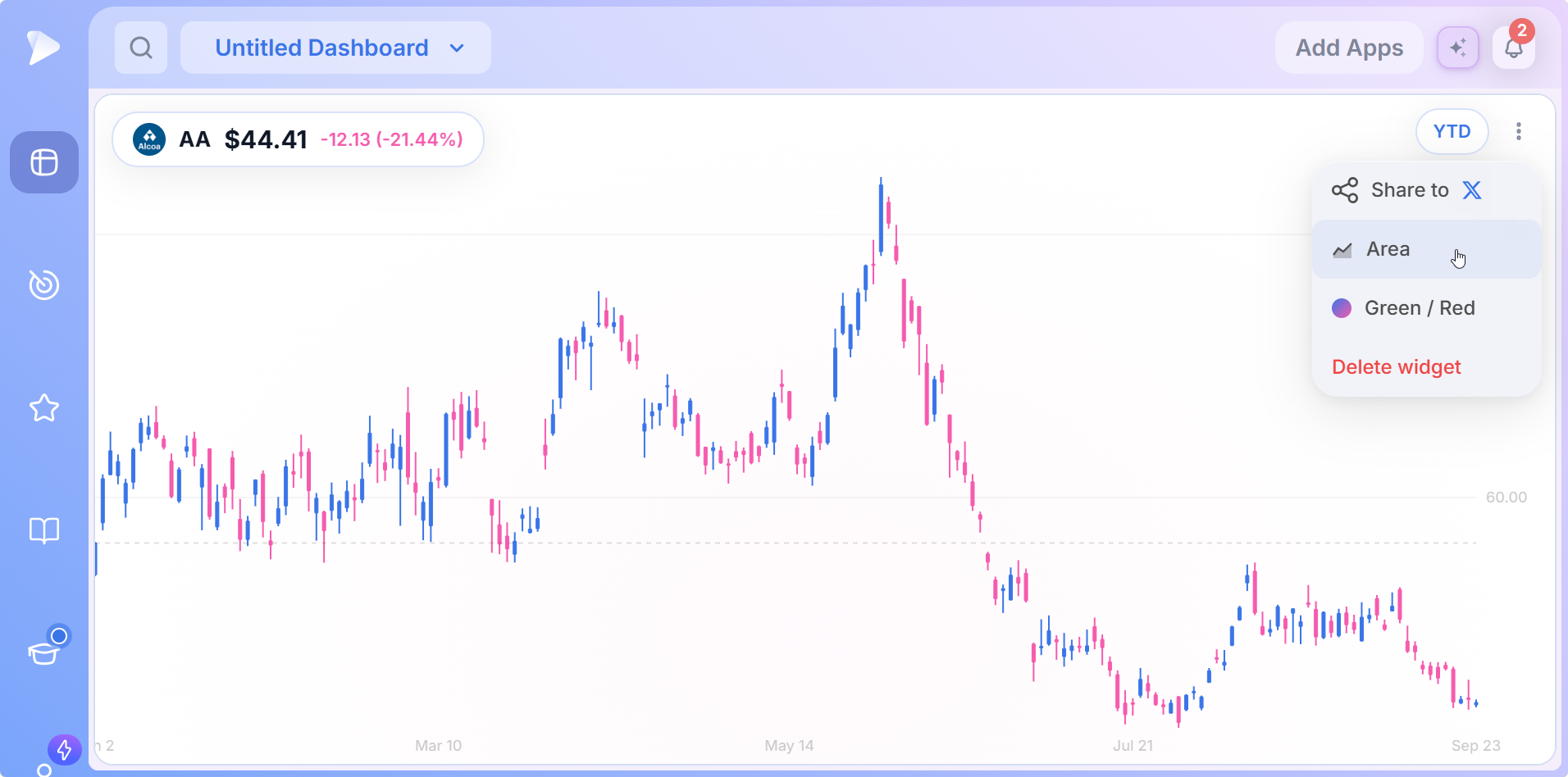
| Menu entry | What it does |
|---|---|
| Share to X | Shares the current view of the widget to X |
| Candlestick / Area | Toggles between the two chart styles, labeled with the one you would switch to |
| Green / Red or Blue / Pink | Toggles between the two color schemes, labeled the same way |
| Delete widget | Removes this Mini Chart from the dashboard |
Candlesticks show each period’s open, high, low and close; the area style is the fastest read on direction. The header follows the color scheme, so a gain shows blue on one and green on the other. Pick whichever your eye reads faster.
Multiple Charts on One Dashboard, Each Independent
Because every dashboard chart widget carries its own configuration, running multiple charts on one dashboard gives you a quote board to your exact specification.
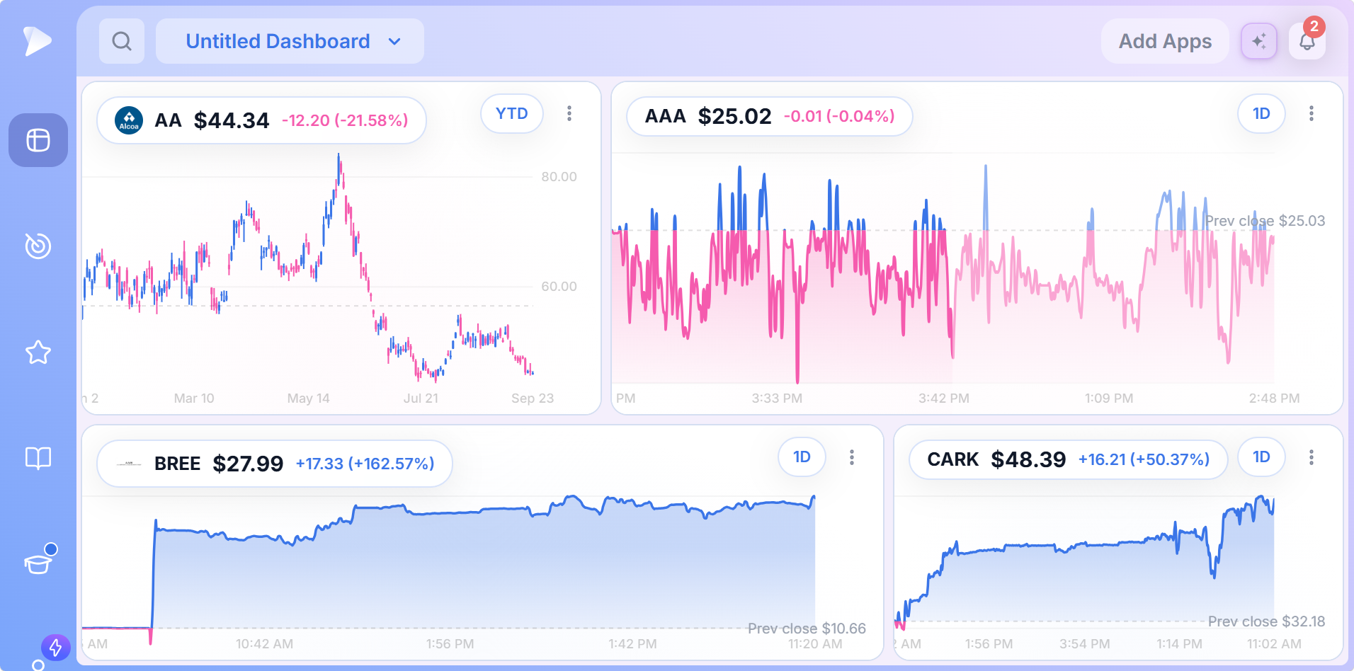
- •Different styles side by side, a YTD candlestick view next to daily area charts.
- •Different horizons at once, so today’s move and the longer structure share a screen.
- •Both colors on screen, a name above its reference close in blue next to names below theirs in pink.
- •No interference: changing one widget leaves its neighbors exactly as they were, which makes the board safe to adjust.
How to Add a Mini Chart Widget to a Dashboard
Head into the Dashboard module and open a new board or the one you keep.
Open the Add Apps panel at the top of the board.
Click Mini Chart in the Visualizations group, or type it into the panel’s search box.
Search a symbol, choose a time frame, then set style and colors from the menu.
Repeat until the board covers everything you watch.
Create a Deepvue account and have a first layout together in a couple of minutes.
Four Layouts Worth Copying
The Quote Board
A dashboard of nothing but Mini Charts is a stock quote widget board covering what you check reflexively: an index proxy or two, your open positions, whatever the market is arguing about that week. Set the ones you watch intraday to 1D and the longer holdings to YTD or 1Y, and keep the board one click away.
The Same Name on Two Horizons
Two widgets, one symbol. The first on 1D to catch what is happening today, the second on 6M or 1Y for the structure today is happening inside. Nothing stops a single session’s move from being read out of context faster.
Context Above, Candidates Below
A row of Mini Charts across the top of a research dashboard, with the Market Brief, the Theme Tracker or a screen beneath. The row tells you how the market and your book are behaving; the apps under it tell you what to do about it.
Index Beside the Screener
The simplest pairing: one Mini Chart on an index proxy next to the screener you spend the most time in. Whenever a breakout looks tempting, the index is already in view, and whether the tape supports it takes no effort to answer.
Mini Chart or the Full Chart?
Both are on the platform and they are not in competition. The full Chart is for the work: indicators, drawings, the RS Line and Stage Analysis, the detail that decides a trade. The Mini Chart is for awareness: one symbol, one horizon, one glance, in view while the work happens elsewhere. Wanting to draw a trendline on a Mini Chart is the signal to open the big one; opening the big one just to check whether the index is up is the signal to add a small one.
What Makes the Deepvue Mini Chart Different
- ✓A compact stock chart that stays put, next to your screens and research instead of in another tab.
- ✓Eight horizons per widget, from today’s session to a listing’s full history.
- ✓A reference line that colors the plot, so above or below reads instantly.
- ✓Exact numbers on hover, not just a shape.
- ✓Independent widgets, so a board can mix symbols, horizons, styles and colors freely.
A widget is a small part of a platform decision. For the bigger picture, theDeepvue comparisons hub sets Deepvue against TradingView, MarketSurge, TrendSpider, Finviz and TC2000, capability by capability.
What Traders Say About Deepvue
Four outside verdicts on the charting side of the platform.
“It’s my favorite charting platform over everything else so far.”
Written by u/lmaobihhhh on r/swingtrading. Open the post
“Swipe mode for going through charts makes it great when on the go.”
Linutor, reviewing the iPad app in February 2026. App Store reviews
“Amazing charting capabilities and key financial numbers in a clean, quick manner.”
One of Deepvue’s published customer testimonials. Read it on deepvue.com
“It’s powerful, simple, and SUPER clean/easy to navigate.”
A verified reviewer on G2. G2 page
On the Deepvue reviews wall, the 4.8 average rests on upward of 220 verified reviews, and 97 percent of them recommend the platform.
Where the Mini Chart Connects
- •The full Chart module for studying anything a Mini Chart makes you curious about.
- •Watchlists for the wider set of names, from which a board of widgets is the short, always visible subset.
- •The screener for finding candidates that eventually earn a widget.
- •The AI Terminal for asking why a name on the board just moved.
- •The Heat Map for the market wide picture above a row of single symbol widgets.
What the Mini Chart Costs
The Mini Chart comes with Deepvue’s single plan at $49 per month, with monthly and annual options. Dashboard apps carry no separate charge, which matters when the whole idea of this mini chart dashboard app is running several.
That one plan covers:
- •The screener and its 1,152 data points.
- •Charts, watchlists, and alerts, all of them unrestricted.
- •Fully customizable dashboards, with every app in the catalog.
- •The Theme Tracker, Market Brief, and AI Terminal, the last with unbounded usage.
Deepvue has one plan, so there are no tiers to compare. For reference, MarketSurge, the legacy platform in this niche, runs $149 per month.
New subscribers also get a one on one onboarding session with a Deepvue team member, an onboarding email series covering platform features and use cases, and weekly live webinars that each go deep on one part of the platform.
Your Names, Always in View
Most of what goes wrong between decisions comes from not looking. A position drifts, an index turns, a leader breaks, and the chart that would have shown it was three clicks away. A stock mini chart on the dashboard you already have open removes those clicks: eight horizons, two styles, two color schemes, a hover readout, and as many widgets as your board needs.
Take Deepvue for a run at $49 each month, add a Mini Chart to the first dashboard you build, and stop keeping a second tab open just to watch one ticker.
↑ Back to contentsFrequently Asked Questions
Settled before you build a board of these.
What is a mini chart used for?
A mini chart is used for keeping one symbol visible while you work on something else. Instead of opening a full charting module to check whether an index turned or a position moved, the Deepvue Mini Chart, a mini stock chart on the dashboard you already have open, answers at a glance.
How do I add a stock chart to my dashboard?
You add a stock chart to your dashboard from the Add Apps panel in the Deepvue Dashboard module: click Mini Chart in the Visualizations group. Then search a ticker, choose a time frame, and set style and colors from the three dot menu.
Can I see multiple stock charts at once?
Yes, you can see multiple stock charts at once. A Deepvue dashboard can hold several Mini Charts, each keeping its own symbol, time frame, style and colors, so one board works as a quote wall for the index and your positions.
Does a mini chart show real time prices?
Yes, the Deepvue Mini Chart shows prices that update through the session rather than on a manual refresh, in the header and on the plot. The 1D view also runs past regular hours, so premarket and after hours trading appear on the line.
What is the Deepvue Mini Chart?
The Deepvue Mini Chart is a stock mini chart widget that draws one symbol as a compact chart on a dashboard. You pick the ticker and one of eight time frames, and it renders price as an area chart or candlesticks, with the last price and change in the header and a hover readout on the plot.
Where do I find the Mini Chart?
You find the Mini Chart in the Visualizations group of the Add Apps panel in Deepvue’s Dashboard module. One click adds it to the board, then you search for a symbol.
What time frames does the Mini Chart offer?
The Mini Chart offers eight time frames: 1D, 5D, 1M, 6M, YTD, 1Y, 5Y and MAX. Each Deepvue widget opens on 1D, and the active setting is highlighted in the menu.
What is the best time frame to use on a mini chart?
The best time frame to use on a mini chart depends on the job. In Deepvue, set widgets you watch intraday to 1D, which includes extended hours, and longer holds to YTD or 1Y. Because settings are per widget, you can run one name on two horizons side by side.
What is the difference between the area and candlestick styles?
The difference between the area and candlestick styles is detail. The area style fills under one price line, the fastest read on direction and the color split. Candlesticks show each period’s open, high, low and close. The Deepvue menu toggles between them per widget.
Why is part of the chart blue and part of it pink?
Part of the chart is blue and part pink because the Deepvue Mini Chart colors the plot against a dashed reference line. On 1D that line is the previous close, labeled with its price. Price above it fills blue, price below it fills pink, and the green and red scheme uses the same split.
Does the daily view include premarket and after hours trading?
Yes, the daily view includes premarket and after hours trading. The Deepvue Mini Chart 1D plot runs beyond the regular session, from the previous evening through the early morning and into the day, so extended hours activity forms part of the line.
How do I change the symbol on a Mini Chart?
You change the symbol on a Mini Chart through the Search symbol panel, which opens over the widget. Type a ticker or company name, and the Deepvue list narrows to matching stocks and ETFs, each labeled with its full name.
Can I switch between area and candlestick charts?
Yes, you can switch between area and candlestick charts. The Deepvue Mini Chart menu holds a style toggle that reads Candlestick while an area chart is showing and Area once candles are showing, so the entry always names the option you would switch to.
Can I change the colors?
Yes, you can change the colors. The same Deepvue menu toggles between blue and pink and green and red, labeled with the scheme you would switch to, and the change figure in the header follows the chosen scheme.
What does hovering the chart show?
Hovering the chart shows a crosshair and a readout with the date and time of that point, the open, high, low and close, and the change in dollars and percent. The Deepvue readout works on every time frame and in both styles.
Can I share a Mini Chart?
Yes, you can share a Mini Chart. The first entry in the Deepvue widget menu, Share to X, sends the chart as displayed to X.
How many Mini Charts can I put on one dashboard?
You can put several Mini Charts on one dashboard, as many as your layout needs. Each Deepvue widget keeps its own symbol, time frame, style and colors, so one board can mix a YTD candlestick view with several daily area charts.
Why use a mini chart instead of the full chart?
You use a mini chart instead of the full chart for awareness rather than study. The Deepvue Mini Chart keeps one symbol in view while you work elsewhere; the full Chart carries indicators, drawings, the RS Line and Stage Analysis for the analysis that decides a trade.
Does the Mini Chart show indicators or volume?
No, the Mini Chart does not show indicators or volume. It shows price alone. For moving averages, volume, drawings and indicator panes, use Deepvue’s full Chart module and keep the Mini Chart for awareness.
Can I plot ETFs as well as stocks?
Yes, you can plot ETFs as well as stocks. The Deepvue symbol search lists stocks and exchange traded funds together, with the full name beside each ticker.
Is the Mini Chart suitable for day trading?
The Mini Chart is suited to keeping context in view for holds that run weeks into months rather than timing day trades. Deepvue is designed around growth and momentum trading, and the widget supports that horizon.
Is the Mini Chart included in the standard Deepvue plan?
Yes, the Mini Chart is included in the standard Deepvue plan. Deepvue has a single plan at $49 per month that covers the Mini Chart along with the screener, charts, watchlists, alerts, dashboards, the Theme Tracker, the Market Brief, and the AI Terminal.
CAN SLIM® is a registered trademark of O’Neil Capital Management, Inc. (U.S. Reg. No. 3,081,940). Deepvue is not affiliated with, sponsored by, endorsed by, or licensed by O’Neil Capital Management, Inc., Investor’s Business Daily, MarketSurge, or their affiliates. Any reference to CAN SLIM® is for descriptive purposes only. Deepvue’s scores, ratings, and screeners are independently calculated by Deepvue and are not the proprietary ratings of MarketSurge or IBD.