Deepvue Visualizations: Four Ways to See the Market Instead of Reading It
Deepvue visualizations are four apps making up the catalog’s Visualizations group: the Heat Map, the Bubble Chart, the Performance Chart and the Mini Chart. Three of them turn a whole list of stocks into a picture, and the fourth keeps a single symbol in view in a small space.
They answer questions a sorted table makes you assemble in your head: is a move broad or carried by three names, and which stocks are strong on two measures at once? All four are part of Deepvue’s $49 monthly plan.
and see the shape of your screen in one glance.
The Deepvue visualizations, in numbers:
Key Takeaways
Sorted tables are exact, but they hide the outline of a group. Is weakness everywhere or in a few names? Is capital rotating between sectors? Which handful of stocks explain your screen’s whole move? A picture shows that at once; a table makes you piece it together.
- ✓Four apps, four shapes: a ranked bar chart, a treemap, a scatter plot and a compact single symbol chart.
- ✓Your universe, not a fixed index. The Bubble Chart, Heat Map and Performance Chart plot any screen, saved list or preset you pick.
- ✓Two measures at once. Both the Bubble Chart and the Heat Map carry independent readings, so the combination surfaces names a single sort would bury.
- ✓Everything is clickable. Linked to a chart through a color group, every bar, tile or bubble opens a chart review in one click.
- ✓Live during the session, with bars reordering, tiles reshading and bubbles moving as prices and volume change.
- ✓Part of the single plan. Try the Deepvue visualizations.
Visualizations at a Glance
- Performance Chart
- One data point per stock, drawn as bars ranked longest first
- Heat Map
- Sector and industry blocks of tiles, colored by one measure and sized by another
- Bubble Chart
- Two data points place every stock, and an optional third sets bubble size
- Mini Chart
- A small chart of one symbol, with its own time frame, style and colors in every copy
What Are the Deepvue Visualizations?
They are the stock visualization tools in the Deepvue catalog, built on one idea: the eye reads shape far faster than it reads rows. Alongside Visualizations, the catalog has three other app groups: Core Features, Research and Tools.
Each one is also a dashboard app, so a picture of the market can share a screen with the chart that judges what it shows.
Who the Visualizations Are For
- ✓Growth stock traders reading a whole screen of candidates at once instead of one row at a time.
- ✓Swing traders looking for the session’s strongest names as they pull away at the open.
- ✓Position traders watching rotation between groups over weeks.
- ✓CANSLIM traders checking whether leadership is broad or narrow before adding exposure.
- ✓Anyone who exports screens just to sort a column or build a chart.
Deepvue is research software and places no orders; it runs alongside whichever broker you use. The Deepvue for hub lays out a routine for each trading style.
Performance Chart
Ranks every stock in a watchlist, screen or preset on the one data point you choose, drawn as horizontal bars with the strongest reading on top. Gains draw blue, losses pink, and the order updates through the session.
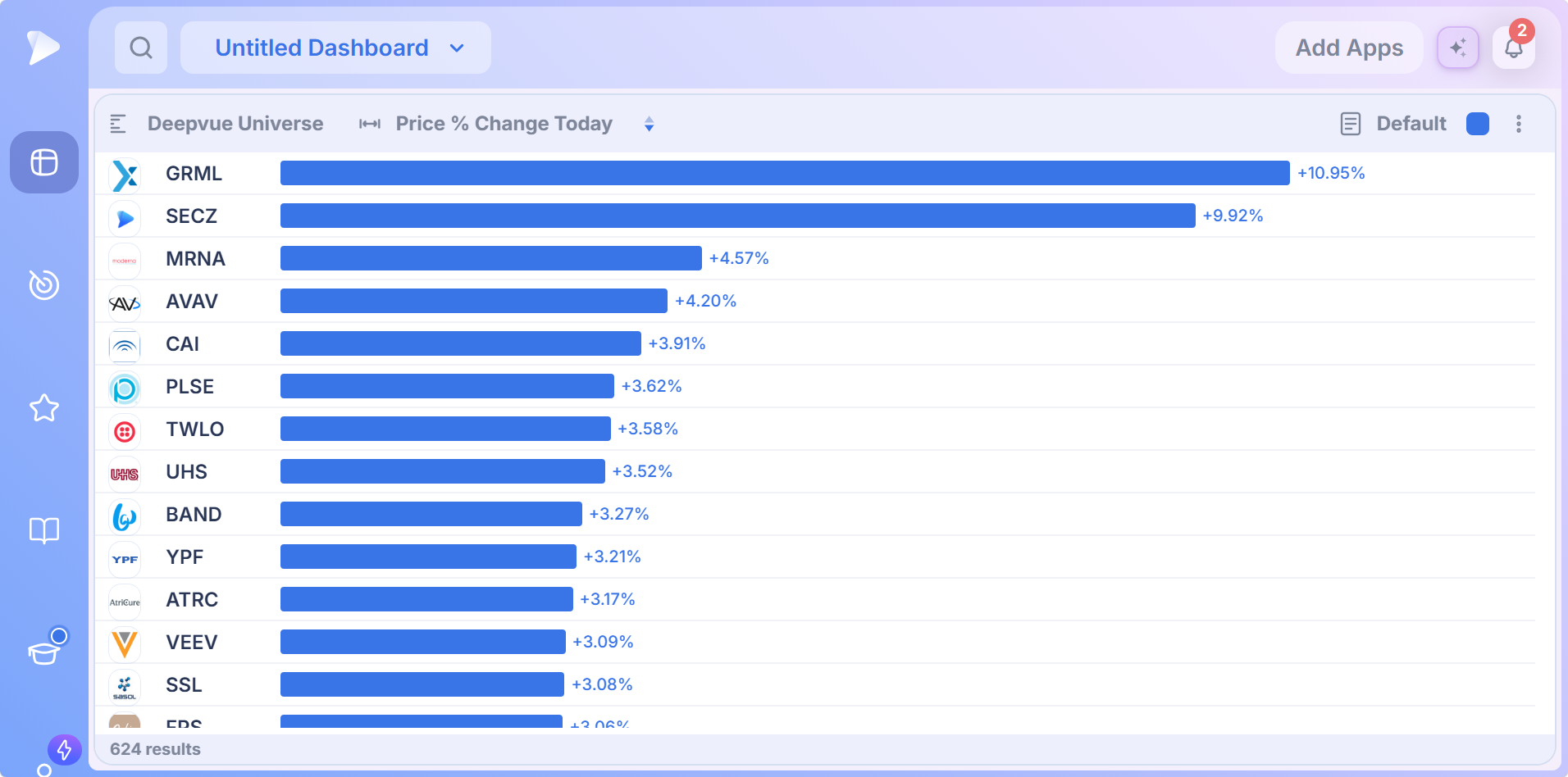
Point it at a basket of sector ETFs and you have a rotation board in two clicks. Share a color group with a chart and every bar opens its symbol; store the setup as a template and it reloads tomorrow in one click.
Heat Map
Turns a screen or watchlist into sector and industry blocks of tiles, so a custom universe reads at a glance rather than a fixed index. Tiles shade green for gains and red for losses.
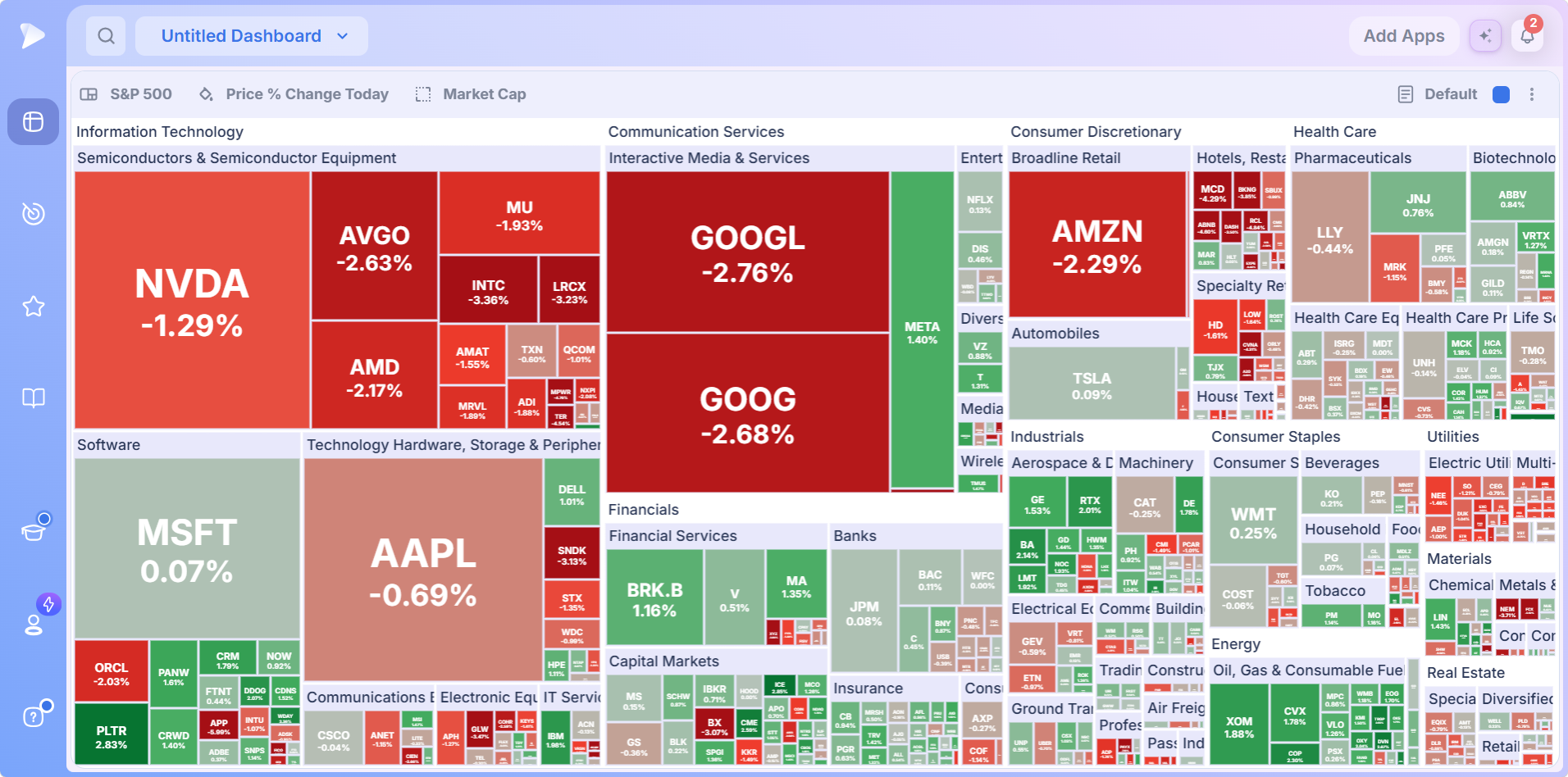
Separate controls set what each tile prints and how big it is. Size by volume and the map shows where trading activity is concentrated; size by market cap for the familiar index view. Click any block to drill into its industries and stocks, and load one of ten shipped templates or save your own.
WatchHeatmap app walkthrough: spotting trends and trading opportunitiesCreate a Deepvue account and put these visualizations on your first board.
Bubble Chart
This stock bubble chart places every stock in a universe by two metrics you choose, with a third optional metric controlling bubble size. Advancing names plot blue and decliners pink.
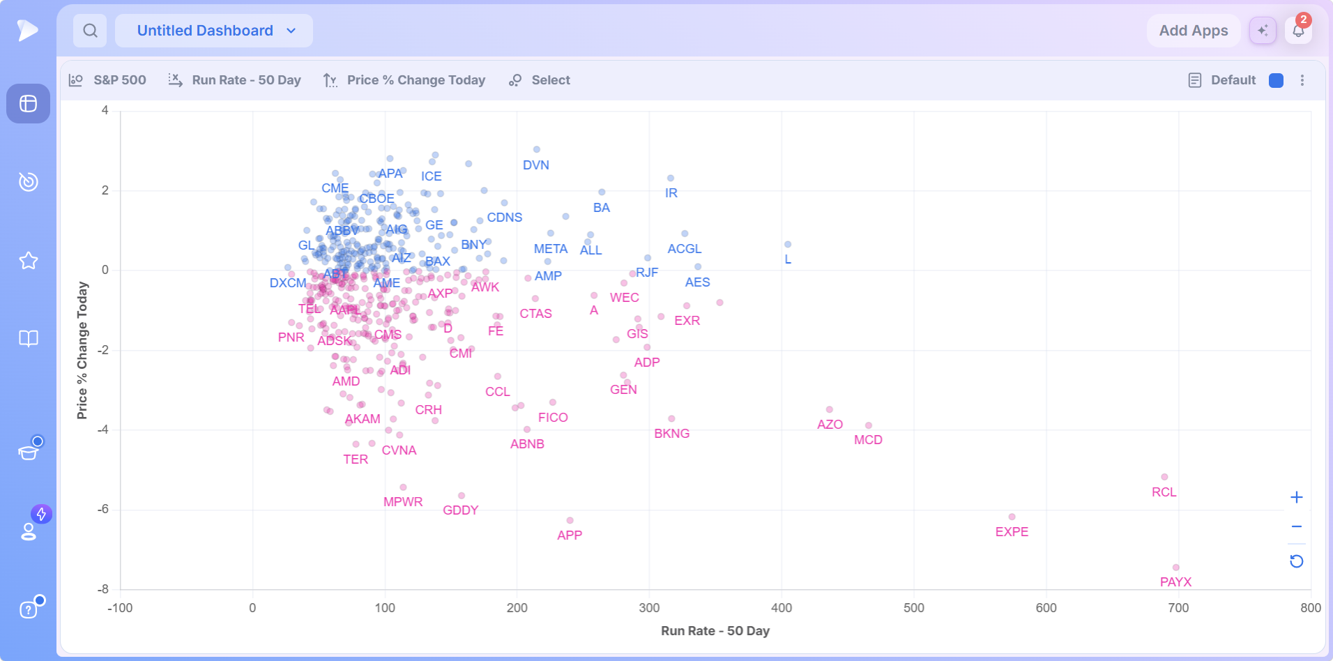
Its strength is surfacing names that look ordinary on either measure alone and stand out on the combination. Positions update through the session as data changes, a hover returns the exact values, zoom and refit controls keep crowded plots readable, and every bubble clicks through to a linked chart.
WatchBubble Charts tutorial: every control plus three setupsMini Chart
A compact chart for one symbol, built for the parts of a dashboard where a full chart would not fit. The header carries the price and the change, and the plot shows the move around a reference line.
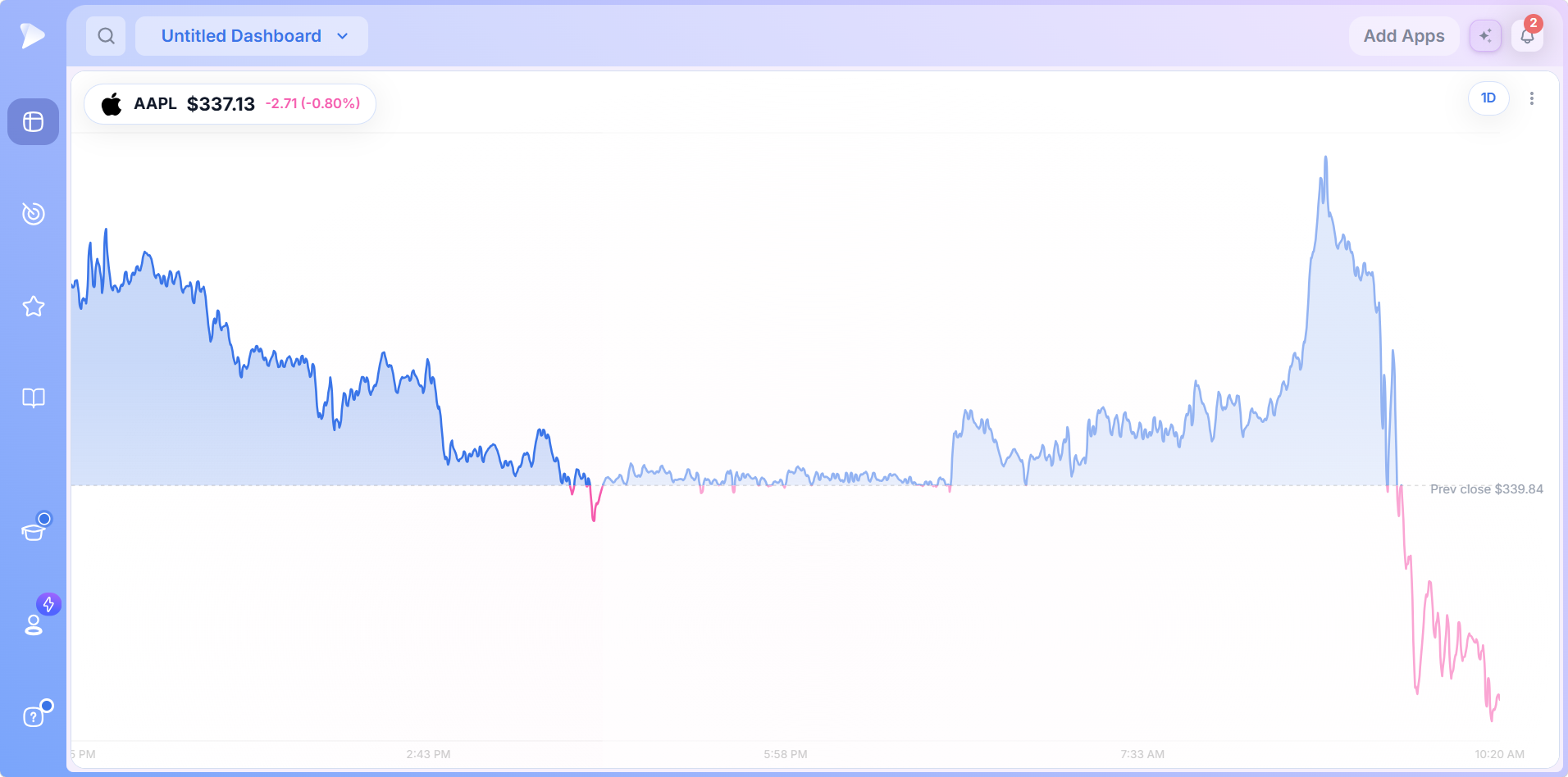
Eight time frames from 1D to MAX, area or candlestick styles, two color schemes and a hover readout, all set per widget. Several on one board, each on its own symbol or horizon, make a quote strip across the top of your screen.
How the Deepvue Visualizations Work Together
The four rarely run alone:
- •A Heat Map beside a Bubble Chart reads one universe as structure and as behavior at the same time.
- •A Performance Chart on sector ETFs is a rotation read before you open a single chart.
- •A row of Mini Charts keeps the index and your positions in view above everything else.
Set them up on a customizable dashboard, give the ones that should follow your chart its color group, and every tile, bar and bubble becomes a doorway into analysis.
Start with Deepvue and assemble that visual board tonight.
What Makes the Deepvue Visualizations Different
- ✓Stock visualization tools that plot what you trade: your screens and watchlists, not a locked index.
- ✓Independent controls, so one picture can carry two or three measures.
- ✓Live, clickable and linked, so seeing becomes reviewing without switching tabs.
- ✓Templates and saved setups for the views you check every day.
The Deepvue comparisons hub weighs the platform as a whole against TC2000, TradingView, Finviz, MarketSurge and TrendSpider.
What Traders Say About Deepvue
Reviewers outside the company, in their own words.
Deepvue’s dashboards are “a lot more helpful than the market overview pages” found elsewhere.
Dave, whose Day Trade Review writeup rates Deepvue 4.7. See what Dave wrote
“It’s powerful, simple, and SUPER clean/easy to navigate.”
A financial services user reviewing on G2. On G2
“It’s my favorite charting platform over everything else so far.”
u/lmaobihhhh, in r/swingtrading. Open the thread
“The interface is very well thought out and highly customizable.”
u/NeosDemocritus, discussing platforms in r/CANSLIM. Open that discussion
The Deepvue reviews wall gathers 220 plus verified reviews at 4.8 on average, and all but 3 percent of reviewers recommend it.
Other Groups in the Deepvue Catalog
- •Core Features: the charts, screener, watchlists, alerts and AI Terminal that every routine starts from.
- •Research: the apps that read market conditions, from breadth and themes to rankings and news.
- •Tools: focused utilities for position sizing, earnings history and the earnings and economic calendars.
- •Outside the catalog: the Model Book module and your dashboards, gathered on the main features hub.
What the Deepvue Visualizations Cost
All four visualizations are included in Deepvue’s single plan at $49 per month, with monthly and annual options, and none of them is priced separately.
That one plan covers:
- •The screener and its 1,152 data points.
- •Charts, watchlists, and alerts, all of them unrestricted.
- •Fully customizable dashboards, with every app in the catalog.
- •The Theme Tracker, Market Brief, and AI Terminal, the last with unbounded usage.
Deepvue has one plan, so there are no tiers to compare. For reference, MarketSurge, the legacy platform in this niche, runs $149 per month.
New subscribers also get a one on one onboarding session with a Deepvue team member, an onboarding email series covering platform features and use cases, and weekly live webinars that each go deep on one part of the platform.
See the Market With Deepvue Visualizations
Four pictures of the same market, a performance chart, a stock heatmap, a stock bubble chart and a mini chart, each answering a question a table cannot. Stock market visualization is not decoration here; it is how you decide where to look next, fast.
Stop reading the market and start seeing it. Get Deepvue and give your first board these views, all for $49 a month.
↑ Back to contentsFrequently Asked Questions
Answers on the four visual apps.
What are the Deepvue visualizations?
The Deepvue visualizations are the catalog’s Visualizations group: the Bubble Chart, Heat Map, Performance Chart and Mini Chart. Three turn a list of stocks into a picture of your own screen or watchlist, while the Mini Chart tracks a single symbol.
What is a stock market visualization?
A stock market visualization is any view of stock data that uses position, size or color instead of rows. Treemaps, scatter plots and ranked bar charts all qualify, and Deepvue ships one of each because the eye reads shape faster than a table.
How do you visualize stock market data?
You visualize stock market data by trading rows for position, size and color. A treemap carries two measures, a scatter plot compares two variables across a universe, and a ranked bar chart orders a list on one; Deepvue offers all three.
What is a stock market heat map?
A stock market heat map is a treemap of a universe: sectors form blocks, industries fit inside them, and each company is a tile sized by one measure and shaded by another. The Deepvue Heat Map lets you choose both measures and the universe.
How should you read a stock heat map?
You should read a stock heat map by confirming the colored and sizing measures first, then look across sector blocks before individual tickers. In the Deepvue Heat Map, deep green and deep red mark the strongest readings; drill into the block that stands out.
Heat Map or Bubble Chart, which should I use?
Whether to use the Heat Map or Bubble Chart depends on the question. The Deepvue Heat Map reads structure, which sectors are strong and where money is going; the Bubble Chart reads behavior, plotting two measures against each other. Many traders run both.
Can I plot my own screen or watchlist?
Yes, you can plot your own screen or watchlist in the Deepvue Bubble Chart, Heat Map and Performance Chart. That is what separates them from free versions locked to an index; the Mini Chart instead follows a single symbol you choose.
Are the visualizations included in the standard plan?
Yes, the visualizations are included in the standard plan. Deepvue has a single plan at $49 per month that covers all four along with the screener, charts, watchlists, alerts, dashboards, the Theme Tracker, the Market Brief, and the AI Terminal.