Deepvue Stage Analysis: See Exactly Where the Stage 2 Stocks Are Hiding
The Deepvue Stage Analysis app takes the market stage assigned to every stock and rolls it up by classification, so you can see how any sector, group, industry, or sub industry divides between Stage 1, 2, 3, and 4.
A Market Overview strip covers the whole universe, a table breaks it down with a Distribution bar and one column per stage, and any row opens into its stocks. A filter offers eight stage options, and figures display as percentages, counts, or both.
and the app is added to a dashboard in seconds, with nothing to configure.
Stock market stage analysis for every classification, in one app:
Key Takeaways
Most traders learn stock market stage analysis one chart at a time: basing, advancing, or breaking down, then on to the next. It works, but it is slow, and it says nothing about whether the group behind that stock is in the same condition.
This app inverts that. Instead of assessing stocks one by one, it counts them, and every classification gets a breakdown of how its members split across the stages.
A group where most stocks are advancing is a different environment from one where most are breaking down. That difference decides whether your breakout has support or is fighting its peers, and here it is visible in seconds.
- ✓Group condition, not one chart at a time. Stage data is aggregated by classification, so you read a whole group at once.
- ✓A Market Overview strip shows how the entire universe divides between stages, with a count, a percentage, and a history chart.
- ✓Four levels of detail, sector down to sub industry, each row carrying a Distribution bar, a column per stage, and a Health reading.
- ✓Eight stage options in the filter, including substages, plus a display control for percentages, counts, or both.
- ✓Every row opens into its constituent stocks, ranked by their move against yesterday’s close, with a quick menu to tag or save any ticker.
- ✓Included in the one plan. Get started with Deepvue here.
Stage Analysis at a Glance
- Market Overview
- One strip splitting the whole universe by stage, with counts, percentages, and a history chart beneath
- Classification table
- One row per classification, with name, constituent count, Distribution bar, stage columns, and Health
- Levels
- Sector, Group, Industry, Sub Industry, switched from the header dropdown
- Stage filter
- Eight options: Stage 1A, 1, 2A, 2, 3A, 3, 4, and 4B-, color matched in pairs
- Display modes
- Three: percentage, count, or both together
- Health reading
- A one word verdict per row, such as Strong, Healthy, Neutral, or Weak
- Drill down
- Click any row for its constituents, ranked by move against yesterday’s close
- Quick menu
- Tag, save to a watchlist, or copy any constituent
- Where to find it
- In theResearch group of the Add Apps menu
- Cost
- No extra charge on the one Deepvue subscription
What Is Stage Analysis?
Stage analysis for stock trading is the framework popularized by Stan Weinstein. It holds that a stock moves through a repeating cycle of four phases rather than simply going up and down. Each of the market stages calls for a different response, so identifying the phase matters more than predicting the next move.
| Stage | What it describes | Typical stance |
|---|---|---|
| Stage 1 | Basing after a decline. Price moves sideways as selling exhausts and accumulation begins | Watch and prepare, do not chase |
| Stage 2 | The advancing phase. Price trends higher and the stock is under accumulation | Where most buying should happen |
| Stage 3 | Topping. The advance stalls and price moves sideways as distribution begins | Tighten risk, stop adding |
| Stage 4 | Declining. Price trends lower under distribution | Avoid on the long side |
Deepvue assigns a stage to each stock automatically, so you never classify by hand. The app then counts those assignments by classification, turning a single stock framework into a market wide read. A stock’s stage is also a data point elsewhere on the platform, so it travels with you into watchlists and screens.
Why Counting Stages Beats Reading Them One by One
Knowing a stock is in Stage 2 is useful. Knowing 70 percent of its industry is also in Stage 2 is far more useful, because it tells you the strength is structural rather than isolated.
The reverse holds too. A good looking chart inside a group where half the members are in Stage 4 deserves more skepticism than the chart suggests, and that is exactly the trade that tends to fail. The app answers a question no individual chart can, for every classification at once.
What the Deepvue Stage Analysis App Shows
The app has two halves. A Market Overview across the top covers the whole universe, and a table underneath breaks that same universe into classifications, both drawn from the same stage assignments.
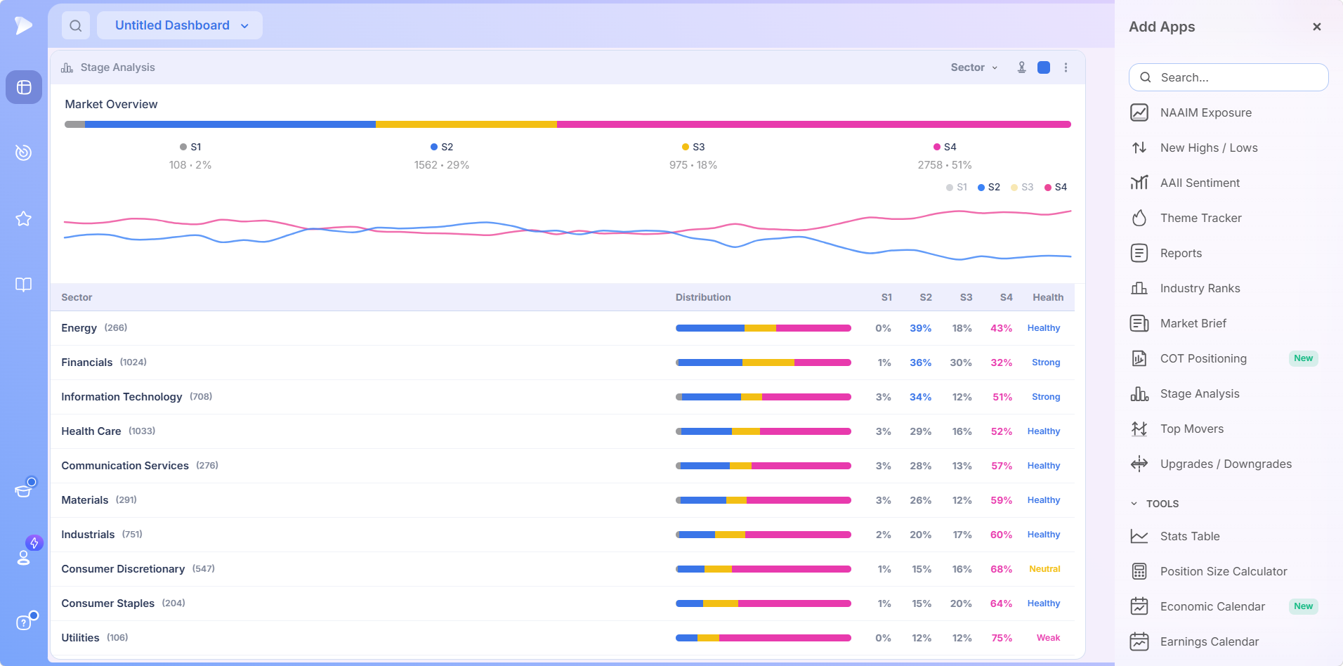
The captures below come from live sessions, so every count, percentage, and Health reading belongs to the day it was taken. Treat them as examples of the layout, not a description of current conditions.
The Market Overview Strip
A single horizontal bar divides the universe into its stages, each segment colored and labeled with two figures: the number of stocks in that stage and their share of the total.
Read on its own, that split is a blunt market health verdict. A large S2 share against a small S4 share means most stocks are advancing. When the two swap places, most are not, whatever an index level is doing.
Beneath the bar, a line chart tracks the stage shares over time, with a legend marking which stages are plotted. It shows whether today’s split is an improvement or a deterioration, and the direction of travel matters more than any single reading.
The Distribution Table
Below the overview, every classification gets a row with four elements:
- •The name and stock count, with the number of companies shown in brackets.
- •The Distribution bar, a miniature Market Overview strip for that classification alone.
- •One column per stage, S1 through S4, each showing that classification’s share, with the heavier readings picked out in their stage color.
- •A Health reading, a one word summary of overall condition, such as Strong, Healthy, Neutral, or Weak.
The Distribution bar is the fastest thing on the row to read. Segments run in the same order on every classification, so you can scan the column vertically and spot odd shapes without reading a percentage. Blue dominant rows are advancing; long pink rows are not.
Do not skim past S1. It tends to run in the low single digits, which means very little is basing. A thin basing share means a thin supply of stocks preparing for a fresh advance, context no individual chart hands you.
In every capture here the table is ordered by S2 share, highest first, so the classifications holding the most Stage 2 stocks come up top.
Open a Deepvue account and check which sectors are carrying the most Stage 2 stocks today.
Four Levels of Detail: Sector, Group, Industry, and Sub Industry
The dropdown in the header switches the table between four levels of classification. The table redraws, but the columns and logic stay identical, so there is nothing new to learn as you go deeper.
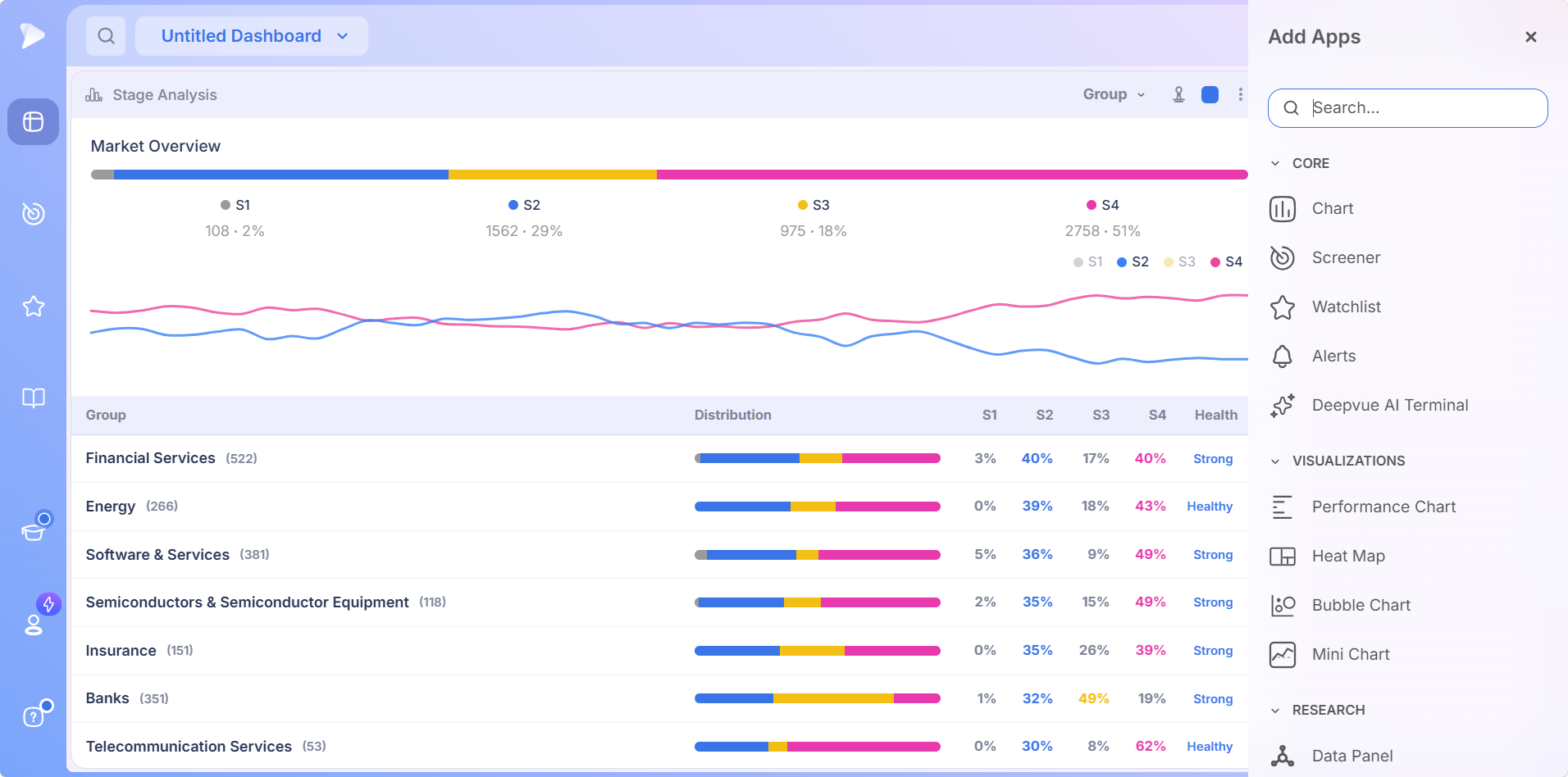
Group Level
The first step down from sectors, and where sector averages start to split apart. A group can post a strong S2 share alongside a heavy S3 reading, the kind of topping pressure a sector view smooths away. Large groups with more declining than advancing members are a very different proposition from the leaders at the top.
Industry Level
Narrower still, and where readings get emphatic. Small industries can post 50 percent or higher on a handful of constituents, and a figure resting on three stocks is not a movement. The same reading across dozens of companies is.
Read the S3 column rather than skipping straight to S2. A classification can look healthy on its advancing share and still carry a topping problem underneath.
Why Some Classifications Look Identical at Two Levels
Switch levels and some rows carry exactly the same figures in both. Energy reads identically at sector and group level, and Life Sciences Tools & Services reads identically at industry and sub industry level.
Nothing is wrong. The GICS hierarchy simply does not subdivide that classification at the next level, so the same companies are described twice under the same name. Spotting it stops you mistaking one reading seen twice for confirmation.
The reverse trap matters too. Financial Services appears at group level and again at industry level, covering far more companies as a group than as an industry, with readings that differ accordingly. Same words, different scope, so check the count in brackets before comparing.
Sub Industry Level
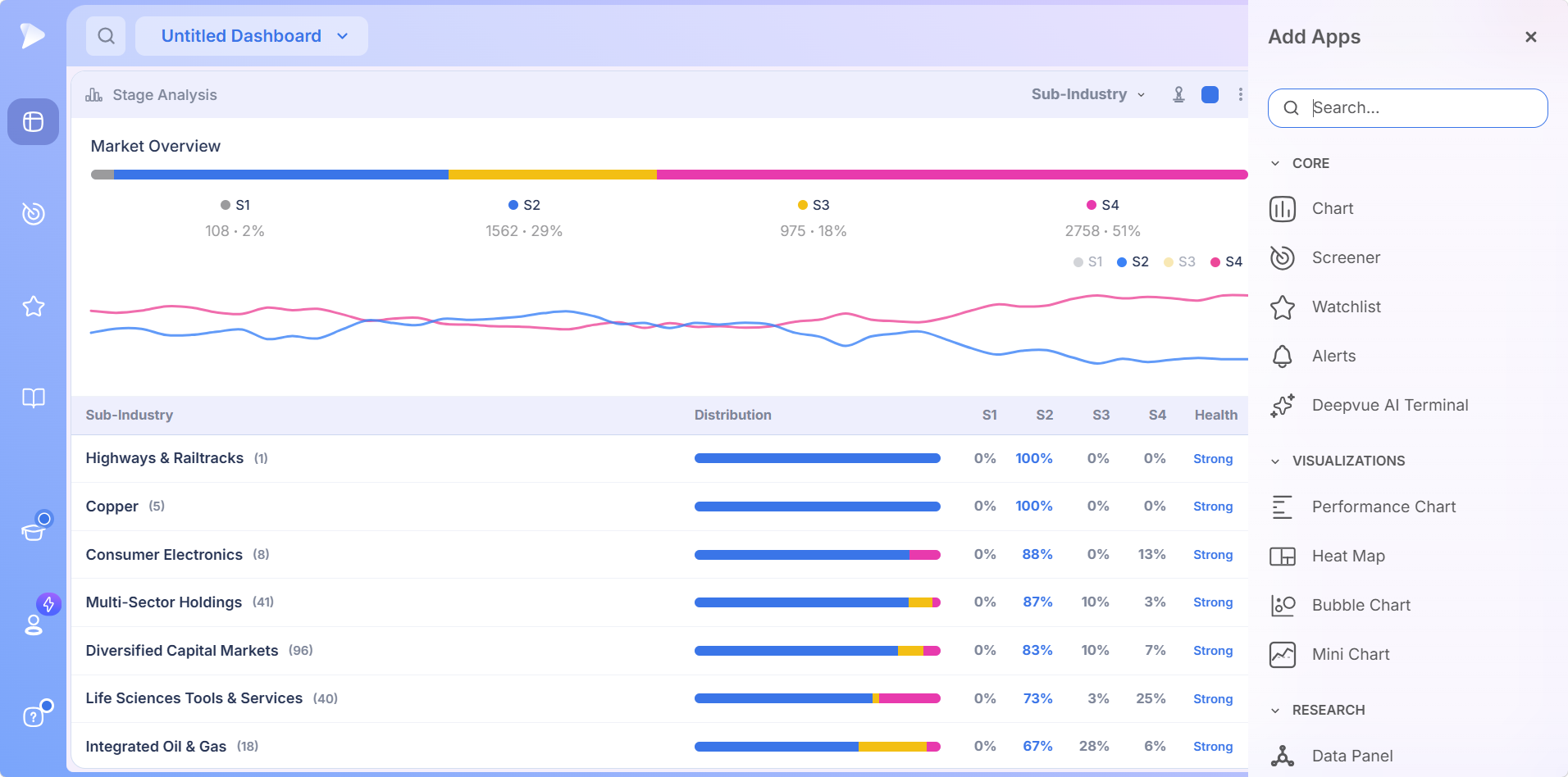
The finest setting, and the one that separates what the levels above blur together. Gold, Silver, and Copper each get their own row rather than being folded into a metals grouping, and their readings can differ sharply.
Two cautions belong with this level:
- •Classifications get very small. Some hold a single company, so a 100 percent reading can rest on one stock.
- •The constituent count matters more the deeper you go, which is why it appears beside every name in brackets.
The Stage Filter and Display Controls
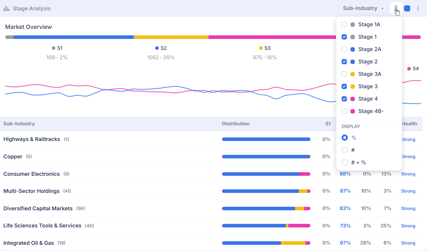
The icon beside the level selector opens a panel with two sets of controls. Together they change what the table counts and how it presents the answer.
Eight Stage Options
The panel lists eight stages as checkboxes, each with a colored dot:
| Color | Stages |
|---|---|
| Gray | Stage 1A and Stage 1 |
| Blue | Stage 2A and Stage 2 |
| Yellow | Stage 3A and Stage 3 |
| Pink | Stage 4 and Stage 4B- |
Each substage shares the color of its main stage, which is how the interface signals they belong together. By default Stage 1, 2, 3, and 4 are ticked and the four substages are not, which is why the table shows four columns rather than eight.
Toggling options changes what the percentages describe. The practical use is isolation: leave Stage 2 selected, clear the rest, and every figure becomes a straight answer to how much of each classification is advancing.
Three Display Modes
| Mode | What you see | When it helps |
|---|---|---|
| % | The share of the classification in each stage. This is the default | Comparing classifications of very different sizes |
| # | The raw count of stocks in each stage | Judging how many companies are behind a percentage |
| # + % | Both figures together | Seeing proportion and scale in one pass |
Counts mode is worth using more than people expect. A percentage flatters small classifications and understates large ones: 100 percent of three stocks and 70 percent of a hundred look alike in a percentage column and are nothing alike in reality.
Opening a Classification
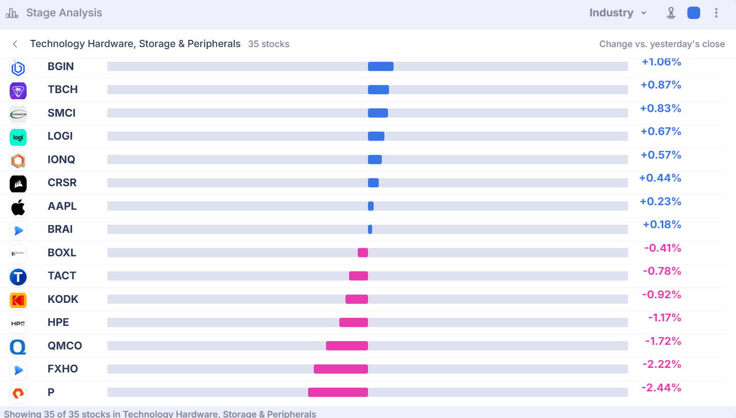
Selecting a row swaps the table for that classification’s members. Each is drawn as a bar showing its move against yesterday’s close, strongest at the top, with gains extending right in blue and losses left in pink.
Above the list are the classification name, its company count, a label confirming what the bars measure, and an arrow that steps you back out. A footer states how many of the classification’s stocks are listed, so you know when a large sector has been cut short.
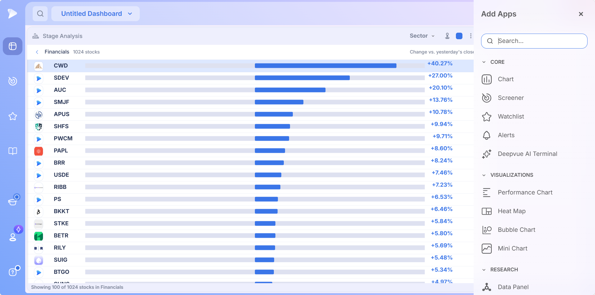
This is the step that connects a statistic to a decision. A sector with a high Stage 2 share is a reason to look; the constituent list shows which names produce that reading and whether any are set up. The drill down works from every level, not just sectors.
Act on a Stock Without Leaving the App
Click the plus button beside any constituent for a quick menu, so a name that stands out inside a strong Stage 2 group goes straight into a watchlist in two clicks.
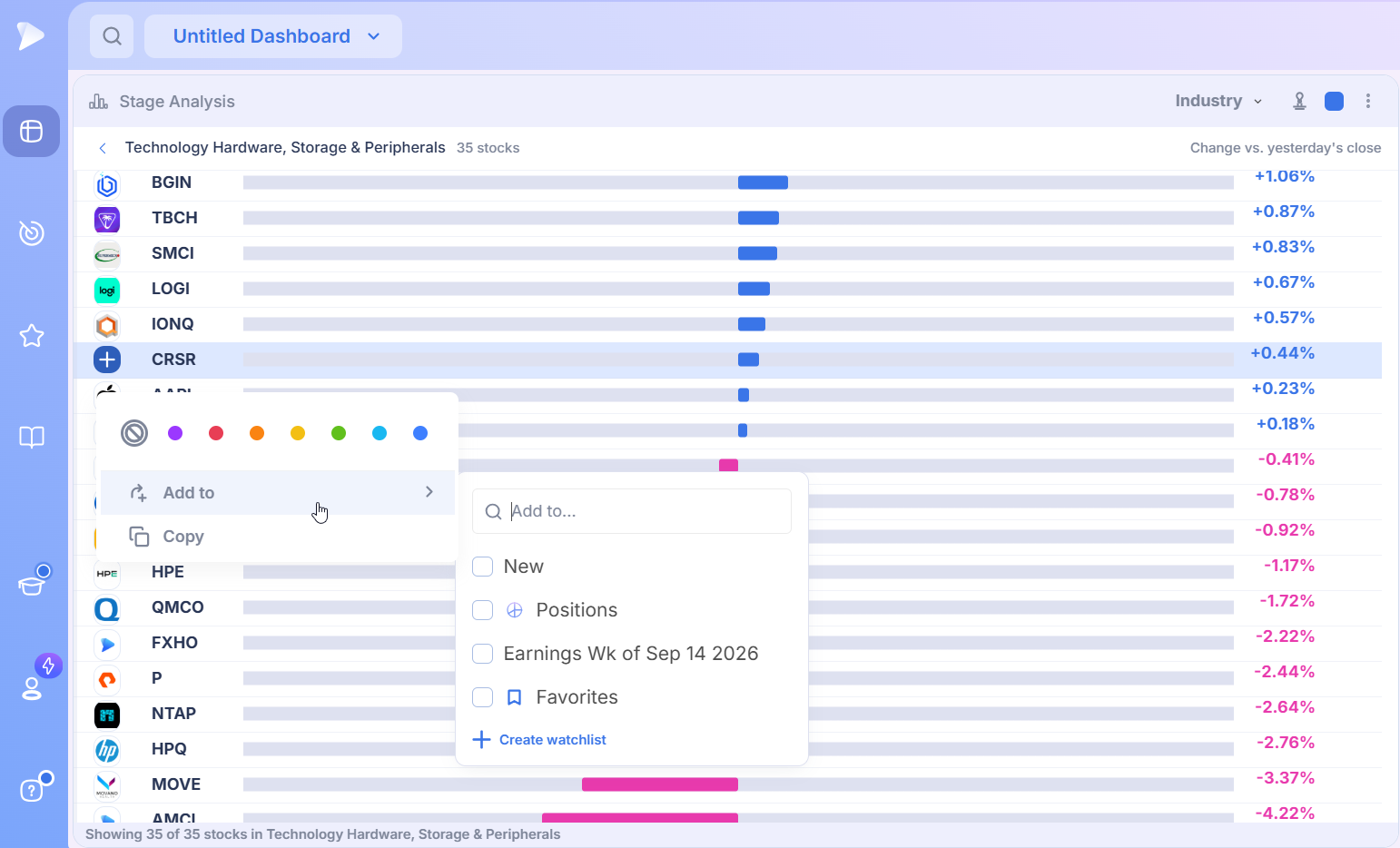
- •Color tags along the top, plus a clear option, so you can flag a ticker in your own color scheme.
- •Add to, which brings up yourwatchlists with a search box and a shortcut for creating a new one.
- •Copy, for grabbing the ticker to paste elsewhere.
Adding Stage Analysis to a Dashboard
Go to the Dashboard module from the left sidebar, then create a new dashboard or open an existing one.
Open the app menu with Add Apps and scroll to Research, where Stage Analysis is filed with the other market context apps.
Click it to add it and size it generously, because every row carries a name, a count, a Distribution bar, four stage columns, and a Health reading.
Set the color square in the header if you want the app grouped with a chart or another app on the same dashboard.
It arrives populated, with nothing to configure, which is why it earns a permanent slot on a market overview dashboard.
Join Deepvue and put a market overview dashboard together in under a minute.
How to Use Stage Analysis in a Routine
Four ways to put stock trading stage analysis to work beyond simply looking at the table.
Read the Overview First, Every Time
Start with the Market Overview split. The S2 share against the S4 share is a quick verdict on how hospitable the market is to buying advancing stocks. If more of the universe is declining than advancing, the case for pressing size weakens no matter how good the chart looks. That one check can save a run of small losses.
Work Down the Levels
Start at sector level and note the two or three with the highest S2 share and lowest S4 share.
Switch to group, then industry, and see whether those sectors stay strong as classifications narrow. Strength that survives the descent is real; strength that dissolves was an average.
Check the constituent count beside anything that looks exceptional at industry or sub industry level.
Open the best candidates and read the constituent list.
Use the Filter to Ask One Question at a Time
Clear every stage except Stage 2 and the table becomes a pure scan for Stage 2 stocks. Clear everything except Stage 4 and it shows which corners of the market to leave alone. Add the substages back for a finer breakdown, and switch to counts whenever a percentage looks too good for the classification behind it.
Cross Check Against the Other Rotation Tools
Stage Analysis answers a question the other market context apps do not:
- •Industry Ranks tells you which classifications are performing best relative to the others.
- •TheTheme Tracker tells you which curated themes are leading.
- •Stage Analysis tells you what condition the underlying stocks are actually in.
When a classification ranks well and also holds a Stage 2 majority, performance and structure point the same way, which carries more weight than either alone.
A Weekly Routine Worth Keeping
Stages change slowly by design, so this app rewards a weekly cadence more than a daily one. Five steps, ten minutes.
Note the Market Overview split and compare it with last week’s. Direction of travel matters more than the absolute figures.
Scan sector level for classifications where the S2 share has grown.
Drop to industry level inside those sectors and find the pockets driving the improvement.
Switch the display to counts and confirm the readings rest on a meaningful number of companies.
Open the strongest classifications and move anything constructive into a watchlist for the week ahead.
Then check your holdings from the other direction. A position whose classification has a climbing S4 share is in a deteriorating environment, even if its chart has not broken yet.
What Makes This Version of Stage Analysis Useful
Stock trading stage analysis is decades old and open to anyone willing to read charts carefully. What this app adds is scale and aggregation:
- ✓Stages are assigned automatically, so no manual classification is needed before you can use them.
- ✓Readings are aggregated by classification, turning a per stock method into a market wide scan.
- ✓Four levels from one control, from broad sectors down to narrow sub industries.
- ✓Eight stage options including substages, so you isolate exactly what you want to measure.
- ✓Percentages, counts, or both, so small classifications cannot mislead you.
- ✓Every row opens into its constituents, and every constituent can be tagged or saved to a watchlist.
No platform is right for everyone, and the honest way to decide is a proper comparison. OurDeepvue comparisons hub sets Deepvue against MarketSurge, TradingView, TC2000, TrendSpider, and Finviz feature by feature, and thecompare category collects every comparison article in one place.
Where Stage Analysis Stops
- •It reports condition, not setups. Whether any single name is worth buying is settled on its chart.
- •Stages shift slowly by design, which makes this a context and positioning tool rather than a timing one.
- •Classifications follow the GICS hierarchy, so you cannot define your own grouping here.
- •US listings only, with no advice offered and no order routing anywhere on the platform.
What Traders Say About Deepvue
What reviewers say about the platform behind this app, in their own words.
“The interface is very well thought out and highly customizable.”
From u/NeosDemocritus on r/CANSLIM. Open the thread
“Great team. Great product. Scanning and charts are great.”
u/patentgrinder, same r/CANSLIM discussion. Read it here
“Deepvue feels extremely well tailored to momentum trading and CANSLIM investing.”
G2, verified reviewer, financial services, five stars. Read the G2 review
“Swipe mode for going through charts makes it great when on the go.”
Linutor, reviewing the iPad app. App Store listing
Deepvue’s ownreviews wall averages 4.8 across more than 220 verified reviews, and 97 percent of those reviewers would recommend it.
Where Stage Analysis Connects
The app tells you which parts of the market are in good condition. These are the tools that turn that into positions.
- •Screener for filtering a healthy classification down to names that meet your criteria, with formation scans underscreener by pattern and signal scans underscreener by indicator.
- •Charts for judging individual setups once a classification has your attention, andwatchlists for holding the names that survive that review.
- •TheHeat Map for today’s moves as a treemap instead of a table.
- •TheAI Terminal for asking what is behind a shift in a classification.
Every prebuilt approach is indexed in thestock screener by strategy pages, theUltimate Screening Guide covers which one suits current conditions, and theKnowledge Base has module by module reference.
What Stage Analysis Costs
Stage Analysis is included in Deepvue’s single plan at $49 per month, with monthly and annual options. Nothing described here is gated, because there is no higher tier to move up to.
That one plan covers:
- •The screener and its 1,152 data points.
- •Charts, watchlists, and alerts, all of them unrestricted.
- •Fully customizable dashboards, with every app in the catalog.
- •The Theme Tracker, Market Brief, and AI Terminal, the last with unbounded usage.
Deepvue has one plan, so there are no tiers to compare. For reference, MarketSurge, the legacy platform in this niche, runs $149 per month.
New subscribers also get a one on one onboarding session with a Deepvue team member, an onboarding email series covering platform features and use cases, and weekly live webinars that each go deep on one part of the platform.
Stop Guessing at the Condition of a Group
Stage analysis for stock trading has always been sound as a method and slow as a practice, which is why so few people keep it up.
Assigning stages automatically and counting them by classification removes the slow part. What is left is what was valuable all along: a clear read on whether the group behind a chart is advancing or falling apart.
Sign up for Deepvue and make the stage split the first thing you look at each week.
↑ Back to contentsFrequently Asked Questions
Common questions about stage analysis and the app, answered from what the interface actually shows.
What is Deepvue’s Stage Analysis app?
Deepvue’s Stage Analysis app is a dashboard app that collects the market stage held by each stock and reports the totals by classification. It shows the share of any sector, group, industry, or sub industry in each stage, alongside a Market Overview covering the whole universe.
What are the four market stages?
The four market stages, in the framework popularized by Stan Weinstein, are Stage 1 basing after a decline, Stage 2 advancing, Stage 3 topping as the advance stalls, and Stage 4 declining. Each calls for a different response, and Deepvue assigns every stock its stage automatically.
What is a Stage 2 stock?
A Stage 2 stock is one in the advancing phase: trending higher, generally holding above its long term moving average, and under accumulation. Weinstein treats Stage 2 as where most buying should happen, which is why the Deepvue Stage Analysis table puts the highest S2 shares first.
What is a Stage 4 stock?
A Stage 4 stock is one in the declining phase: trending lower under distribution, below a falling long term moving average, with rallies being sold. Weinstein’s rule is to avoid Stage 4 on the long side, and Deepvue’s S4 column shows which groups hold the most of them.
What is the 30 week moving average in stage analysis?
The 30 week moving average in stage analysis is the long term trend line Weinstein built the method around, roughly a 150 day average on a daily chart. Price above a rising 30 week average points to Stage 2, and below a falling one to Stage 4. Deepvue assigns the stage automatically.
How do you identify a Stage 2 breakout?
You identify a Stage 2 breakout when price clears a Stage 1 base, holds above a 30 week moving average that has turned up, and volume expands on the advance. Deepvue assigns stages automatically, so Stage Analysis shows how many stocks in a group have already made that transition.
What is Stage 3 distribution in a stock?
Stage 3 distribution in a stock is the topping phase: after a Stage 2 advance, price churns sideways, the long term average flattens, and distribution begins. Stage 3 prints breakouts that look like Stage 2 ones and then fail, and Deepvue’s S3 column shows how much of a group has stalled.
How do you use Weinstein stage analysis?
You use Weinstein stage analysis by buying in Stage 2, avoiding Stage 4, preparing during Stage 1, and tightening risk in Stage 3. Deepvue’s Stage Analysis app scales that up by counting stages across classifications, so you find the groups where advancing stocks concentrate before picking names.
How is stage analysis different from technical analysis?
Stage analysis is different from technical analysis because it is one specific framework within it. Rather than forecasting a target, it classifies which phase of a repeating cycle a stock is in so you know which stance fits. Deepvue extends it from single charts to whole classifications.
How many stage options does the filter offer?
The Stage Analysis filter offers eight stage options: Stage 1A, Stage 1, Stage 2A, Stage 2, Stage 3A, Stage 3, Stage 4, and Stage 4B-. Each substage shares its main stage’s color. By default the four main stages are selected, which is why the table shows four stage columns.
Can I see counts instead of percentages?
Yes, you can see counts instead of percentages in Deepvue’s Stage Analysis app. The Display control in the stage filter panel offers three modes: percentage, count, or both together. Counts reveal how many companies actually stand behind a striking percentage.
What levels of classification does it cover?
Deepvue’s Stage Analysis app covers four levels of classification: Sector, Group, Industry, and Sub Industry, selected from the dropdown in the header. The columns and the logic stay the same at every level; only the granularity changes.
What does the Health column show?
The Health column shows a one word summary of a classification’s overall stage condition at the end of each row. Readings seen in Deepvue’s Stage Analysis app include Strong, Healthy, Neutral, and Weak.
Can I get from a classification to the individual stocks?
Yes, you can get from a classification to its individual stocks in one click. Selecting a row in Deepvue’s Stage Analysis app swaps the table for its members, each shown as a bar for its move against yesterday’s close, with an arrow to step back out. It works from all four levels.
Can I add a stock from Stage Analysis to a watchlist?
Yes, you can add a stock from Stage Analysis to a watchlist without leaving the app. Click the plus button beside any constituent, choose Add to, and pick one of your Deepvue watchlists or create a new one. The same menu also offers color tags and Copy.
Why is the company count beside each name so important?
The company count beside each name is important because percentages behave very differently at different sizes. A 100 percent reading across three companies describes three stocks, while 70 percent across a hundred describes a genuine pattern. Deepvue shows the count beside every classification for that reason.
How is this different from Industry Ranks?
Stage Analysis is different from Industry Ranks because it measures condition rather than performance. Industry Ranks tells you where a classification ranks against every other; Stage Analysis tells you what share of its members are basing, advancing, topping, or declining. In Deepvue, agreement between the two beats either alone.
Is it suitable for day trading?
No, Deepvue’s Stage Analysis app is not built for day trading. Stages are structural and shift slowly, which makes it a context and positioning tool rather than a timing one, designed for holding periods measured in weeks and months.
Is Stage Analysis included in the standard Deepvue plan?
Yes, Stage Analysis is included in the standard Deepvue plan. Deepvue has a single plan at $49 per month that covers Stage Analysis along with the screener, charts, watchlists, alerts, dashboards, the Theme Tracker, the Market Brief, and the AI Terminal.