Deepvue Data Panel: The Numbers You Care About, Beside Your Chart
The Data Panel is a dashboard app in Deepvue that shows the figures you choose for the stock in focus, grouped into named category cards. Earnings trend, relative strength, group rank, fund sponsorship: whatever your method checks stays in view next to the chart.
A new panel opens with five categories, draws on all 1,152 Deepvue data points in ten searchable categories, and switches between your saved layouts and a preset library built by named traders.
and the numbers behind every chart you open load right beside it.
The Deepvue data panel, in numbers:
Key Takeaways
A chart tells you what a stock has done. It does not tell you whether earnings are accelerating, whether funds are adding shares, or where the industry ranks this quarter. On most platforms those answers are one tab away, and a tab you have to switch to is a tab you eventually stop checking. That is how breakouts get bought in companies going nowhere.
The Deepvue data panel keeps those figures on screen and follows whatever symbol the dashboard is on. You pick the rows, you name the categories, and the checklist you trade by is the one in front of you.
- ✓Five cards out of the box: company info, price and volume, momentum, earnings and sales, and fund and insider ownership.
- ✓1,152 data points in ten searchable categories behind the Add Data Point window, from General and Earnings through Technicals, Proprietary Ratings and Pre/Post Market.
- ✓Color that reads for you: blue for positive readings, pink for zero or negative ones, ticks and crosses for yes or no rows.
- ✓Thirteen presets in four collections, including panels credited to Mark Minervini, Oliver Kell, Ross Haber and Stan Weinstein, plus Richard Moglen dashboard layouts.
- ✓Panels follow the color group, so a chart, a list and several data panels can report on one symbol together.
- ✓Part of the standard subscription. Try the Data Panel in Deepvue.
Data Panel at a Glance
- Default layout
- Five category cards under the name User Panel, plus an Add Category button
- Data library
- All 1,152 Deepvue data points, in ten categories: General, Earnings, Sales, Sector & Industry, Fundamentals, Price & Volume, Technicals, Institutions & Insiders, Proprietary Ratings and Pre/Post Market
- Adding rows
- An Add Data Point window for each card, with search and a used against available count per category
- Custom categories
- Add Category opens a name field; every new card needs a name
- Color coding
- Blue for positive readings, pink for zero or negative ones, dark for neutral values, ticks and crosses for yes or no rows
- Expandable rows
- Sector, industry, rank and ownership rows carry a chevron; rank rows open into the full league table
- Presets
- Top Traders (7), Dashboard (4), Swing Trading and Sector / Industry Group Ranks
- Saved panels
- A searchable list of your own panels, with Create new and a Select checkbox
- Symbol source
- The color group square in the header, shared with a chart, screener or watchlist
- Where to find it
- Research group, via Add Apps
- Cost
- Included in the single $49 per month Deepvue plan
What Is the Deepvue Data Panel?
It is a stock data panel built as a stock data dashboard widget: a card listing the data points you choose for the symbol in focus, sorted into named categories. The point is proximity. Rather than a fundamentals page you visit, it is a compact block you keep in view alongside everything else on the board.
Deepvue also has a data tab inside the Screener and Watchlist modules, next to the chart for the selected row. The Data Panel is different: a standalone data panel dashboard app from the catalog that you add to any board and pair with charts, rankings and lists. Both read from the same data library, but the dashboard card is the one you build a screen around.
How It Differs From the Rest of the Research Group
The other Research apps describe the market: breadth, highs and lows, themes, rankings, news. The Data Panel describes one stock, which makes it their partner rather than a rival. Industry Ranks tells you which groups lead; the panel tells you where the name on your chart ranks inside its group.
Who the Data Panel Is For
Traders who want the fundamental and technical read at the same moment as the chart. Deepvue is built for holds lasting weeks to months, and every figure a panel carries serves that horizon.
- ✓Growth stock traders who will not buy a breakout without checking the earnings trend and fund sponsorship behind it.
- ✓Swing traders running a layout like the Swing Trading preset, with relative volume, range and pattern flags beside the chart. Deepvue for swing traders walks through the full routine.
- ✓Position traders tracking a holding’s six month group rank and whether funds keep adding to it.
- ✓CANSLIM traders who want EPS Rating, RS Rating, ownership and group rank in one block, close to the checklist the method was built on. The routine is mapped out in Deepvue for CANSLIM traders.
- ✓MarketSurge users who want their stock checklist next to a modern chart, arranged their own way.
- ✓Traders refining a process who learn by seeing how experienced operators lay out their numbers, which is exactly what the presets are.
What a Fresh Panel Shows
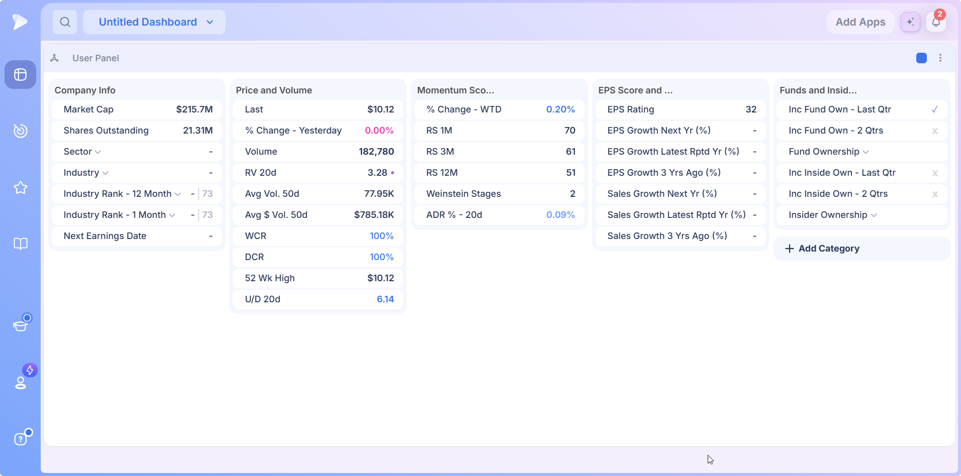
Add the app and it arrives as User Panel, already filled for whichever stock the dashboard is showing. At full width, five category cards line up side by side, each with a heading and a stack of labeled rows.
| Category | What the rows cover | Default rows |
|---|---|---|
| Company Info | Identity, classification, group rank and the earnings calendar | Market cap, shares outstanding, sector, industry, industry rank over 12 months and 1 month, next earnings date |
| Price and Volume | Where price stands and how much is trading | Last price, change against yesterday, volume, 20 day relative volume, 50 day average volume and dollar volume, the WCR and DCR closing ranges, 52 week high, 20 day up down volume ratio |
| Momentum Scores | Relative strength and trend position | Week to date change, RS over 1, 3 and 12 months, the Weinstein stage, 20 day ADR percent |
| EPS Score and Sales | The earnings and revenue trend | EPS Rating; EPS growth for next year, the latest reported year and three years ago; the same three for sales |
| Funds and Insiders | Sponsorship and inside ownership | Whether fund ownership rose last quarter and over two quarters, the same pair for insiders, plus expandable Fund Ownership and Insider Ownership rows |
Rows are colored by what the reading implies, which is what makes a panel readable without actually reading it:
- •Blue for a positive reading, such as a gain or a strong closing range.
- •Pink for a reading at zero or below, such as a flat or falling day.
- •Dark for neutral values like market cap, volume and the rating scores.
- •A tick or a cross for yes or no rows, which is how the ownership rows read at a glance.
The DCR and WCR rows are the daily and weekly closing ranges: where the close landed inside the day’s or the week’s high to low range. A close near the top is a different day from a close near the bottom, even when the percentage change is identical.
Rows That Open Into More
Some rows are more than a value. Sector, Industry, both industry rank rows, Fund Ownership and Insider Ownership each carry a chevron beside the label.
The rank rows are the most useful of them. Click one and it unfolds into the whole league table: every industry by name, its rank and how many stocks it holds, with the selected stock’s own industry highlighted. Sector, group and sub industry ranks work the same way on any horizon.
Even collapsed, a rank row reads as a position and a total, so the context arrives before you expand anything. Third of 73 industries is genuine leadership. Third of 11 sectors is a much blunter read, and the same number means something very different.
Try Deepvue and see where your own holdings rank inside their groups.
Adding Data Points and Categories
The default layout is a starting point, not a limit. Every category card takes new rows through its own Add Data Point window, titled for the card it feeds, so extending Company Info opens Add Data Point to Company Info.
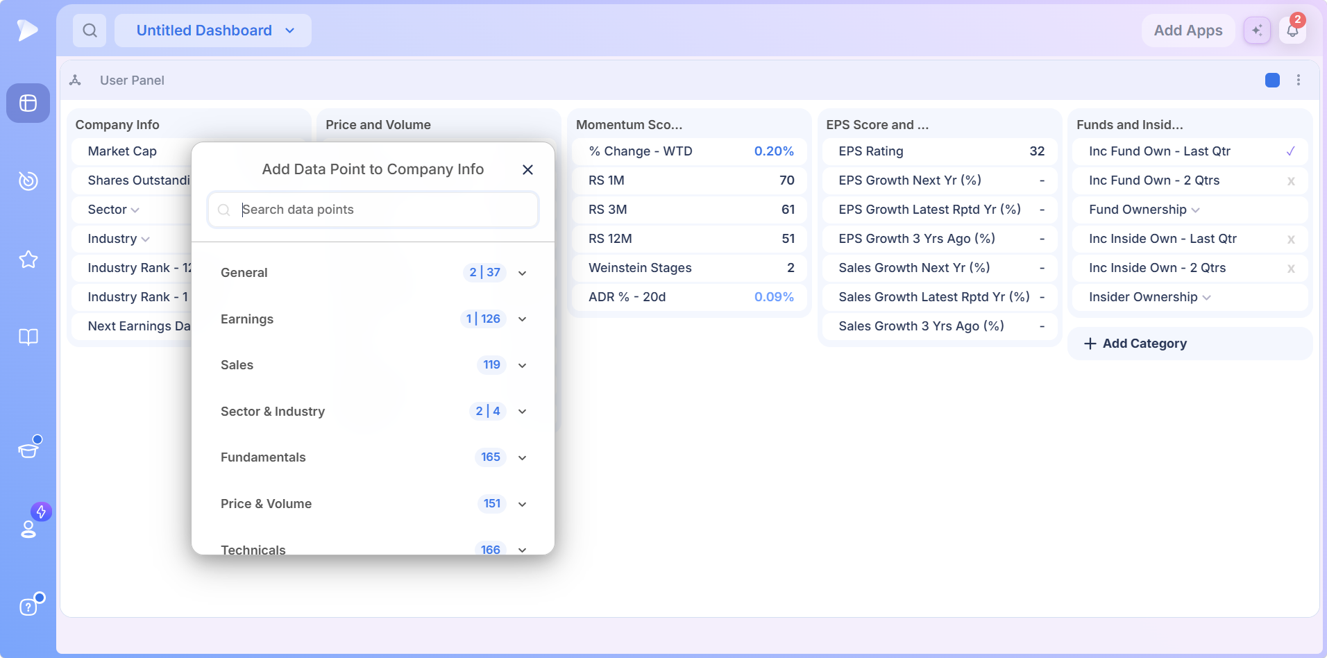
The badge beside each category does two jobs. When the card already uses data points from that category, it shows two figures, the rows in use and the total the category holds. When nothing from the category is in the card yet, only the total appears. One look tells you where a card draws its figures from.
Know the figure you want? Type it into Search data points instead of opening categories one by one. Scroll the list and the rest of the library comes into view.
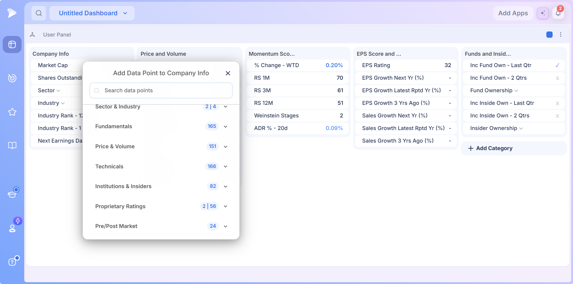
- •General: company basics such as market cap and shares outstanding.
- •Earnings: EPS figures, growth rates and the next report date.
- •Sales: revenue figures and growth.
- •Sector & Industry: how the company is classified.
- •Fundamentals: company financials beyond the earnings and sales lines.
- •Price & Volume: price, volume, averages and range figures.
- •Technicals: chart based measures of trend and volatility.
- •Institutions & Insiders: fund and insider ownership and how it is changing.
- •Proprietary Ratings: Deepvue’s own scores, including RS Rating, EPS Rating, Composite Rating and group ranks.
- •Pre/Post Market: extended hours figures for early and late session moves.
Adding a Category of Your Own
Click Add Category at the end of the row and it turns into a name field. Every card needs a name; leave the field blank and the panel flags that a category name cannot be empty. Once named, the new card fills the same way as the defaults, through its Add Data Point window.
A card can mix categories freely, which is how the default Company Info card combines classification, ratings and an earnings date. Build each card around a question rather than a data type. A card called Before I Buy, holding EPS growth, RS, fund ownership and group rank, gets read on every name. A card called Technicals with thirty rows does not.
Open Deepvue and build a card around the four numbers you check before every entry.
The Panel Selector and the Data Panel Presets Library
Click the panel name in the header and a selector opens with two tabs: Saved Data Panels and Data Panels Presets. The presets tab holds the data panel presets library, searchable from a box at the top and grouped into four entries. Top Traders and Dashboard show a count and open into submenus; Swing Trading and Sector / Industry Group Ranks load directly.
Top Traders
These are trader data panels in the literal sense: each is the set of figures a named trader keeps next to a chart. Loading one shows what a trader whose method you follow actually watches before acting.
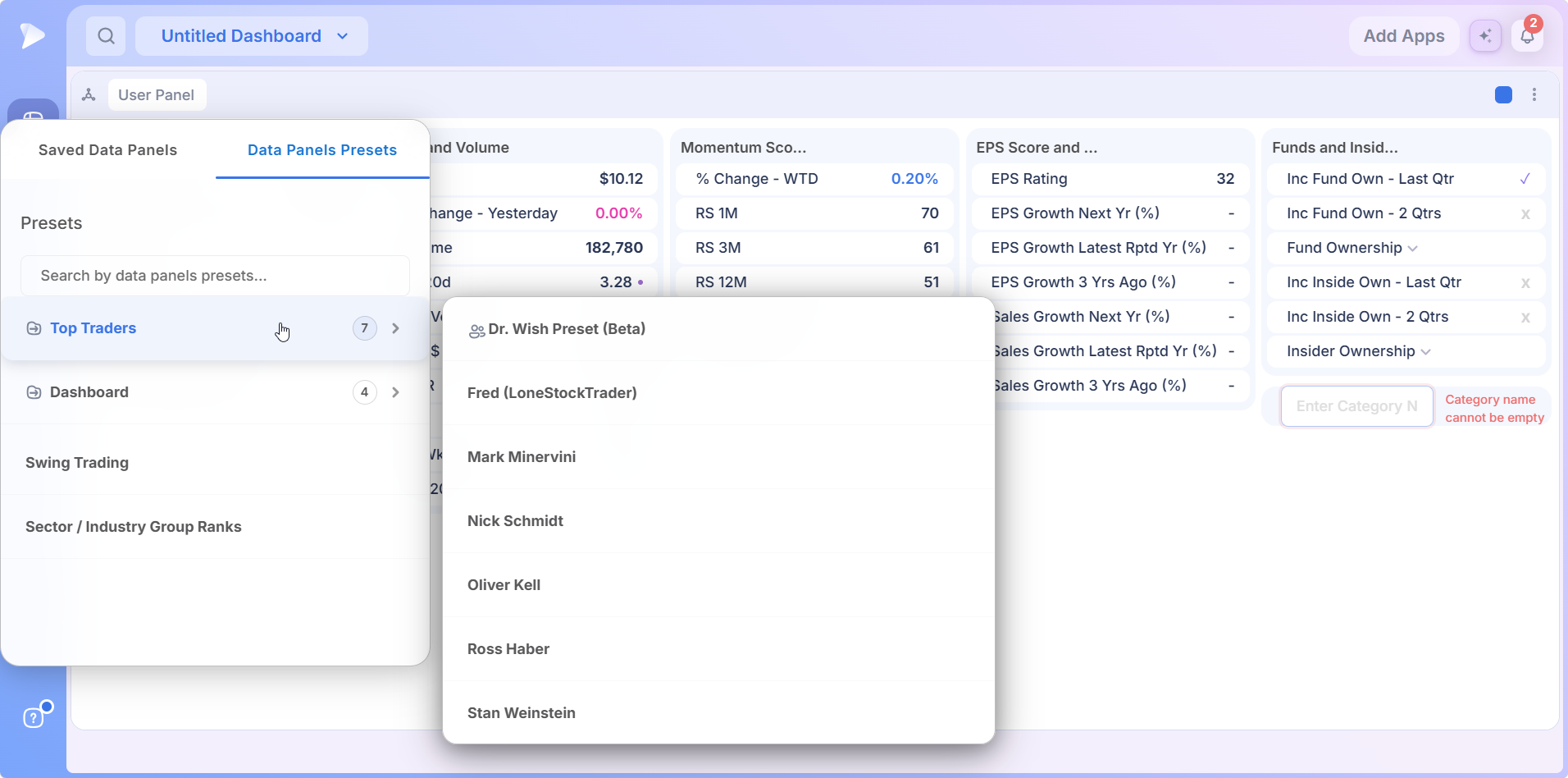
Take the Mark Minervini panel. It opens with a Quickscope category built around liquidity and range: dollar volume and its 20 day average, ATR and ADR percent, relative volume, the up down ratio, and accumulation, liquidity and volatility ratings. A Ratings card follows with composite and relative strength scores, then a Fundamentals card. It is a compact expression of a method that starts by asking whether a stock is tradeable at all.
Dashboard
Four panels built for dashboard use: three Richard Moglen layouts and one called Up on Volume DP.
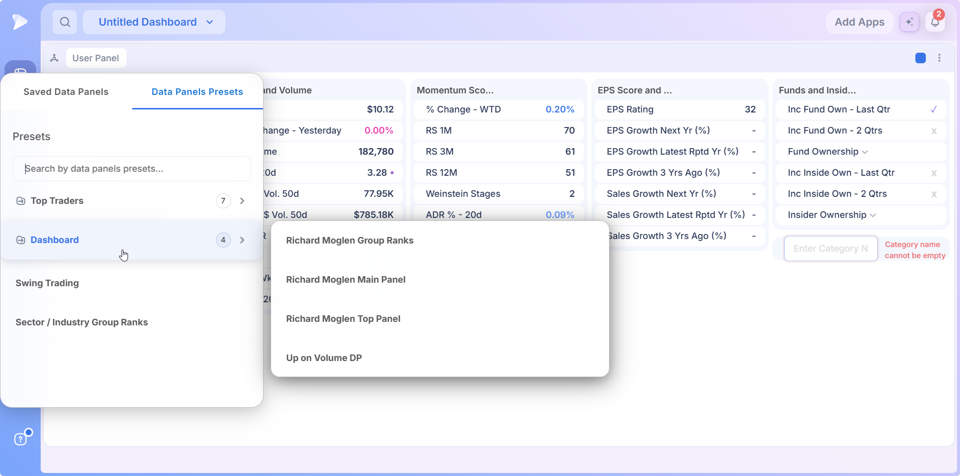
- •Richard Moglen Group Ranks leads with the industry rank already expanded, so the group’s standing is the first thing you read. Short interest, range and volume follow, then relative strength across four horizons with the Weinstein stage, earnings and sales with days to cover, and fund ownership with its quarterly growth.
- •Up on Volume DP is the opposite in scale: a Symbol card, a Price and Volume card with price against the 10 week average, relative volume and distance from the 52 week high, and a Group card with the rank. It confirms a volume signal fast rather than studying a company.
Swing Trading
Swing Trading and Sector / Industry Group Ranks carry no submenu, so a single click loads either one. Hovering an entry brings up a three dot menu beside it.
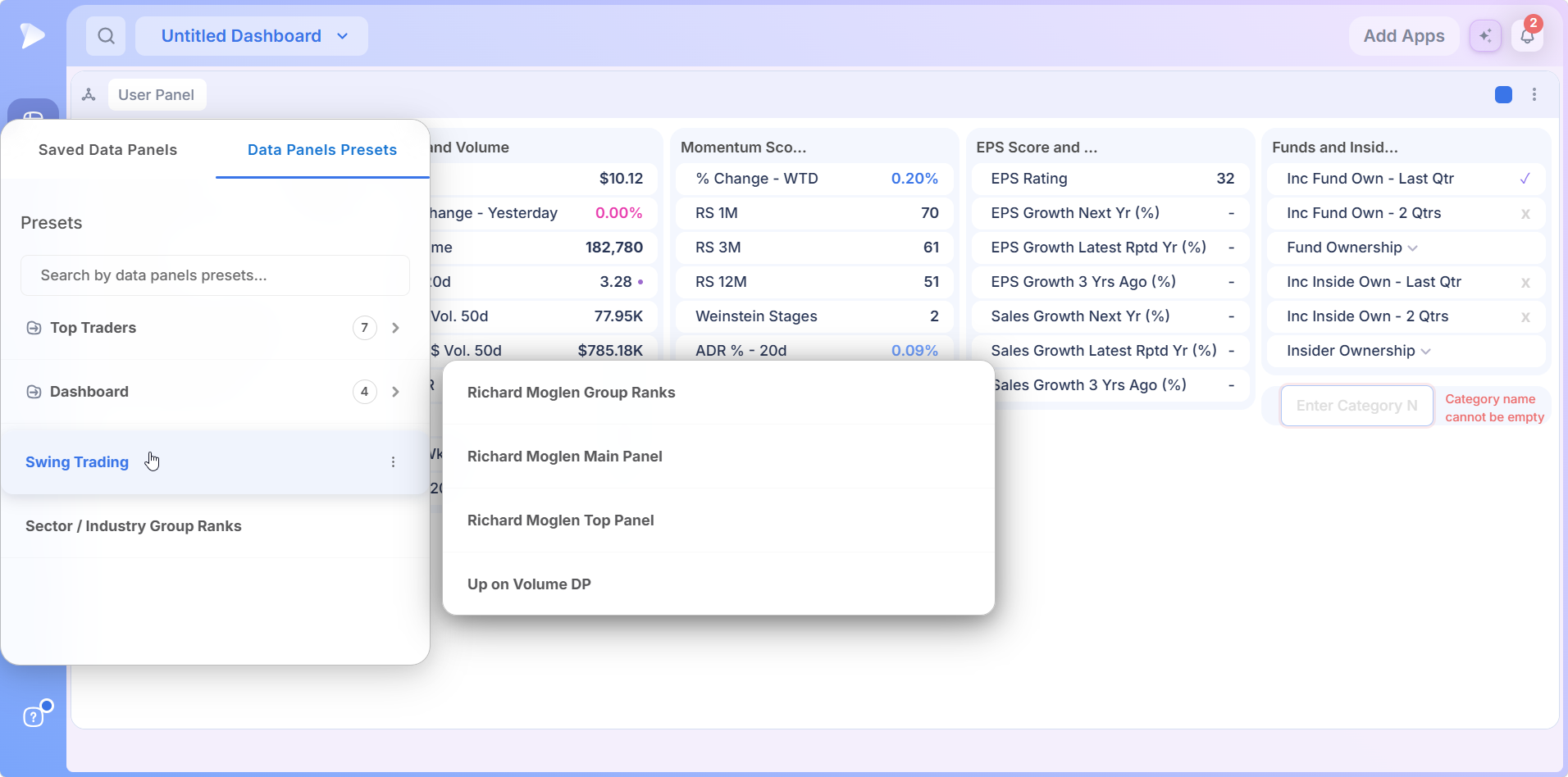
The Swing Trading panel is organized for a shorter holding period and adds a category the default does not carry. Its four cards:
- •Company Information: identity, IPO date, next earnings, market cap and float.
- •Price and Volume: change today, from the open and from the low, then range, volatility and volume measures.
- •Ratings and Trends: the Weinstein stage and RS scores, change since the last earnings report, price against the 21 day and 10 week averages, and a tick for whether the 10, 21 and 50 day averages are stacked in order.
- •Pattern Recognition: a tick or a cross for Launch Pad, Power of Three, Slingshot, Power Trend, Pocket Pivots, In the Wick, Wick Play, Open = High and Open = Low.
That last card is a full pattern read in one glance rather than nine separate checks.
Sector and Industry Group Ranks
The last of the data panel presets is nothing but rankings. Three columns carry the one, three and six month horizons, and each holds a sector, industry, group and sub industry rank, every one written as position and total and expandable into its league table.
Read across and the horizons check each other: an industry ranked first over three months and second over six is a leader that has held the job for a while. It is the Industry Ranks app seen from a single stock’s point of view, and one of the most popular trader data panels for group work.
Saved Panels and Custom Copies
The other tab belongs to you. Saved Data Panels lists every panel you keep, with a search field, a Create new button and a Select checkbox for choosing several at once. A check mark shows which panel is loaded right now.
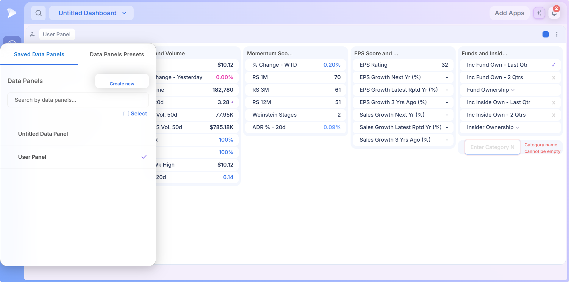
There are three routes to a custom data panel:
- •Create new starts another panel of your own, ready for categories and rows.
- •Save a Copy on any preset turns a library layout into an editable panel under Saved Data Panels, where you can rename and rework it.
- •Extend User Panel with Add Category and Add Data Point until it carries the figures your method depends on, and nothing else.
Start from the preset closest to how you trade and subtract before you add. A custom data panel of forty rows is a panel nobody reads; twelve rows that answer your actual checklist get read on every name.
Several Panels, One Symbol
Nothing limits you to one stock data dashboard widget. Run two Richard Moglen panels, the Minervini panel and Up on Volume DP on one board in the same color group, and all four report the same stock. Select a different name anywhere in that group and every panel redraws at once.
That is the reason to run several small panels rather than one giant one. Different presets ask different questions of the same stock, and three compact panels read a name from three angles without editing anything.
How to Add a Data Panel to a Dashboard
Open the Dashboard module and go to the board you want, new or existing.
Click Add Apps in the top right corner of the dashboard.
Pick Data Panel from the Research group. One click adds it, named User Panel, with its five default categories filled.
Set the color group from the square in the panel header so the card tracks your chart.
Load a layout by clicking the panel name: a preset, or one of your saved panels.
Start with Deepvue and load one of the trader data panels next to your chart on the first name you look at tomorrow.
Four Layouts Worth Building
Chart Plus Checklist
The simplest and most used layout for a data panel widget. A chart on one side, a panel on the other, same color group. Load the preset closest to your method, or your own copy of one, and every name you flip through gets its numbers alongside. A check that used to be a tab switch becomes an eye movement.
Screen, Chart, Panel
A screener result list, a chart and a panel across one dashboard in one group. Step down the results and both follow. For a first pass through a long screen, the Swing Trading preset’s pattern flags and range figures sort candidates from noise before you look at structure.
The Three Angle Read
A liquidity preset, a group rank preset and a fundamentals preset, all following the same chart. Each answers one question about the stock in focus, and together they give a fuller picture than any single data panel widget of forty rows.
Rank Panel Beside Industry Ranks
Put the Sector / Industry Group Ranks preset next to the Industry Ranks app. The app shows the whole market’s league table; the panel shows where the selected stock ranks in it across three horizons. When both agree the group is leading, the name has a tailwind, and Stage Analysis confirms the group’s condition from a third angle.
What Makes the Deepvue Data Panel Different
- ✓Your checklist, your layout: a custom data panel built from any of 1,152 data points, grouped into cards you name.
- ✓Trader built starting points, with presets credited to names like Minervini, Kell, Weinstein and Haber.
- ✓A data panel widget with rank context, written as position and total and expandable into the full league table.
- ✓Deepvue ratings built in, so RS Rating, EPS Rating and group ranks share a card with price and ownership.
- ✓A stock data dashboard widget linked to the board through color groups, so one new symbol updates every panel at once.
Every platform involves tradeoffs, and a side by side view is the fairest way to judge them. The Deepvue comparisons hub lines Deepvue up against MarketSurge, TradingView, TC2000, TrendSpider and Finviz, one feature at a time.
What Traders Say About Deepvue
Unedited words from people who use the platform.
“Amazing charting capabilities and key financial numbers in a clean, quick manner.”
A customer testimonial published on deepvue.com. See it on deepvue.com
“I believe DeepVue is purpose built for swing or position trading.”
u/DLightman1983, posting in r/swingtrading. Read the thread
“It’s powerful, simple, and SUPER clean/easy to navigate.”
A verified G2 user working in financial services. Read the G2 review
“Deepvue is the most economical and impressive trading platform I have used.”
An App Store reviewer, November 2024. Check the App Store reviews
More of the same on the Deepvue reviews wall, where over 220 verified reviews average 4.8 stars and 97 percent of reviewers recommend the platform.
Where the Data Panel Connects
- •Charts for the price structure behind the figures in your stock fundamentals panel, tied to it by color group.
- •Watchlists and the screener for the names the panel describes as you move through them.
- •The RS Rating and EPS Rating explainers for how the two proprietary scores anchoring most presets are built.
- •The AI Terminal for the story behind a number that surprises you.
- •The Performance Chart for ranking a whole universe on any single data point a panel shows.
What the Data Panel Costs
The data panel dashboard app is part of Deepvue’s single plan at $49 per month, with monthly and annual options. Every preset comes with it, and you can keep as many saved panels as your routine needs.
That one plan covers:
- •The screener and its 1,152 data points.
- •Charts, watchlists, and alerts, all of them unrestricted.
- •Fully customizable dashboards, with every app in the catalog.
- •The Theme Tracker, Market Brief, and AI Terminal, the last with unbounded usage.
Deepvue has one plan, so there are no tiers to compare. For reference, MarketSurge, the legacy platform in this niche, runs $149 per month.
New subscribers also get a one on one onboarding session with a Deepvue team member, an onboarding email series covering platform features and use cases, and weekly live webinars that each go deep on one part of the platform.
Keep the Numbers Where You Will Read Them
The figures that separate a good chart from a good trade already exist on the platform. What decides whether you check them is whether they are on screen when the chart is. A stock fundamentals panel next to the chart, laid out the way a trader you respect lays out theirs or the way your own checklist runs, is the difference between numbers you use and numbers you know about.
Get started with Deepvue today, put a Data Panel next to your chart, and let the checklist read itself.
↑ Back to contentsFrequently Asked Questions
Answers to what traders ask before building a routine around the card.
What is a data panel in stock trading?
A data panel in stock trading is a block of figures, such as earnings growth, relative strength and ownership, that displays for whichever stock you are viewing. In Deepvue, the Data Panel is a dashboard app that keeps those figures beside your chart and updates every time you change symbol.
What should a stock data panel include?
A stock data panel should include whatever you would check by hand before buying. For most growth traders that means the earnings and sales trend, relative strength, fund and insider ownership, the industry or group rank, and enough price and volume detail to judge liquidity. Deepvue’s default panel covers all five.
How do I see a stock’s fundamentals while looking at the chart?
You see a stock’s fundamentals while looking at the chart by adding a Deepvue Data Panel to the same dashboard and giving both the same color group square. The panel then reports on whichever symbol the chart shows, working as a stock fundamentals panel that stays in step with price.
What is the Deepvue Data Panel app?
The Deepvue Data Panel app is a dashboard card that displays a chosen set of data points for whichever stock is selected, grouped into named categories. It ships with a five category default layout and a library of 13 presets, and it follows a chart or list through the dashboard color group.
Is the Deepvue Data Panel the same as the data tab in the Screener?
No, the Deepvue Data Panel is not the same as the data tab in the Screener. The Screener and Watchlist modules show a data tab beside their charts, while the Data Panel is a standalone card from the dashboard catalog that you add to any board. Both draw on the same data library.
What does a new Data Panel show by default?
A new Data Panel shows five categories by default, under the name User Panel: Company Info, Price and Volume, Momentum Scores, EPS Score and Sales, and Funds and Insiders. Deepvue adds an Add Category button at the end of the row so you can extend it straight away.
How do I add a data point to a Data Panel?
You add a data point to a Data Panel through the Add Data Point window for the category card you want to extend. In Deepvue the window offers a search field across all 1,152 data points plus ten data categories, from General and Earnings to Proprietary Ratings and Pre/Post Market, each opening with a chevron.
What do the numbers beside each data category mean?
The numbers beside each data category show how much of that category a card already uses. In the Deepvue Add Data Point window, a badge with two figures gives the data points in use and the total available, while a single figure means nothing from that category is in the card yet.
How do I add a new category to a Data Panel?
You add a new category to a Data Panel with the Add Category button at the end of the row. Deepvue asks for a category name first and will not accept an empty one. Once named, the new card fills through its own Add Data Point window, like the defaults.
Which data panel presets are available?
Deepvue offers 13 data panel presets in four collections: Top Traders, credited to Dr. Wish (beta), Fred of LoneStockTrader, Mark Minervini, Nick Schmidt, Oliver Kell, Ross Haber and Stan Weinstein; Dashboard, with three Richard Moglen panels and Up on Volume DP; Swing Trading; and Sector / Industry Group Ranks.
Can I edit a preset?
Yes, you can edit a preset by saving a copy of it. Each Deepvue preset carries a Save a Copy button, and the copy appears under Saved Data Panels, where you can rename it, rework its rows and add categories without touching the original.
Can I build my own stock data panel?
Yes, you can build your own stock data panel in Deepvue three ways: click Create new on the Saved Data Panels tab, extend the default User Panel with Add Category and Add Data Point, or copy the preset closest to how you trade and edit it.
What do the RS Rating and EPS Rating mean?
The RS Rating and EPS Rating are Deepvue proprietary scores on a 1 to 99 scale. The RS Rating measures price performance against the whole market, where 99 means outperforming 99 percent of stocks; the EPS Rating scores earnings strength the same way. Most Data Panel presets carry both.
What is an industry rank and why does it matter?
An industry rank is where a stock’s industry places against every other industry over a given horizon, and it matters because leadership clusters. Deepvue ranks 73 industries, and a strong stock in a top ranked one has a tailwind that the same chart in a lagging industry lacks.
Why does fund and insider ownership matter?
Fund and insider ownership matters because rising fund ownership shows institutions building positions, the steady accumulation that often comes before a sustained move, while insider buying shows the people closest to the business backing it. The Deepvue Data Panel flags both with a tick or a cross.
What do the DCR and WCR closing range values mean?
The DCR and WCR closing range values mean where the close landed inside the daily and weekly high to low range. A close near the top is stronger than one near the bottom even at the same percentage change, because buyers held control into the bell. The Deepvue Data Panel shows both by default.
What happens when I click a rank row?
When you click a rank row, it expands into the full league table for that classification level. The Deepvue Data Panel lists every group by name with its rank and stock count and highlights the selected stock’s own group, so a single rank becomes a comparison.
What do the blue and pink numbers mean?
The blue and pink numbers in a Deepvue Data Panel mean positive and non positive readings. Blue marks a gain or other positive value, pink marks a value at zero or below, neutral values such as market cap and volume stay dark, and yes or no rows show a tick or a cross.
Can I run more than one Data Panel on a dashboard?
Yes, you can run more than one Data Panel on a Deepvue dashboard. Each keeps its own layout, and any panels sharing a color group report the same stock at the same time, so several presets can describe one name from different angles.
How does the Data Panel know which stock to show?
The Data Panel knows which stock to show through the Deepvue dashboard color group. Give the panel the same colored square as a chart, screener or watchlist on the board, and it displays whichever symbol is selected there.
Does the Data Panel show charts?
No, the Data Panel does not show charts. It shows figures, flags and expandable tables, and in Deepvue the structure and setup are judged on the Chart app next to it, linked through the color group.
Is the Data Panel useful for day trading?
The Data Panel is useful mainly for trades that last weeks to months rather than day trading. Deepvue is built for growth stock and momentum traders, and the panel serves the fundamental and technical checks that horizon needs instead of intraday timing.
Is the Data Panel included in the standard Deepvue plan?
Yes, the Data Panel is included in the standard Deepvue plan. Deepvue has a single plan at $49 per month that covers the data panel dashboard app and every preset, along with the screener, charts, watchlists, alerts, dashboards, the Theme Tracker, the Market Brief, and the AI Terminal.