Deepvue Stats Table: Earnings and Sales History You Can Read in One Look
The Stats Table is a Deepvue dashboard app that lays out a stock’s earnings and sales by quarter or by year, with year over year growth printed beside every figure. Reported history runs up to a dashed divider, and earnings estimates continue past it.
Hover a cell for the earnings surprise, and watch for the blue bar that marks three straight quarters of acceleration. It is the fundamental half of a growth stock read, as fast as the chart beside it.
and check whether the business behind every breakout is actually accelerating.
The Deepvue Stats Table, in numbers:
Key Takeaways
Growth stock trading comes back to one question: are earnings and sales accelerating, and will it continue? The answer is in a company’s quarterly history and its forward estimates. Digging it out of a filing is slow enough that most traders skip it and trade the chart alone, then wonder why a clean breakout failed in a business that was shrinking.
The Deepvue Stats Table makes the fundamental read as quick as the technical one. Two rows of EPS and sales growth, a run of periods, growth beside every number, and the table follows whichever stock your chart or screen has selected.
- ✓Earnings and Sales rows across quarters or years, every cell pairing the figure with its year over year growth.
- ✓A dashed divider separates reported results from earnings estimates, with roughly 10 to 15 quarters back and about 10 forward for most names.
- ✓Blue for growth, pink for decline, so a row’s direction reads before you parse a single figure.
- ✓Hover any cell for Reported, Estimate, Surprise % and Surprise $.
- ✓A blue bar flags accelerating earnings growth over three consecutive quarters; a red bar flags deceleration.
- ✓A Legend behind the gear sets rows, Quarterly or Annual, and a 4 or 8 period span.
- ✓One plan, no add ons. Put the Stats Table next to your chart.
The Stats Table at a Glance
- Rows
- Earnings and Sales, each shown or hidden from the Legend, plus an Estimate checkbox
- Columns
- Quarters or years, set with the Quarterly and Annual control
- Span
- 4 or 8 periods at a time, labeled 4 Quarters and 8 Quarters in the quarterly view; earlier periods scroll into view while the row labels stay fixed
- Data depth
- About 10 to 15 reported quarters and about 10 estimate quarters for most stocks
- Growth basis
- Year over year, against the same period a year earlier; figures are non GAAP
- Color
- Blue for growth, pink for decline
- Hover card
- Reported, Estimate, Surprise % and Surprise $
- Signals
- Blue bar for three quarters of acceleration, red bar for deceleration, dashed divider before estimates
- Header controls
- Gear for the Legend, color group square, three dot menu
- Where to find it
- Tools group in Add Apps; the same table also appears below the chart in the Screener and Watchlist modules
- Cost
- Part of the one $49 per month Deepvue plan, with nothing extra to unlock
What Is the Deepvue Stats Table?
The Stats Table is a stock stats table built as a dashboard app, turning a company’s earnings and sales table into something you read at a glance instead of rebuilding from a report. It belongs to the Tools group in Add Apps, and a matching table appears below the chart in the Screener and Watchlist modules. The standalone app is the one you can pair with any chart, list or screen on a dashboard.
The layout is spare on purpose: a timeline of periods across the top, two rows beneath it, and a header with the controls.
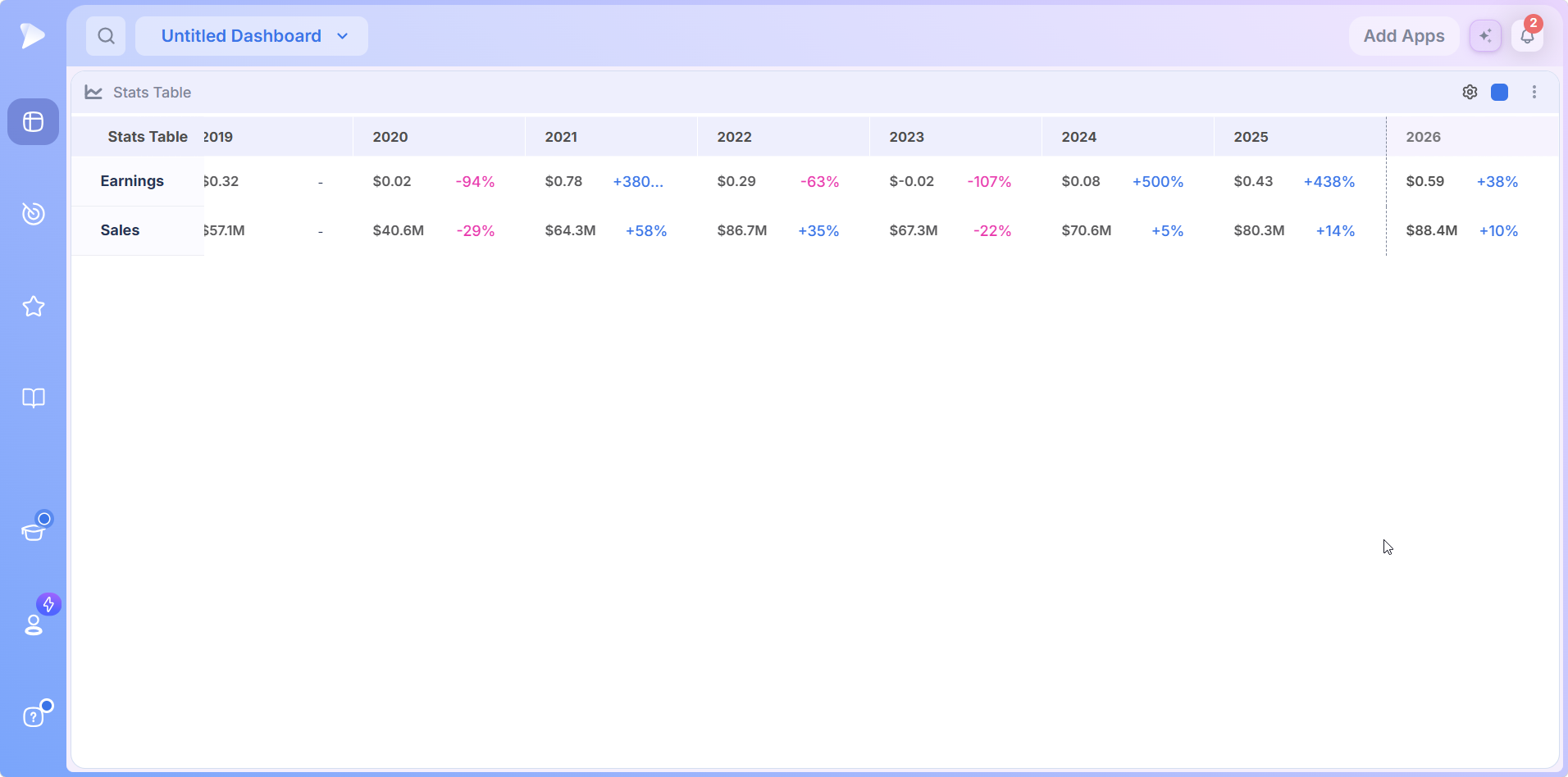
- •Header: the app name, a gear that opens the Legend, a color group square and a three dot menu.
- •Timeline: quarter or year columns, depending on the view.
- •Rows: Earnings and Sales, with their labels pinned on the left as the periods scroll sideways.
- •Divider: a dashed vertical line where reported results end and estimates begin.
- •Bars: a colored bar beneath a row when growth has accelerated or decelerated for three quarters running.
Who the Stats Table Is For
- ✓CANSLIM traders, for whom current and annual earnings growth are the first two letters of the method and the acceleration bar is a scan that runs itself. Deepvue for CANSLIM traders builds the fundamental read into the daily routine.
- ✓Growth stock traders comparing forward estimates with the reported trend to judge whether the street already expects the acceleration.
- ✓Swing traders studying earnings gaps who want the surprise behind one on a hover, not in a filing. The horizon is covered in Deepvue for swing traders.
- ✓Position traders checking that a holding’s earnings and sales keep growing quarter after quarter.
- ✓MarketSurge users who want quarterly fundamentals and estimates beside a modern, customizable chart.
Other trading styles get their own walkthroughs on the Deepvue for hub.
How the Stats Table Works
EPS and Sales Growth, Row by Row
Read across Earnings for the profit history in one line, then across Sales for revenue, so EPS and sales growth stack one above the other.
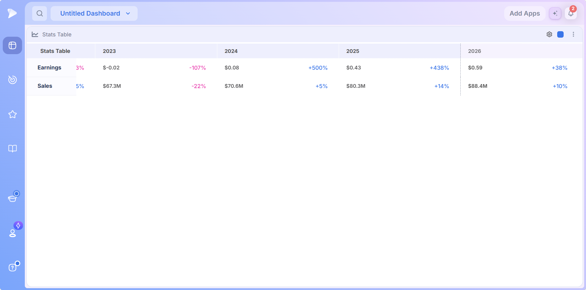
- •Blue growth marks a period that beat the same period a year earlier.
- •Pink growth marks a decline against that year earlier period.
- •A mostly blue row is a business expanding; a row streaked with pink is one going the other way.
The two rows move independently, and that disagreement is information. Rising sales above falling earnings points to margin pressure; rising earnings above flat sales can mean cost cutting rather than demand. The strongest growth stocks show both rows climbing together.
Year Over Year, and Non GAAP
Every growth percentage compares a period with the same period a year earlier, not the one just before it. That removes seasonality: a retailer’s December quarter against its own prior December is a trend, while the same quarter against the quiet one before it is noise. The underlying earnings and sales figures are non GAAP, worth knowing when you reconcile them against a headline number reported elsewhere.
Reported History, a Divider, Then Earnings Estimates
The dashed vertical line is the most important mark on the app. Everything to its left is reported; everything to its right is an earnings estimate, an expectation rather than a result, under a lighter column header.
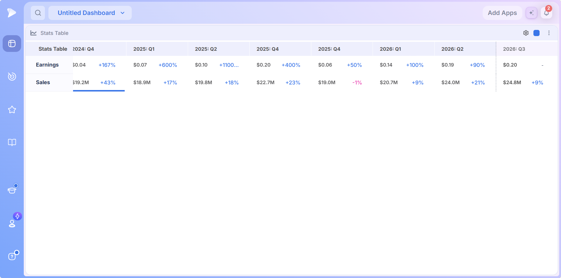
Deepvue carries roughly 10 to 15 quarters of history and about 10 quarters of estimates for most names, so where a company has been and where analysts expect it to go share one frame. Quarter by quarter earnings estimates this far out are uncommon at this price point, and markets trade on expectations as much as results. Reading the estimate side is how you find the names the street expects to accelerate, not only the ones that already have.
Hover Any Cell for the Earnings Surprise
Rest the pointer on a cell and a card opens with four lines:
- •Reported: what the company actually earned or sold.
- •Estimate: what the street expected beforehand.
- •Surprise %: the gap between the two, as a percentage.
- •Surprise $: the same gap in dollars.
On a reported period all four fill in. On an estimate period only the Estimate does, because the other figures do not exist yet.
The earnings surprise is the number to hunt. A large positive surprise means the company got well ahead of the street, and that gap is what drives an earnings gap on the chart. A history of beats, visible one hover at a time, is often a better signal than the growth rate alone.
Open a Deepvue account and check the surprise history on the names you hold before their next report.
Acceleration and Deceleration Bars
The most useful visual on the app is a thick blue bar under a row when growth has accelerated for three consecutive quarters. It points straight at the pattern growth traders hunt: a business whose rate of growth is itself rising.
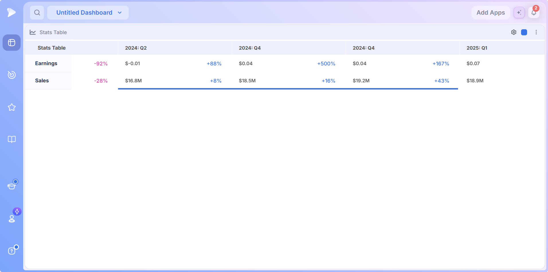
- •Blue bar: three consecutive quarters of accelerating growth.
- •Red bar: three consecutive quarters of deceleration.
- •Both rows, both halves: the bars apply to earnings and sales, and to estimates as well as reported figures.
The instruction that comes with the bars is simple. When you are tabbing through a list and a blue bar appears, slow down. The app is flagging accelerating earnings growth, the rare pattern that tends to come before a major move, without you working out four quarters of growth rates in your head.
The Legend: Quarterly Earnings Table or Annual View
The gear in the header opens the Legend, which decides what the table shows and over what horizon.
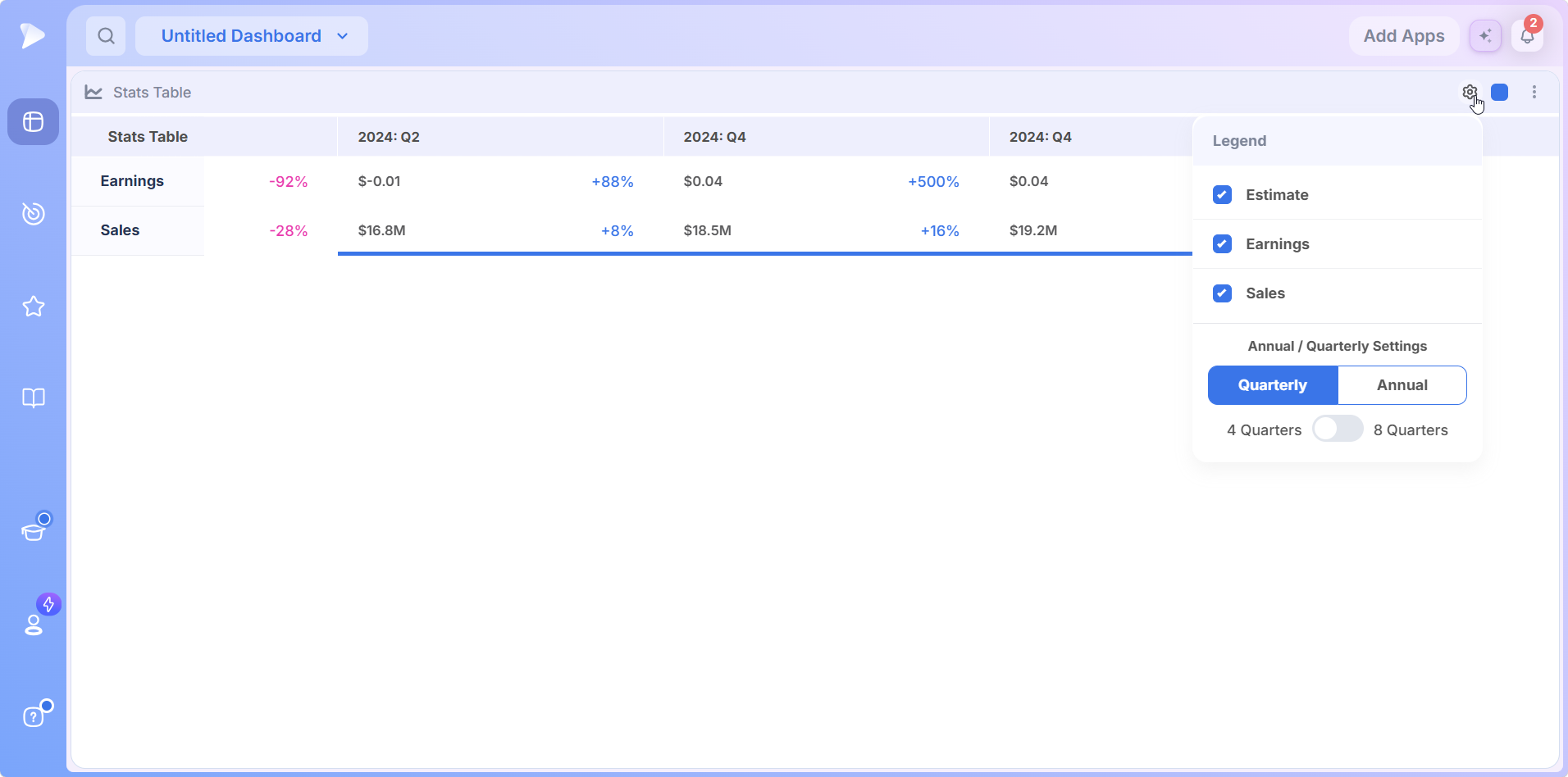
- •Estimate, Earnings and Sales checkboxes show or hide each row, so you can study earnings alone or strip out the estimates.
- •Quarterly and Annual redraws the timeline as quarter or year columns.
- •4 Quarters or 8 Quarters sets how many periods appear at once; the annual view shows four or eight years the same way.
Match the settings to the question. Quarterly at 4 Quarters is a quarterly earnings table for judging the latest report and the ones around it; annual at eight years shows whether a company has a long growth record or a short spurt. On a weekly chart the table switches itself to annual, pairing a longer chart horizon with a longer fundamental one, and you can switch it back. A line chart version of the same data is also available, though the table reads fastest.
A Worked Example: The Earnings Surprise Before a 300 Percent Move
The clearest case for surprise history is the Zscaler example the Deepvue team walks through, because it connects a cell in the table to a move on the chart. On May 28, 2020, Zscaler reported $0.07 against a $0.02 estimate, a 225 percent earnings surprise, with sales beating slightly too.
The stock gapped up the next session, broke out of its prior base and trended above its moving averages for roughly 200 days, about a 300 percent gain from the earnings day close. Its earnings growth ran the acceleration pattern the blue bar is built to catch, climbing from 13 percent to 78, then 107, then 184.
The lesson is the workflow the app is built for: a large surprise in either row is the signal to put a name on watch and look for the next setup, because expectations were just reset upward and the chart often follows.
Get started with Deepvue and run that check on this quarter’s reports while the surprises are fresh.
How to Add the Stats Table to a Dashboard
Go to Dashboards and open an existing board or start a fresh one.
Hit the Add Apps button at the upper right of the board.
Click Stats Table in the Tools group and it appears on the board.
Open the gear to choose Quarterly or Annual, the 4 or 8 period span, and which rows to show.
Match the color group square to a chart, screener or watchlist so the table follows the selected name.
How to Use the Stats Table: Three Routines
The Weekend Fundamental Pass
Keep the stock stats table beside the chart and step through a screen or watchlist. On each name, look for two things: is either row mostly blue, and is there an acceleration bar? A blue Earnings row with a bar beneath it is worth stopping on; a row streaked with pink usually is not, whatever the chart is doing. The Deepvue team runs this pass on weekends, reading the technical and fundamental pictures in one sweep.
The Surprise Hunt
Set the table to quarterly and hover the most recent reported cell on each name you are studying. A large positive earnings surprise is the flag to put a name on watch. The Earnings Calendar grades beats and misses across the whole week, which is how you find the surprises worth hovering in the first place.
The Forward Read
Shift your attention right of the divider. Read the earnings estimates quarter by quarter and ask whether the street already expects acceleration or whether the reported trend is running ahead of the forecasts. Names the market has not yet priced for growth are a different opportunity from names everyone expects to grow. When a number surprises you, a right click into the AI Terminal pulls the story behind it.
Try Deepvue and read the next four quarters of estimates on every name in your screen.
What Makes the Deepvue Stats Table Different
- ✓Estimates in the same frame as reported history, about 10 quarters out for most stocks.
- ✓Acceleration flagged for you, with a bar instead of mental arithmetic.
- ✓The earnings surprise on hover, in percent and in dollars.
- ✓Quarterly or annual in one click, over four or eight periods.
- ✓Linked to your dashboard, so the table changes stock when the chart does.
Choosing a platform means weighing what each one does well. See how Deepvue stacks up against MarketSurge, TradingView, TC2000, TrendSpider and Finviz in the Deepvue comparisons hub, or browse every head to head article in the compare category.
What Traders Say About Deepvue
Four verdicts from outside the company, quoted word for word with a link to each source.
“Amazing charting capabilities and key financial numbers in a clean, quick manner.”
From the customer testimonials featured on deepvue.com. View on deepvue.com
“It includes the key features that matter for those styles.”
A verified G2 reviewer, writing about momentum and CANSLIM trading. G2 review
“The interface is very well thought out and highly customizable.”
u/NeosDemocritus in r/CANSLIM, weighing Deepvue against MarketSurge. Reddit thread
“Deepvue is the most economical and impressive trading platform I have used.”
A November 2024 review on the Apple App Store. App Store listing
The Deepvue reviews wall tells the same story at scale: a 4.8 average from more than 220 verified reviews, with 97 percent of reviewers recommending Deepvue.
Where the Stats Table Connects
- •Charts for the price picture beside the fundamentals, linked through the color group.
- •The Earnings Calendar for when a report is due and how it landed, and the Data Panel for EPS and sales figures next to the rest of a stock’s numbers.
- •The screener for building the list worth reading, with every prebuilt approach indexed under stock screener by strategy.
- •The EPS Rating for the single score that summarizes the earnings trend the table lays out period by period.
What the Stats Table Costs
The Stats Table comes with Deepvue’s single plan at $49 per month, with monthly and annual options, so the fundamental check in your routine never ends up behind an upgrade prompt.
That one plan covers:
- •The screener and its 1,152 data points.
- •Charts, watchlists, and alerts, all of them unrestricted.
- •Fully customizable dashboards, with every app in the catalog.
- •The Theme Tracker, Market Brief, and AI Terminal, the last with unbounded usage.
Deepvue has one plan, so there are no tiers to compare. For reference, MarketSurge, the legacy platform in this niche, runs $149 per month.
New subscribers also get a one on one onboarding session with a Deepvue team member, an onboarding email series covering platform features and use cases, and weekly live webinars that each go deep on one part of the platform.
Read the Fundamentals as Fast as the Chart
The chart tells you what price has done; the earnings and sales table tells you whether the business underneath has earned the move. One row of profit, one of revenue, growth on every figure, estimates past the divider and a bar that flags acceleration on its own turn the fundamental check from a chore into a glance. That glance separates a breakout worth trading from one running on air.
Start with Deepvue for $49 per month, add the Stats Table to your dashboard, and let the numbers keep pace with the chart.
↑ Back to contentsFrequently Asked Questions
What traders ask before the table becomes part of a routine.
What is a stats table for stocks?
A stats table for stocks, or stock stats table, is a grid of a company’s earnings and sales by period, with the growth rate beside each figure. The Deepvue Stats Table adds forward estimates past a dashed divider, the earnings surprise on hover and bars that flag three quarters of acceleration or deceleration.
What is a good EPS growth rate for a stock?
A good EPS growth rate for a stock is less about one number than about direction. Growth traders look for accelerating growth, such as 20 percent, then 40, then 70, over a steady 50. The Deepvue Stats Table flags that pattern with a blue bar after three quarters.
What is EPS (earnings per share)?
EPS, or earnings per share, is a company’s profit divided by its shares outstanding. The level alone says little; the direction and pace over time matter, which is why the Deepvue Stats Table pairs every earnings figure with its year over year growth instead of showing the raw number alone.
What is the difference between EPS and sales?
The difference between EPS and sales is top line versus bottom line. Sales is what customers paid; EPS is the profit per share left after costs. The Deepvue Stats Table shows them as separate rows because they can disagree, and reading both shows whether growth comes from demand or cost cutting.
What does an earnings surprise mean for a stock price?
An earnings surprise means a company reported results far from what analysts expected, and a large positive one often drives an earnings gap as the market reprices the business. The Deepvue team points to a 225 percent surprise in 2020 that preceded a roughly 300 percent move.
What is accelerating earnings growth, and why does it matter?
Accelerating earnings growth is a growth rate that rises quarter after quarter, rather than staying high but flat. It matters because the pattern often shows up before the market fully prices it. The Deepvue Stats Table flags three consecutive quarters of it with a blue bar.
How do you read earnings estimates?
You read earnings estimates as expectations, not facts. Everything right of the dashed divider in the Deepvue Stats Table is what analysts currently forecast, and much of it is already priced in. The useful question is whether the reported trend on the left is running ahead of those forecasts or behind them.
Where can I see a stock’s quarterly earnings history?
You can see a stock’s quarterly earnings history in the Deepvue Stats Table, set to Quarterly from the Legend. It carries roughly 10 to 15 reported quarters and about 10 quarters of estimates for most stocks, with year over year growth beside every figure.
What is the Deepvue Stats Table?
The Deepvue Stats Table is a dashboard app that lays out a stock’s earnings and sales across quarters or years, a quarterly earnings table and an annual one in a single app. It adds growth to every figure, a divider before estimates, the surprise on hover and acceleration bars.
How many quarters can the Stats Table show at once?
The Stats Table can show 4 or 8 quarters at once, chosen with the 4 Quarters and 8 Quarters switch in the Deepvue Legend. Earlier periods scroll into view while the Earnings and Sales labels stay fixed, and the annual view works the same way in years.
Can I hide the estimates in the Stats Table?
Yes, you can hide the estimates in the Stats Table. The Deepvue Legend has an Estimate checkbox alongside the Earnings and Sales checkboxes, so you can show reported results only, or keep the forward quarters on screen past the dashed divider.
How is the growth percentage calculated?
The growth percentage is calculated against the same period one year earlier, not the period just before it. That year over year basis in the Deepvue Stats Table removes seasonality, so the figure reflects a real trend instead of the normal rise and fall between quarters.
Are the Stats Table numbers GAAP or non GAAP?
The Stats Table numbers are non GAAP. Keep that in mind when a figure in Deepvue differs from the GAAP number a company puts in its headline results, since the two measures treat certain costs and one time items differently.
What does hovering a cell show?
Hovering a cell shows a card with four lines: Reported, Estimate, Surprise % and Surprise $, for earnings or sales. In the Deepvue Stats Table, a quarter that has not reported yet fills only the Estimate line, since the other figures do not exist yet.
What do the blue and red bars mean?
The blue and red bars in the Deepvue Stats Table mean a run of three quarters. A thick blue bar under a row marks three consecutive quarters of accelerating growth, and a red bar marks three of deceleration, for earnings or sales and for estimates as well as reported figures.
Can I switch between quarterly and annual views?
Yes, you can switch between quarterly and annual views. The gear in the Deepvue Stats Table opens a Legend with a Quarterly and Annual toggle and a 4 or 8 period span. On a weekly chart the table switches to annual automatically, and you can switch it back.
How far back and forward does the data go?
The data goes back roughly 10 to 15 quarters and forward about 10 quarters of earnings estimates for most stocks in the Deepvue Stats Table. Estimate depth at that granularity is uncommon at a $49 per month price point.
How do I use the surprise numbers?
You use the surprise numbers to find companies that beat expectations by a wide margin, which often drives an earnings gap. Spot a large positive surprise on hover in the Deepvue Stats Table, put the name on watch, then look for the next setup on the chart.
Can I show only earnings or only sales?
Yes, you can show only earnings or only sales. The Deepvue Stats Table Legend has separate checkboxes for the Earnings, Sales and Estimate rows, so you can focus on one line of the business at a time.
Where do I find the Stats Table in Deepvue?
You find the Stats Table in Deepvue in the Tools group of the Add Apps menu, where one click adds it to a dashboard. The same earnings and sales table also appears below the chart in the Screener and Watchlist modules.
Is the Stats Table included in the standard Deepvue plan?
Yes, the Stats Table is included in the standard Deepvue plan. Deepvue has a single plan at $49 per month that covers the Stats Table along with the screener, charts, watchlists, alerts, dashboards, the Theme Tracker, the Market Brief, and the AI Terminal.