Deepvue Heatmap: See Rotation, Strength, and Where Money Is Flowing at a Glance
The Deepvue Heatmap plots any universe of stocks as a sector grouped treemap. Three header controls define the view: the universe, the data point printed on each tile, and a second data point that sets how large each tile is.
Click any sector or industry to drill in, and save the whole configuration as a reusable template. It ships with 10 named templates and a preset library covering CANSLIM, VCP, momentum, technical, fundamental, earnings and thematic screens.
and see which groups are carrying the market before you buy into one.
The Deepvue stock heatmap, in numbers:
Key Takeaways
A stock heatmap and a screener do different jobs. A screener hands you a list, and a list is precise but useless for one job: showing you the shape of a market.
Is today’s weakness broad or concentrated? Is money leaving semiconductors and arriving in oil and gas? Which three names inside a group are carrying the whole move? A stock market heatmap shows it at a glance, using space and shading instead of rows, and saves the ten minutes of scanning most traders skip right before buying into a group that is quietly falling apart.
- ✓Plot any screen or watchlist, yours or a preset, as a treemap grouped automatically by sector and industry, so sector rotation is visible without reading a single row.
- ✓Two independent data point controls. One sets the value printed on every tile, the other sets tile size, so one screen carries two variables at once.
- ✓Both controls are searchable, from price change in dollars and percent to Volume, premarket change, longer lookbacks and volatility measures.
- ✓A deep preset library: 169 screener presets in nine categories, plus watchlist presets with 14 named themes, thematic ETFs and Model Book Stocks.
- ✓Drill into any block, then save the configuration of all three controls as a template you reload in one click.
- ✓No extra charge on the one plan. Build your first Deepvue heatmap.
Heatmap at a Glance
- Universe control
- Any screener, screener preset, watchlist or watchlist preset; S&P 500 by default
- Plotted data point
- The value printed on each tile, which also drives the shading; Price % Change Today by default
- Sizing data point
- What determines tile area, independent of what is printed; Market Cap by default
- Grouping
- Automatic, by sector and then industry
- Shading
- Green for positive readings, red for negative, muted for readings near zero
- Drill down
- Click any block to expand it, with a breadcrumb and back arrow
- Templates
- 10 presets plus My Templates, each restoring all three controls
- Header, right
- The Default template menu, color group square and three dot menu
- Catalog name
- Heat Map, under Visualizations when you open Add Apps
- Cost
- Bundled into the standard Deepvue plan
What Is the Deepvue Heatmap?
The Deepvue Heatmap is a stock heatmap built as a dashboard app. It draws a universe as a treemap: every stock is a tile inside its sector and industry block, printing one data point and sized by another. The technical reference is in the Heat Map Knowledge Base article.
What sets it apart from the generic heatmap for stocks is that the universe is yours. Most are locked to an index with a fixed metric. This one defaults to the S&P 500, but point it at any screen, preset, watchlist or curated list and it turns from a market overview widget into a research tool.
Who the Heatmap Is For
Growth traders who work from the top down: read the market, find the strong groups, then find the leaders inside them.
- ✓Swing traders checking whether today’s action is broad or narrow before committing to a setup. Deepvue for swing traders turns that check into a habit.
- ✓Position traders watching whether the sector behind a multi month hold is still being accumulated.
- ✓Breakout traders tracking market rotation during the session rather than after it.
- ✓CANSLIM traders who treat group strength as a core selection criterion, the method Deepvue for CANSLIM traders explains.
- ✓Anyone managing a large watchlist who wants one screen showing the state of all of it at once.
How a Stock Heatmap Differs From a Screener List
You want both. A screen tells you which stocks qualify; a heatmap tells you what the market looks like right now.
| Deepvue Heatmap | A ranked screener list | |
|---|---|---|
| Best question | What is the shape of the market or this group right now? | Which specific stocks meet my exact criteria? |
| Variables shown | Two at once, one plotted and one setting tile area | Many, one per column |
| Grouping | Automatic sector and industry blocks | Whatever you sort by |
| Reading speed | Instant pattern recognition across hundreds of names | Row by row, top to bottom |
| Weight | Visible as area, so the names you emphasize dominate the frame | Invisible unless you add a column for it |
| Best use | Spotting rotation, breadth and concentration | Building a precise candidate list |
The workflow is simple: use the heatmap to decide where to look, then the screener to decide what qualifies.
The Three Header Controls
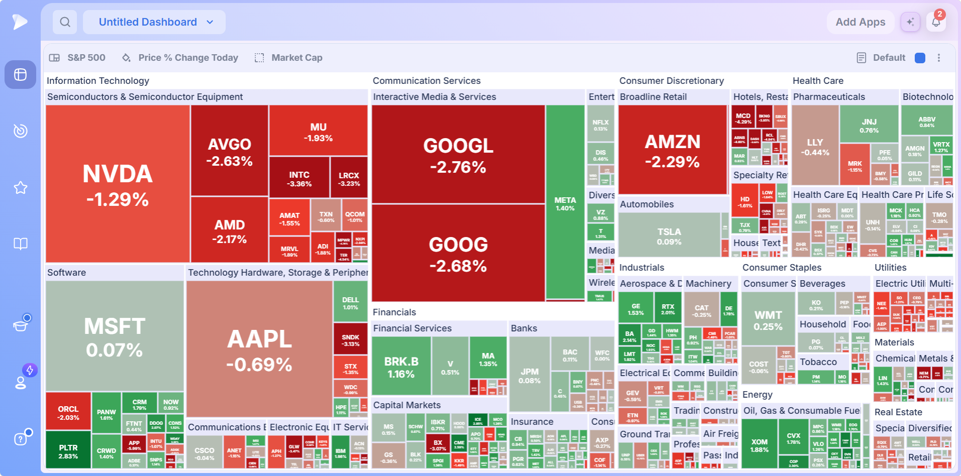
Every heatmap comes down to three controls, left to right in the header. Learn what each does and you have learned most of the app.
| Control | Default | What it does |
|---|---|---|
| 1. Universe | S&P 500 | The list of stocks being drawn. Swap in any screener, preset, watchlist or preset list |
| 2. Plotted data point | Price % Change Today | The value printed inside every tile, and what drives the shading |
| 3. Sizing data point | Market Cap | How much area each stock occupies, independent of the number printed on it |
The two data point controls are easy to tell apart: the plotted one carries a small paint bucket icon, the sizing one a dashed square.
How the Shading Works
Shading follows the plotted data point, never the sizing one. Positive readings render green, negative readings red, and readings near zero a muted tone, with the strongest values deepest. That is what lets you read a market before processing a single number: muted tiles are a market going nowhere, deep green and deep red side by side are a rotation day.
Shading is relative, though. A tile that looks strong is strong within this universe on this data point. That is context, not a signal.
How to Read a Heatmap in Four Steps
Read the header first. Left to right, the three controls tell you which stocks are on screen, what each tile’s number means and what tile size represents. Most misreadings come from skipping this.
Scan the blocks, not the tickers. Notice which sector and industry blocks are deep and which are muted before you read a single ticker.
Find the odd one out. A strong tile inside a weak block, or the reverse, is the relative strength or weakness worth investigating.
Drill in. Click the block that interests you to expand it and read its constituents at full size.
That is the entire skill. Everything else is about what to put in those three controls.
Control 1: Choosing What the Heatmap Plots
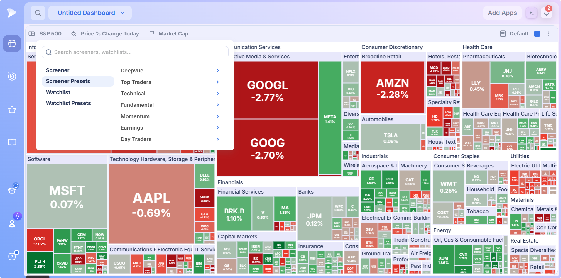
This control decides whose market you are looking at, so it matters most. Click it and a panel opens with a search box and four sources down the left.
| Source | What it holds |
|---|---|
| Screener | Any screen you built and saved yourself, filters live, so the map reflects today’s results |
| Screener Presets | A library of 169 prebuilt Deepvue screens across nine categories |
| Watchlist | Any watchlist you have created, including lists built elsewhere on the platform |
| Watchlist Presets | Deepvue’s curated lists, including 14 named market themes |
Grouping is automatic, so a screen sorts into sector blocks the moment it loads. Blocks labeled N/A just mean those stocks have no sector assigned yet, usually recent listings.
The Screener Preset Library
Screener Presets makes the heatmap a visual front end for Deepvue’s whole prebuilt library, each preset loading straight into the map. Presets are read only until you duplicate them, after which the copy is fully editable.
| Category | Screens | What it covers |
|---|---|---|
| Top Traders | 83 | Screens built around named professional methodologies |
| Technical | 29 | Setup and chart action screens, the ones most likely to feed a trade |
| Deepvue | 17 | The house screens, including the platform’s proprietary signals |
| Fundamental | 16 | Ownership, earnings and sales screens |
| Day Traders | 10 | Shorter horizon screens, several useful as participation filters |
| Earnings | 7 | Screens organized around the reporting calendar |
| Markets | 4 | Major index lists |
| Pre/Post Market | 2 | Extended hours activity |
| Momentum | 1 | A float squeeze screen |
- •Deepvue: from CANSLIM Type RS and Volatility Contraction Pattern through Pure Momentum and Power 21. Load Deepvue Leaders or Model Book Stocks and the grouping tells you which sectors the current leadership is concentrated in.
- •Technical: pullback, volume, tightness and breakout screens. Load 52 Week Highs and the map shows where new highs are clustering by sector; put Up on Volume and Down on Volume on two heatmaps side by side and you are watching accumulation and distribution across the market.
- •Fundamental: from Increasing Insider Ownership and Accelerating Earnings through CANSLIM and EPS/Sales Growth.
- •Day Traders: Deepvue is not a day trading platform, but Relative Volume, Highest Volume and Huge Trading Volume work as participation filters, and grouped by sector they become a rotation read on a multi week timeframe.
The Watchlist Preset Library and the 14 Themes
Watchlist Presets opens into six folders. Themes is the one to know, holding curated baskets for the areas where momentum tends to concentrate.
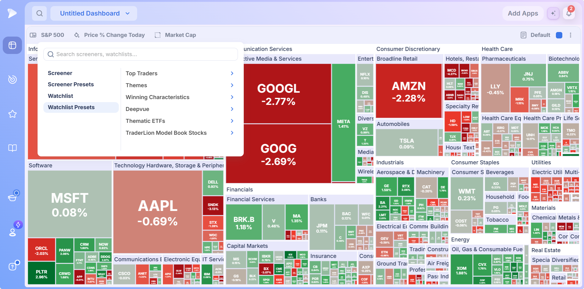
- •Themes: Aerospace, Artificial Intelligence, Bitcoin Miners, Blockchain, Casinos, Cybersecurity, Drones, Genomics, Home Construction, Nuclear, Quantum, Robotics, Solar and Space.
- •Thematic ETFs: sector, index, industry, country, commodity, crypto, volatility, SPDR, bull and bear, and USA equal weight lists, among others. The sector basket is a clean top level rotation read; the volatility and bear baskets are a fast check on whether defensives are being bid.
- •TraderLion Model Book Stocks: historical big winners, for studying past leadership rather than trading today’s tape.
Loading a theme is the fastest way to answer a question about one slice of the market. A theme’s members split automatically across the sector blocks they belong to, so you see at once when one part of a theme behaves differently from another, exactly what a ranked list buries.
Open a Deepvue account and plot your own screen instead of somebody else’s index.
Controls 2 and 3: Choosing the Data Points
Both controls draw from the same searchable list, by design: any data point can be the value you read, the value that sets tile size, or both.
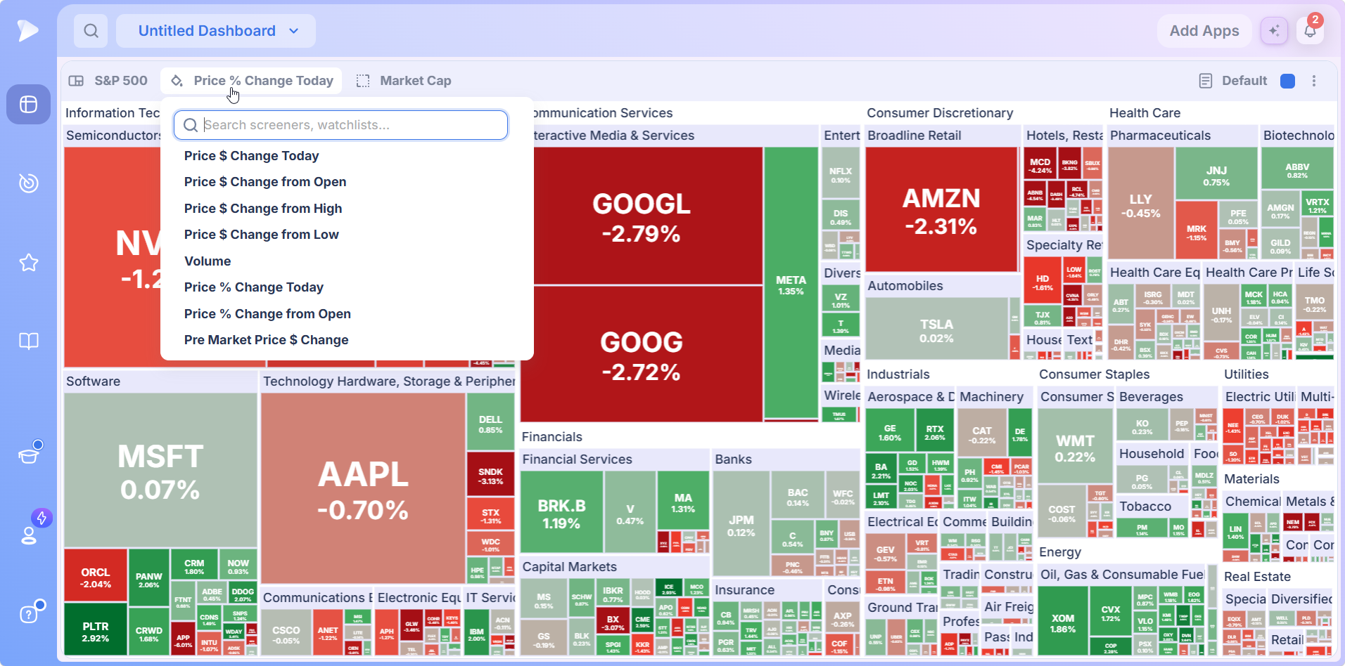
Eight options show before scrolling, covering dollar change on the day and against the open, high and low, Volume, percent change on the day and since the open, and the premarket dollar move. The selector reaches further, to 20 day and year to date percent change, Market Cap, and volatility measures such as ADR percent over 20 days. Typing the name beats scrolling.
The Sizing Control Is the One People Overlook
The sizing data point sets how much area each stock occupies, independent of what is printed on it. Market Cap is the default, the familiar index style view where the largest companies dominate. Change it and the same universe tells a completely different story.
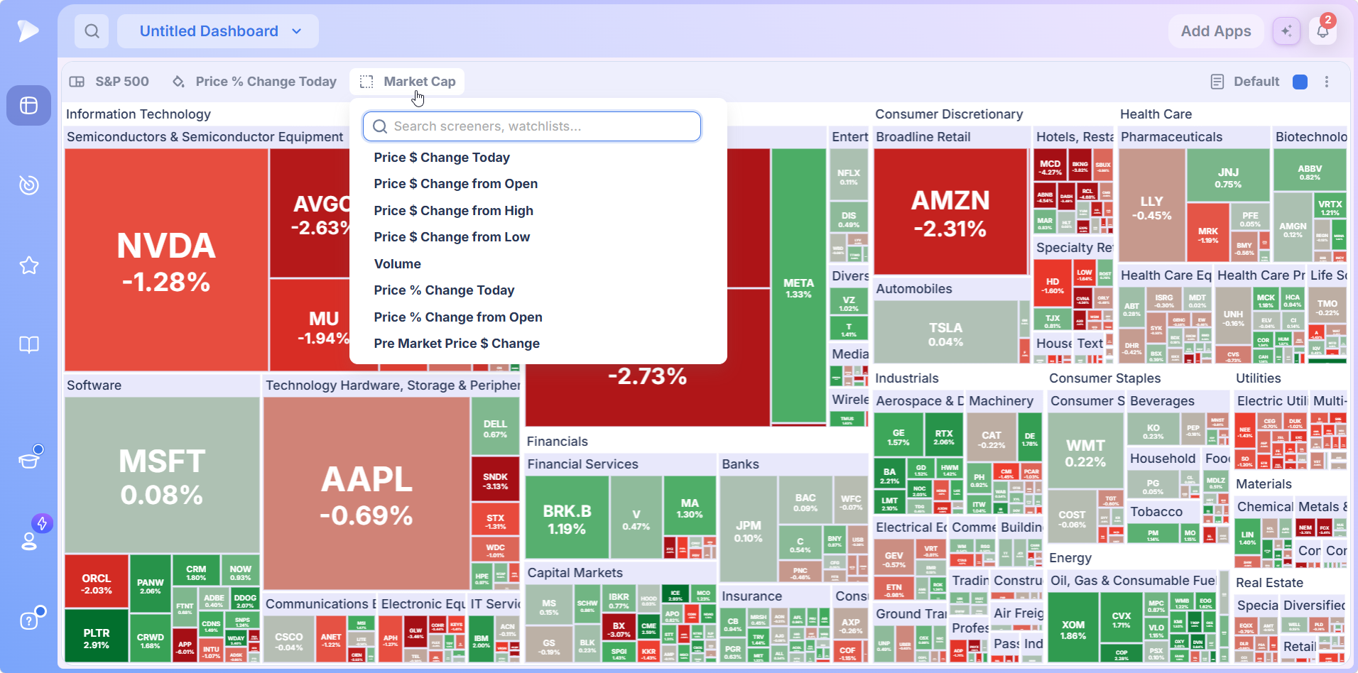
Set sizing to Volume and the map reweights around where trading is actually happening, so the largest tiles become the names absorbing the most activity rather than the biggest market caps. That is a direct read on participation, and the single most useful reconfiguration in the app.
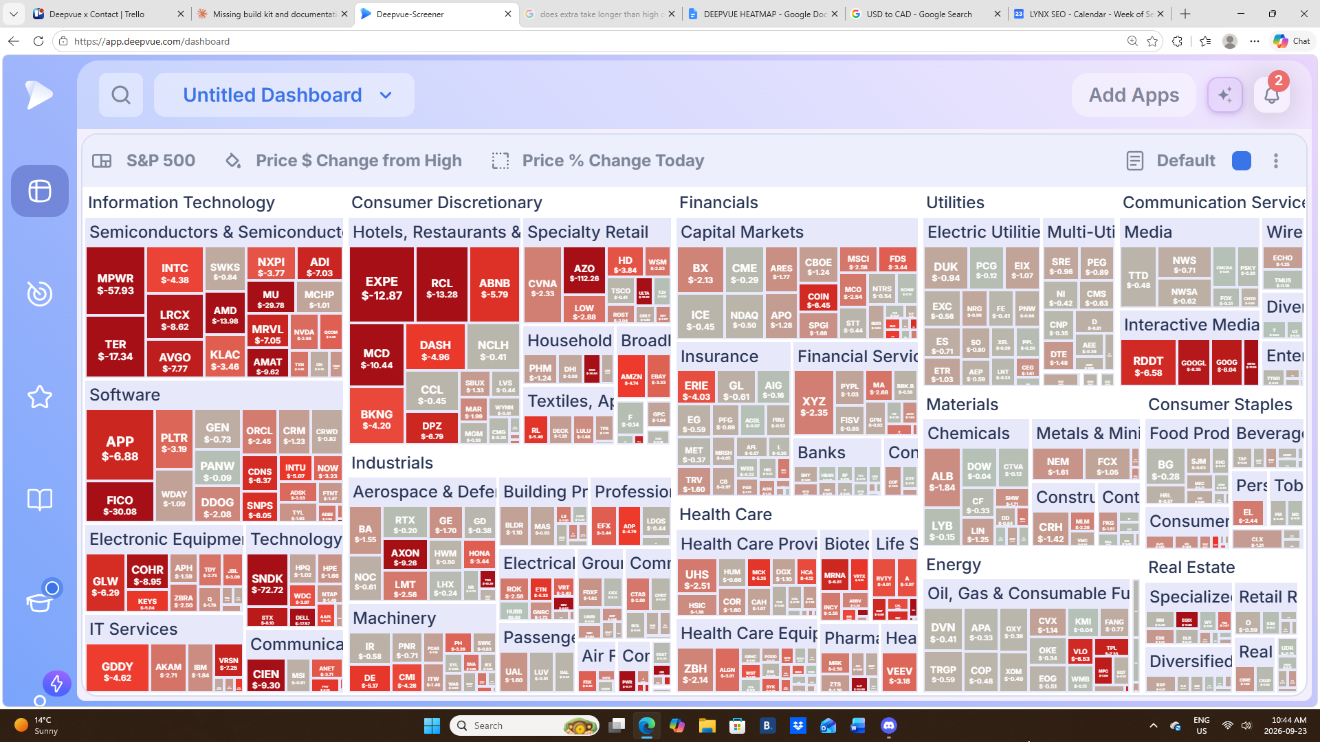
Because area is no longer tied to market cap, smaller names that are actually moving claim the space the giants would otherwise own. Two questions on one screen, no columns to read.
The Change Options, and Why the Differences Matter
Several options look similar and measure genuinely different things. Choosing the wrong one is the most common way to misread a heatmap.
| Option | Measures from | What it answers |
|---|---|---|
| Price % Change Today | The previous session’s close | How much is this stock up or down on the day, gap included? |
| Price % Change from Open | Today’s opening print | What have buyers and sellers done since trading actually began? |
| Pre Market Price $ Change | Activity before the bell | What is moving before the session starts? |
| 20 day % change | The price roughly one month ago | Who has been leading over the past month? |
| YTD % change | The year’s opening price | Who has led all year? |
| Price $ Change from High | Today’s high | Who is closing strong and who faded? |
| Price $ Change from Low | Today’s low | Who recovered off the low, and how far? |
| 20 day ADR % | Average daily range over 20 days | How much does this stock typically move? A volatility read, not a performance read |
Change Today Versus Change From Open
The difference is the overnight gap. Change Today measures from the previous close, so a stock that gapped up four percent and sold off all session can still print positive. Change from Open measures from the opening print, so the same stock prints negative and tells the truth about the session. On gap, earnings and post macro days they tell opposite stories, and you almost always want change from open.
Pairing Two Change Options Together
Because the controls are independent, you can pair two timeframes. Plot year to date performance while today’s move from the open sets tile size: the number says how a stock has done all year, the space says how much it is moving now.
- •Plot a longer lookback, size by a shorter one to find established leaders that are waking up.
- •Plot a shorter lookback, size by a longer one to find today’s movers that already have a track record.
- •Plot performance, size by volume to separate real participation from noise.
Dollar Change Versus Percent Change
Percent change normalizes across price levels, so a low priced stock and an expensive one compare fairly. Dollar change gives the raw size of the move, which matters for position sizing and for how far a name has traveled inside its daily range.
Drilling Into a Sector or Industry
Drill down turns a heatmap for stocks into a shortlist. Click any block and it fills the frame, with a breadcrumb reading All, then the sector, then the industry, and a back arrow to step out.
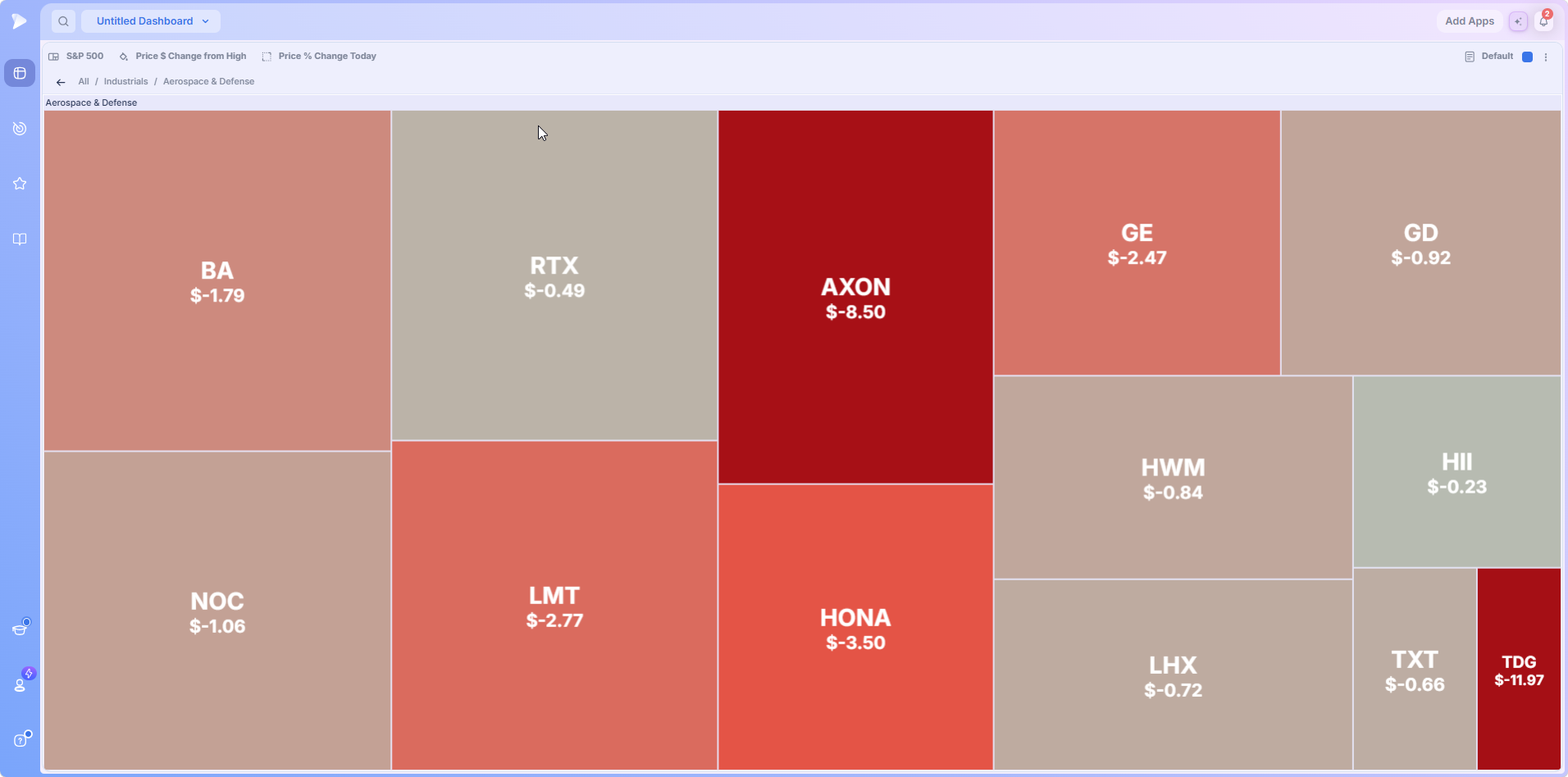
Inside, every constituent gets real space, so unreadable slivers become legible. At the full market level a whole industry can be one small block dominated by a single giant; expanded, you often find the strength is not in the biggest name at all. The reverse is just as useful: where almost every tile is weak, the handful of positive names show up in about a second, whether you are hunting relative strength inside a weak group or confirming that a group is under distribution.
Templates: Saving a Complete Configuration
A template stores all three controls at once, so loading one reconfigures the universe, the plotted data point and the sizing data point together. Click Default in the header and the menu lists 10 presets above a My Templates section.
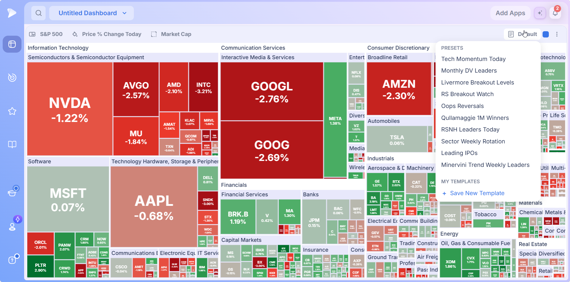
- •Momentum and leadership: Tech Momentum Today, Monthly DV Leaders, RSNH Leaders Today and Minervini Trend Weekly Leaders.
- •Breakouts and reversals: Livermore Breakout Levels, RS Breakout Watch and Oops Reversals.
- •Rotation and new issues: Sector Weekly Rotation, Leading IPOs and Qullamaggie 1M Winners.
What a Template Configures
Two shipped templates read as worked examples of how experienced traders combine the three controls.
| Template | Universe | Plotted | Sizing |
|---|---|---|---|
| Leading IPOs | Recent IPOs | YTD % change | Price % Change from Open |
| Qullamaggie 1M Winners | One month top gainers | 20 day ADR % | 20 day % change |
Leading IPOs asks which recent listings have performed since coming public and are active today: YTD performance is plotted while today’s move from the open sets size. Qullamaggie 1M Winners is more instructive. The universe is the month’s top gainers, but the plotted value is a volatility measure, sized by 20 day performance, so the map shows which winners are most volatile, weighted by how much they gained.
Save New Template adds your own configuration under My Templates, turning a setup you return to every morning into a single click.
Why a Stock Trading Heatmap Beats Reading a List
Not because it is prettier. Human pattern recognition is far faster than table reading, and a treemap converts numbers into the pattern the eye is built for.
- ✓Breadth in one glance. Whether weakness is broad or concentrated in two groups is obvious from the shading.
- ✓Rotation becomes visible. Cyclicals and energy strong while semis and software are weak is money moving between them.
- ✓Weight is not hidden. Area weighting shows which moves actually matter.
- ✓Outliers surface themselves. The one strong tile inside a weak group is impossible to miss.
- ✓It scales. A 500 name universe is unreadable as a list and perfectly readable as a map.
How to Add the Heatmap to Your Dashboard
Create and name a board in the Dashboard module. Many traders keep one dedicated to heatmaps, because the app rewards space.
Bring up the Add Apps panel.
Click Heat Map in the Visualizations group, or find it with the search at the top of the panel.
Set your three controls, or open Default and load one of the 10 presets to skip setup entirely.
Dashboard Layouts Worth Building
- •The dedicated heatmap dashboard. One heatmap with nothing competing for space. The simplest, and for most traders the most used.
- •Heatmap plus chart. Same color group, so clicking a name in the map loads its chart beside it.
- •Two heatmaps side by side. The same universe, one sized by Market Cap for the index picture, one by Volume for participation.
- •Heatmap plus Theme Tracker plus Market Brief. A complete top down screen: the brief explains the macro drivers, the Theme Tracker ranks themes, and the heatmap shows the detail underneath both.
Sign up for Deepvue and build the heatmap dashboard tonight.
How to Use the Heatmap: Core Workflows
Start With the Default Market View
Read the S&P 500 as it loads: is the market moving as one, or are groups moving against each other? Scan the sector blocks, not names. Strength in cyclicals and energy against weakness in semiconductors and software is market rotation, and that read alone should shape how aggressive you are. Default sizing is honest about weight too: when a few giants hold an index up while everything behind is weak, the map shows the imbalance a headline index hides.
Point It at Your Own Screen or Watchlist
This is where a generic stock market heatmap becomes a Deepvue heatmap for stocks you actually care about. Load your leaders screen, your watchlist or a preset, and the same visual grammar applies. Because grouping is automatic, the moment a screen loads you see how it spreads across sectors and which names print strongest.
The Open Flow Configuration
Set the universe to your leaders screen or primary watchlist.
Set the plotted data point to Price % Change from Open, which strips the overnight gap.
Set the sizing data point to Volume, so the largest tiles are the names absorbing the most activity.
A large tile with a strong reading is real buying on real volume; a large tile with a weak reading is distribution you want to catch early. A High Relative Volume screen from the Technical folder gets you a similar view before you touch the sizing control.
The End of Day and Premarket Configurations
Late in the session, plot Price $ Change from High or from Low to see where each stock stands inside its daily range. Names closing near their highs behave very differently from names giving back an early gain, which matters for what you hold overnight. Before the open, plot Pre Market Price $ Change on your watchlist: because the map is grouped by sector, you can tell whether a move is one isolated name or a group wide macro reaction.
Configurations Worth Copying
| Goal | Plotted data point | Sizing data point |
|---|---|---|
| Index level market read | Price % Change Today | Market Cap |
| Where participation is going off the open | Price % Change from Open | Volume |
| Who closed strong versus who faded | Price $ Change from High | Market Cap |
| Premarket movers in your watchlist | Pre Market Price $ Change | Market Cap |
| Long term leaders that are active today | YTD % change | Price % Change from Open |
| Volatility among recent winners | 20 day ADR % | 20 day % change |
| Participation without price bias | Price % Change Today | Volume |
Link the Heatmap to a Chart
Put the map and a chart in one color group, using the square in each header, and clicking a name loads its chart beside the map. Deepvue’s charts carry the RS Line, Stage Analysis, Enhanced Volume and AVWAP, which tell you whether a standout is actually set up.
Cross Check and Ask Why
Three apps answer the same question at three resolutions. The Market Brief explains the macro drivers in words, the Theme Tracker ranks 31 curated themes, and the heatmap shows the stocks underneath both. When a theme climbs the Theme Tracker and its basket looks strong on the map, that is confirmation from two angles. When a tile stands out that you cannot explain, the AI Terminal is one question away.
A Daily Routine Using the Heatmap
- •Premarket. Watchlist with premarket change plotted; note what is moving and whether it is isolated or group wide.
- •At the open. Switch to the open flow configuration and watch which groups attract real participation in the first half hour.
- •Mid morning. Drill into the two or three strongest groups, note the names carrying each move, and review setups on a linked chart.
- •Into the close. Switch to Price $ Change from High to see who closed strong and who faded.
- •Save what works. Any configuration you return to becomes a template, so tomorrow is a series of one click loads.
What Makes the Deepvue Stock Trading Heatmap Different?
Free heatmaps are everywhere. What makes the Deepvue stock trading heatmap worth using comes down to what you point it at and what it connects to:
- ✓Your universe, not just an index. Screens and watchlists, your own or Deepvue’s, all plot the same way.
- ✓A deep preset library behind it, from VCP and CANSLIM screens to 14 curated themes, one click from the map.
- ✓Two independent data point controls, so one universe can answer several questions.
- ✓Templates that save everything, 10 shipped configurations plus your own.
- ✓Real drill down, sector to industry to constituents, with a breadcrumb.
- ✓Wired into a platform, with color group linking to charts plus the Theme Tracker, Market Brief, screener and AI Terminal alongside it.
Before committing to any platform, see how Deepvue measures up against MarketSurge, TC2000, Finviz, TradingView and TrendSpider in the Deepvue comparisons hub, with each matchup broken down in detail.
What Traders Say About Deepvue
How four outside reviewers describe the platform behind the map.
Deepvue’s dashboards are “a lot more helpful than the market overview pages” found elsewhere.
Dave’s assessment for Day Trade Review, which rates Deepvue 4.7. Read his writeup
“The interface is very well thought out and highly customizable.”
Posted by u/NeosDemocritus in r/CANSLIM. Go to the discussion
“Deepvue feels extremely well tailored to momentum trading and CANSLIM investing.”
From a verified G2 reviewer in financial services. See the G2 entry
“Deepvue is a great tool for traders.”
An April 2026 review on Apple’s App Store. View the listing
Across Deepvue’s published reviews, the score averages 4.8 from more than 220 verified reviewers, 97 percent of whom would recommend it.
Where the Heatmap Connects
The heatmap is where a market read turns into a shortlist. These are what you do with that shortlist.
- •Watchlists for capturing the names that stood out, ready to review or take into an AI Terminal question.
- •The screener for filtering a strong group down to names that qualify, with formation based scans under screener by pattern.
- •Industry Ranks and Stage Analysis for the same sector rotation question read as rankings and as condition.
- •The Performance Chart, Bubble Chart and Mini Chart, for ranking, plotting or tracking the same names in other shapes.
What the Heatmap Costs
The Heatmap is part of Deepvue’s single plan at $49 per month, with monthly and annual options, templates and preset library included.
That one plan covers:
- •The screener and its 1,152 data points.
- •Charts, watchlists, and alerts, all of them unrestricted.
- •Fully customizable dashboards, with every app in the catalog.
- •The Theme Tracker, Market Brief, and AI Terminal, the last with unbounded usage.
Deepvue has one plan, so there are no tiers to compare. For reference, MarketSurge, the legacy platform in this niche, runs $149 per month.
New subscribers also get a one on one onboarding session with a Deepvue team member, an onboarding email series covering platform features and use cases, and weekly live webinars that each go deep on one part of the platform.
Start Reading the Market With the Deepvue Heatmap
Rotation, breadth, concentration and participation are all things you could calculate from a table. A stock trading heatmap just shows them to you. Point it at your own screens or the preset library, decide what should be plotted and what should set tile size, drill into whatever stands out, and save the configuration so tomorrow it is one click.
Get started with Deepvue and put a Deepvue heatmap for stocks you actually trade on your first screen every morning.
↑ Back to contentsFrequently Asked Questions
Quick answers to what traders ask most about the app.
What is the Deepvue Heatmap?
The Deepvue Heatmap is a dashboard app that plots a universe of stocks as a treemap grouped by sector and industry. Each stock is a tile printing one data point you choose, while a second data point sets its size. It is listed as Heat Map under Visualizations in Add Apps.
How do you read a stock market heatmap?
You read a stock market heatmap by checking the header first, so you know what is plotted and what sets tile size, then scanning sector blocks rather than tickers. In the Deepvue Heatmap, look for the odd one out, a strong tile in a weak block, and drill into it.
What is a treemap, and how is it different from a heatmap?
A treemap is the layout: nested rectangles grouped by sector and industry, each sized by a data point. A heatmap adds a second data point as color. The Deepvue Heatmap is both at once, so each tile carries size from one measure and shading from another.
What do the colors on a heatmap mean?
The colors on a heatmap mean the direction and strength of the plotted data point. In the Deepvue Heatmap, positive readings are green, negative readings red, readings near zero muted, and the strongest values deepest, relative to everything else on screen.
Does a red tile mean a stock is a bad buy?
No, a red tile does not mean a stock is a bad buy on its own. Deepvue shading is relative and usually reflects one session, so a deep red tile can be an earnings reaction rather than a verdict. Treat color as context, then confirm the setup on a chart.
What does the size of a tile represent?
The size of a tile represents whatever you set in the sizing control. By default it is Market Cap, the familiar index style view. Switch the Deepvue sizing control to Volume and the largest tiles become the names absorbing the most trading activity.
How do you use a heatmap to find sector rotation?
You use a heatmap to find sector rotation by reading sector blocks as groups. When one set of sectors shades deep green while another shades deep red on the same Deepvue screen, market rotation is happening, and the Theme Tracker or Industry Ranks confirm whether it holds.
How do I see where money is flowing during the session?
You see where money is flowing during the session by setting the Deepvue sizing control to Volume and plotting Price % Change from Open. The largest tiles are the names absorbing the most activity since the bell, and their color shows whether it is buying or selling.
Can I build a heatmap of a single sector or theme?
Yes, you can build a heatmap of a single sector or theme. Load one of Deepvue’s 14 curated theme baskets or a sector ETF list from Watchlist Presets, or load any screen and drill into the sector block you care about.
Can I use my own screener or watchlist in the heatmap?
Yes, you can use your own screener or watchlist in the heatmap. Click the first control in the Deepvue header and choose Screener, Screener Presets, Watchlist or Watchlist Presets; the preset library holds 169 screens across nine categories.
What data points can the heatmap display?
The data points the heatmap can display start with eight measures in the menu: price change in dollars and percent against several reference points, Volume, and the premarket dollar move. The Deepvue list is searchable and extends to Market Cap, longer lookbacks and volatility measures such as ADR percent.
What is the difference between the two data point controls?
The difference between the two data point controls is role. The first, marked with a paint bucket icon, sets the value printed on each tile and drives the shading; the second, marked with a dashed square, sets tile size. In Deepvue they are independent.
What is the difference between change today and change from open?
The difference between change today and change from open is the overnight gap. Change Today measures from the previous close; Change from Open measures from the session’s opening price. On gap days the two can tell opposite stories on a Deepvue heatmap.
How do I drill into a sector or industry?
You drill into a sector or industry by clicking its block, which expands to fill the frame with every constituent at readable size. Deepvue shows a breadcrumb of All, the sector and the industry, with a back arrow to step out.
Can I save my heatmap settings?
Yes, you can save your heatmap settings. Open the Default menu in the Deepvue header and choose Save New Template, and all three controls are stored together under My Templates.
Which templates come with the Heatmap?
The templates that come with the Heatmap are Tech Momentum Today, Monthly DV Leaders, Livermore Breakout Levels, RS Breakout Watch, Oops Reversals, Qullamaggie 1M Winners, RSNH Leaders Today, Sector Weekly Rotation, Leading IPOs and Minervini Trend Weekly Leaders, all in Deepvue’s Default menu.
What themes can I plot on the heatmap?
The themes you can plot on the heatmap are Deepvue’s 14 curated baskets: Aerospace, Artificial Intelligence, Bitcoin Miners, Blockchain, Casinos, Cybersecurity, Drones, Genomics, Home Construction, Nuclear, Quantum, Robotics, Solar and Space.
How is this different from a free stock market heatmap?
This differs from a free stock market heatmap in control. Free heatmaps are usually locked to an index with a fixed metric; the Deepvue Heatmap plots any screen or watchlist, sets the printed value and tile size independently, drills down, saves templates and links to a chart.
Is the heatmap useful for day trading?
The heatmap is useful mainly as context for holds of weeks to months rather than for day trading. Deepvue serves traders holding for weeks, and the map reads intraday flow to inform those decisions, not to time intraday entries.
Is the Heatmap included in the standard Deepvue plan?
Yes, the Heatmap is included in the standard Deepvue plan. Deepvue has a single plan at $49 per month that covers the Heatmap along with the screener, charts, watchlists, alerts, dashboards, the Theme Tracker, the Market Brief, and the AI Terminal.