Last Updated:
June 27, 2025
What are bubble charts?
Bubble charts are Deepvue’s version of a scatter plot chart. They let you visualize data using color and size, giving you a quick way to see patterns and relationships.
Each point on the chart represents one data entry. The horizontal position (x-axis) and vertical position (y-axis) show the values of two variables, while the size and color of each bubble add two more dimensions, so you can track up to four variables at once.
This makes bubble charts a powerful tool for analyzing multi-dimensional data without overwhelming your screen. Bubble charts stand out because they offer:
- Clear relationships: Great for spotting trends, correlations, or outliers in your data.
- Simple design: No lines or bars – just dots, so you can focus on raw data.
- Flexible axes: Both x and y axes use numerical scales, which adjust based on your data.
- Common uses: Ideal for comparing things like price vs. volume in trading.
Deepvue takes bubble charts to the next level by allowing full customization. You can plug in data that matches your trading style and adjust how it looks on the chart, making your insights faster and more actionable.
These tools are especially useful for traders who want to track market rotation, spot opportunities, and follow price action with precision.
Get quick visual insights into market performance
Bubble charts make it easy to scan your entire watchlist in seconds. Instead of digging through rows of data, you get a clear visual of which stocks are standing out.
It’s a fast, efficient way to cut down your analysis time, especially during your busy trading day. You can quickly see where the strength is and where the money’s flowing.
Throughout the day, you’re constantly checking for signs of strength – whether that’s in individual stocks, leading sectors, or overall market sentiment. Bubble charts help you take in more information, faster.
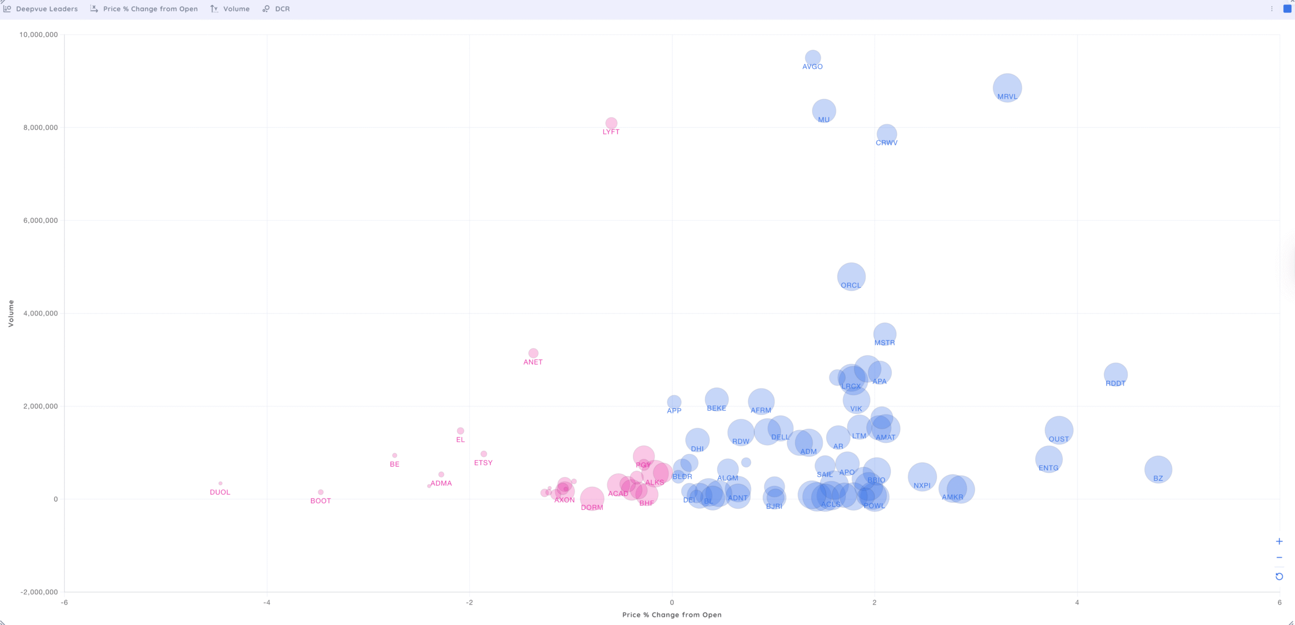
One of the best ways to get started is by using the Deepvue Leaders Screener Preset. It’s designed to highlight top-performing stocks right out of the gate.
From there, you can customize the bubble chart data points to fit your trading focus. Some of the most useful metrics include:
- Price performance
- Volume
- Daily Closing Range (DCR)
Each bubble on the chart tells a story:
- X-axis (horizontal): Price performance. The farther to the right, the more the stock is up.
- Y-axis (vertical): Volume. The higher the bubble, the more trading activity it’s getting.
- Size of the bubble: DCR – Bigger bubbles mean the stock is trading near its daily highs.
Find the stocks that stand out
Bubble charts are a fully customizable feature within the Deepvue Dashboard. Instead of looking at stocks in only one index, you can create a bubble chart for any watchlist or screener.
Change the stocks in your bubble chart to look at any personal watchlist, including:
By customizing your bubble chart, you can filter out noise and focus only on stocks that align with your trading strategy.
Sort and Customize Data to Fit Your Strategy…
More customization is possible by changing the data you use to organize your bubble charts. Instead of just Market Cap and Percentage Change, you can adjust how the bubble chart is configured.
Personalize your bubble charts by changing the data to:
Custom-tailor a bubble chart to help you focus on stocks that fit your trading system. Use any available data to change the value displayed or the box size in your unique bubble chart.
Bubble chart Examples
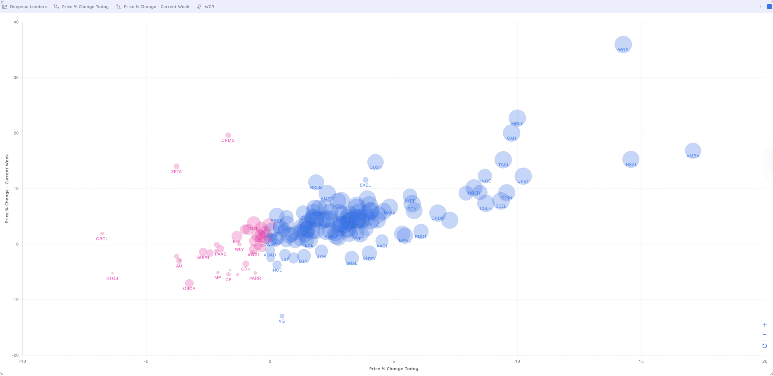
Analyzing Price % Change for the Current Day & Week
When following the leading stocks, make sure to look for stocks that have large percentage gains on both the daily and the weekly time frames.
Throughout the day, compare stocks that have a large percentage increase with their weekly performance.
This bubble chart utilizes the Deepvue Universe Preset Screen instead of looking at the overall index and displays the Daily and Weekly Percentage Change, while the size of the bubble is related to the Weekly Closing Range. Visually identify which stocks are performing the best on the weekly time frame while looking at how they are trading on the current day.
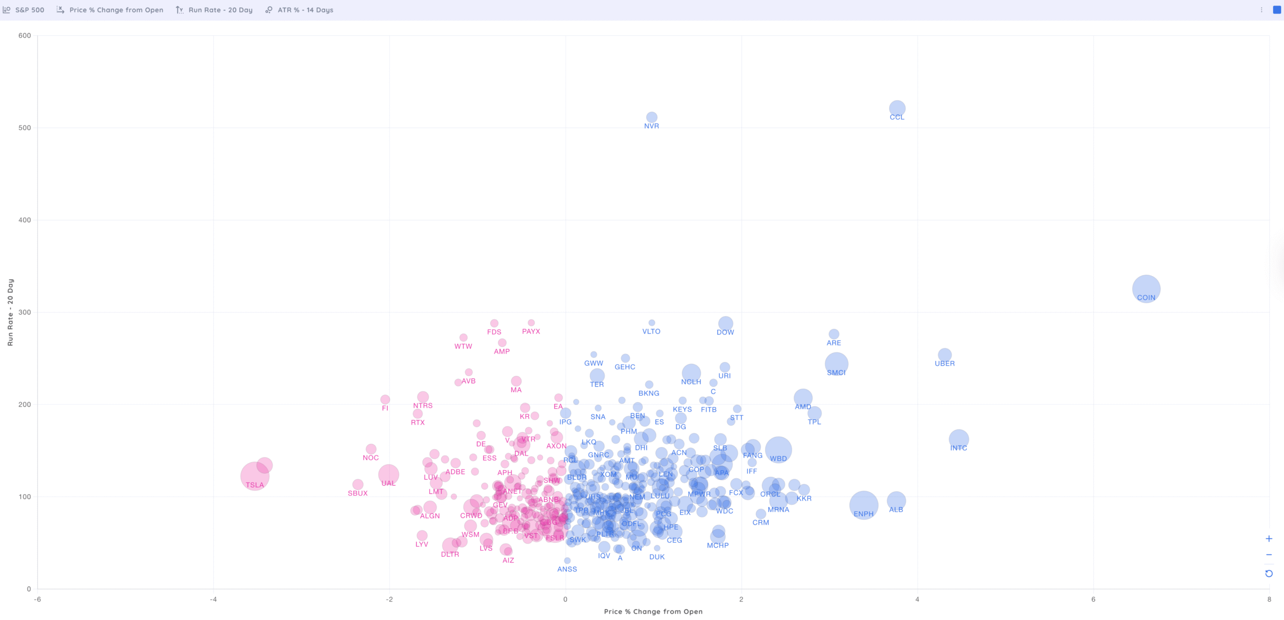
Tracking Percent Change From Open & Run Rate
Price and Volume are the two driving forces of all stock moves.
As the market progresses throughout the day, look for stocks that have a large Percentage Change From The Open and have an increasing Run Rate (the day’s potential volume vs. average volume).
This bubble chart of the S&P 500 displays the Percentage Change From The Open and Run Rate with bubbles sized by Average True Range, allowing you to determine what stocks are up (or down) and have expected volume to be above average. Visually identify which stocks have an expected increase in volume while looking at the price percentage change from the open.
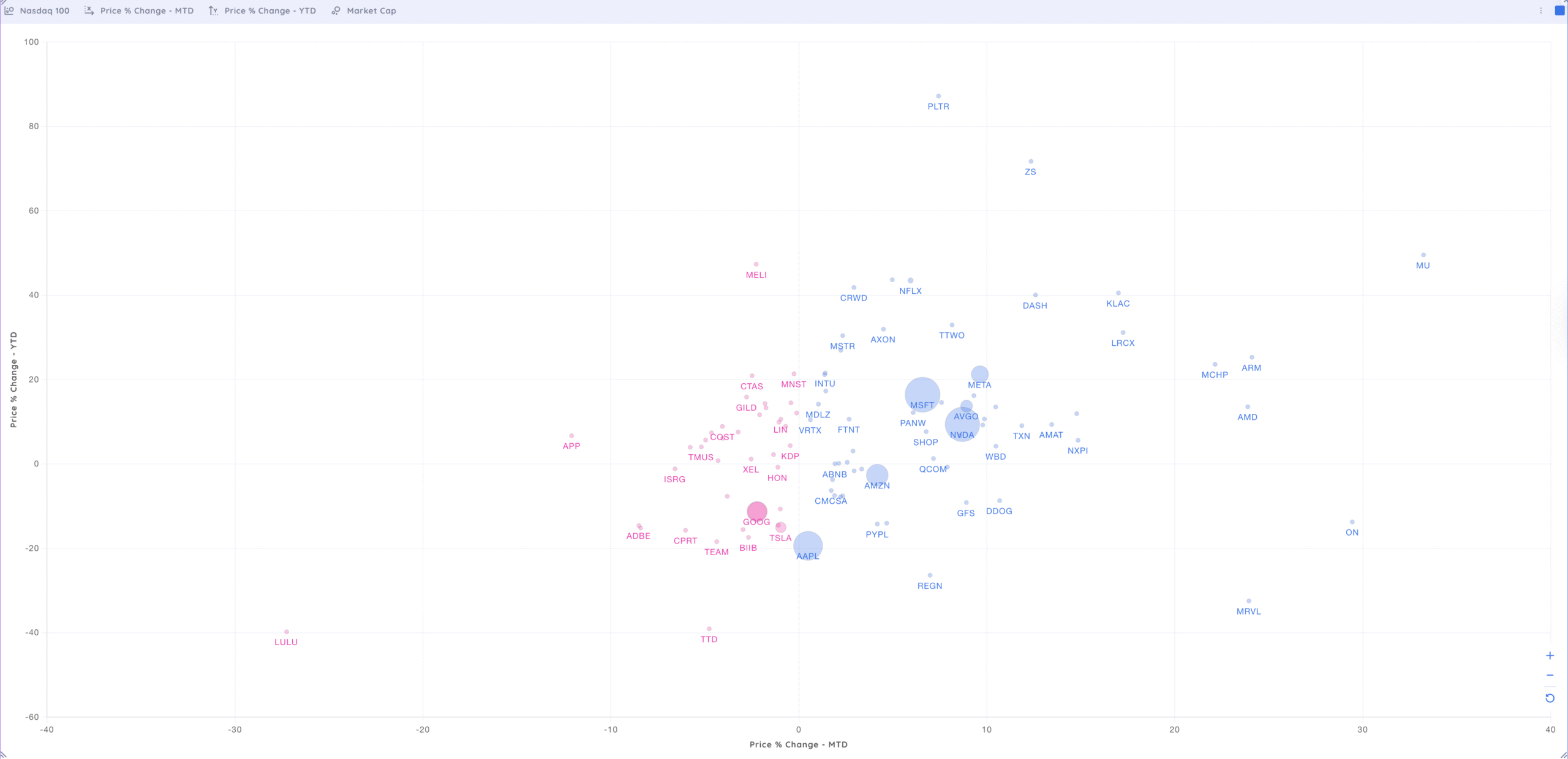
Using Price % Change MTD & YTD for Long-Term Trends
Position traders identify leading market themes by analyzing top Year-To-Date (YTD) performers.
By simultaneously evaluating Month-To-Date (MTD) performance, you can smooth out the short-term price fluctuations, giving you a clearer picture of the prevailing market trend.
This bubble chart of the Nasdaq 100 displays the MTD and YTP Price Percentage Change with bubbles sized by Market Cap, identifying the biggest yearly moves and focusing on the current month. The larger bubbles will help identify how the largest market-cap stocks are performing.
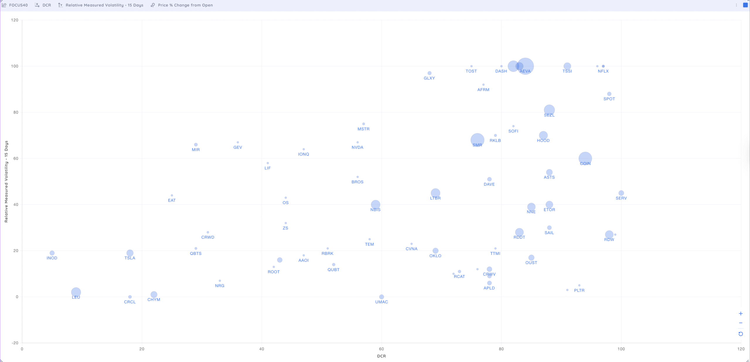
Measuring Daily Closing Range & RMV for Volatility Insights
Traders analyze the Daily Closing Range (DCR), the difference between the highest and lowest price throughout the trading day, to gauge the strength of the day’s performance. The Relative Measured Volatility (RMV) measures trading volatility over a certain time frame.
Deepvue’s custom bubble charts allows users to create unique comparisons using data that will help them identify the strongest-performing stocks.
Use this bubble chart with your weekly focus list and display the DCR and RMV with bubbles sized by Price % Change from the Open. The larger boxes signify a large daily gain, and the value displayed quickly reveals a strong closing range and expansion of price.
How to create your bubble chart dashboard
Bubble charts are part of the fully customizable Dashboard module within the Deepvue app.
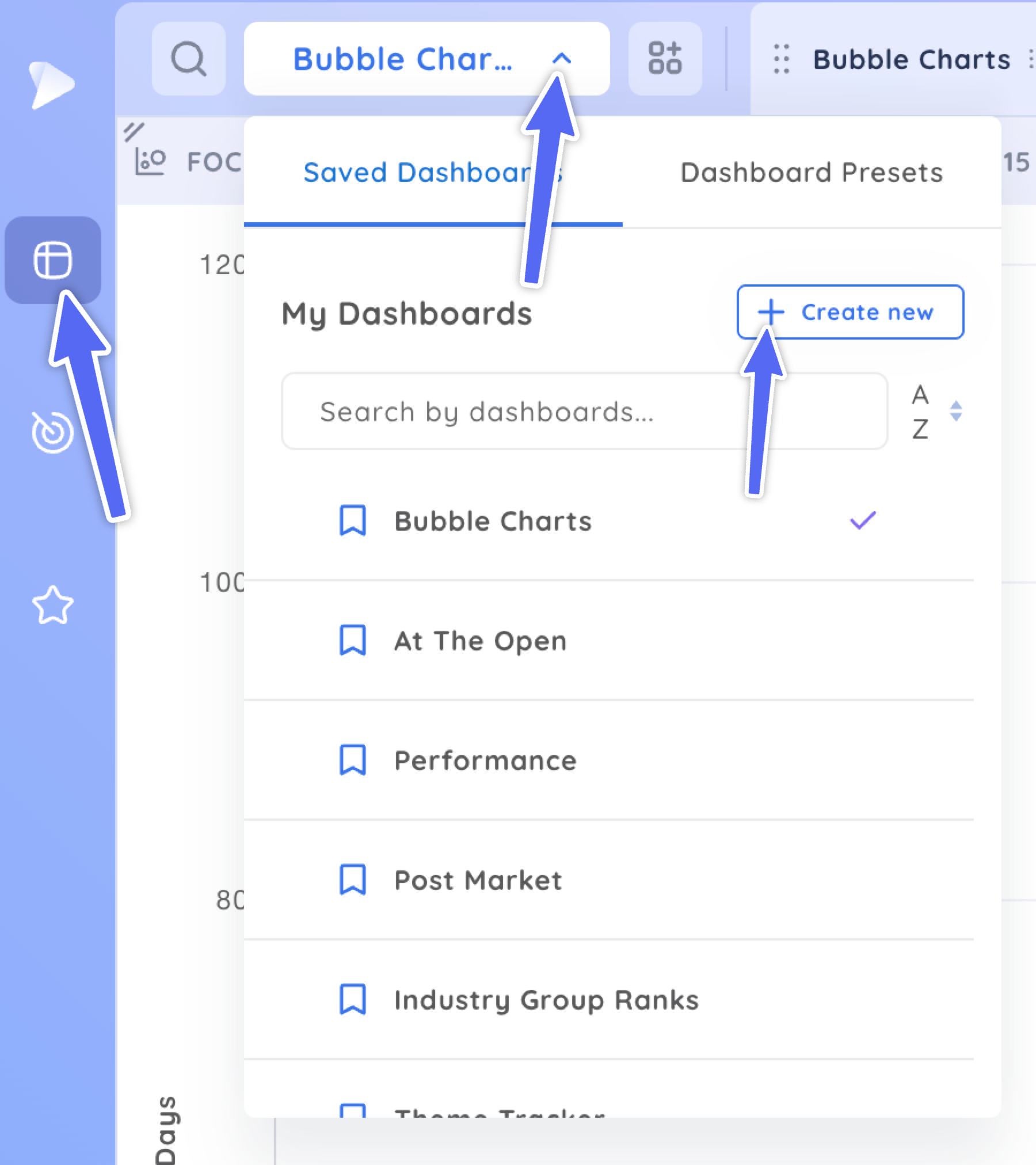
Navigate to the Dashboard Menu and create a New Dashboard.
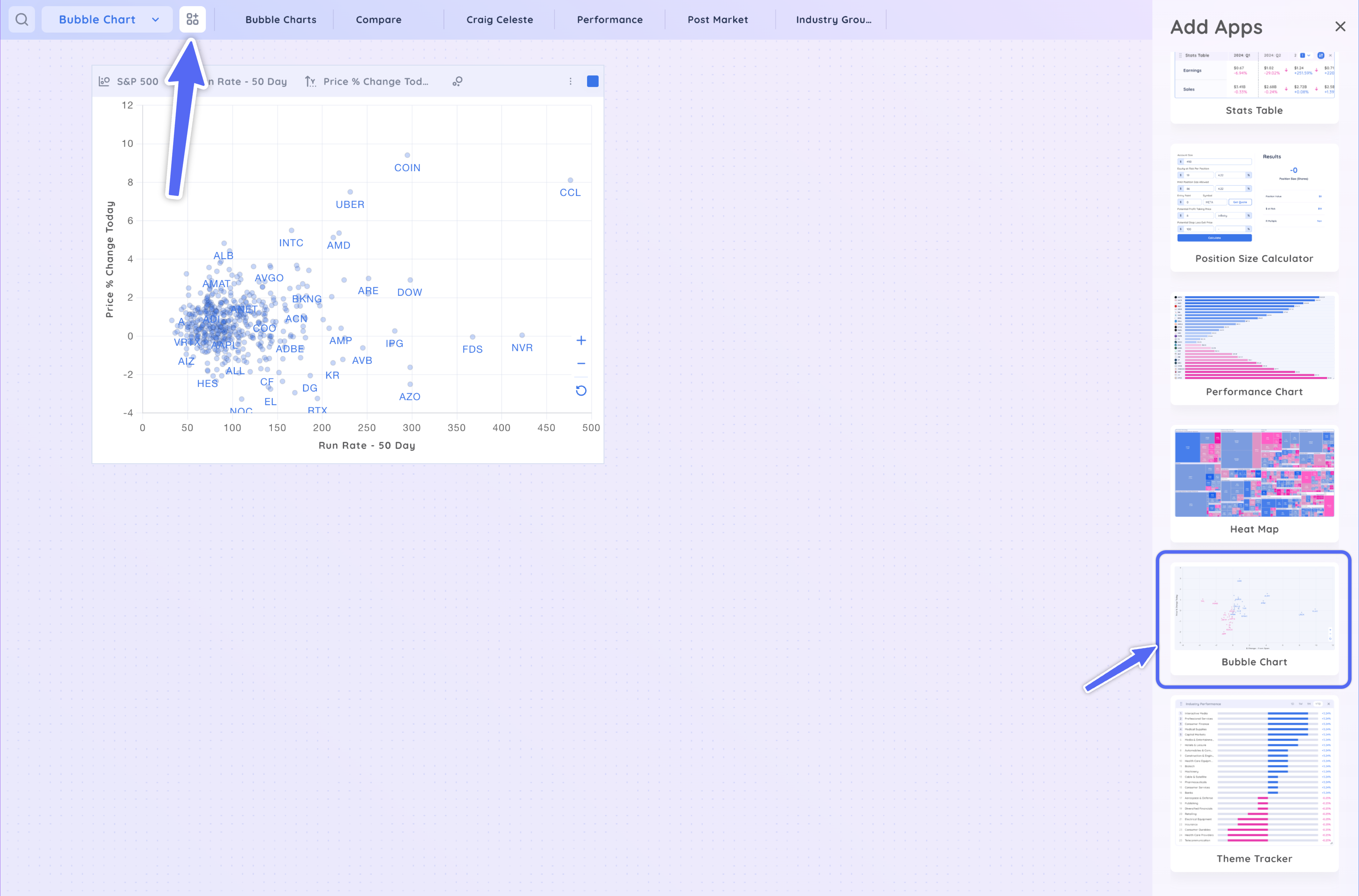
Name your new Dashboard, add the bubble chart app, and resize the app to fit your workspace.
Add charts and any other dashboard modules to your custom layout. Click on any of the bubbles to see the accompanying chart.
How to customize your bubble charts …
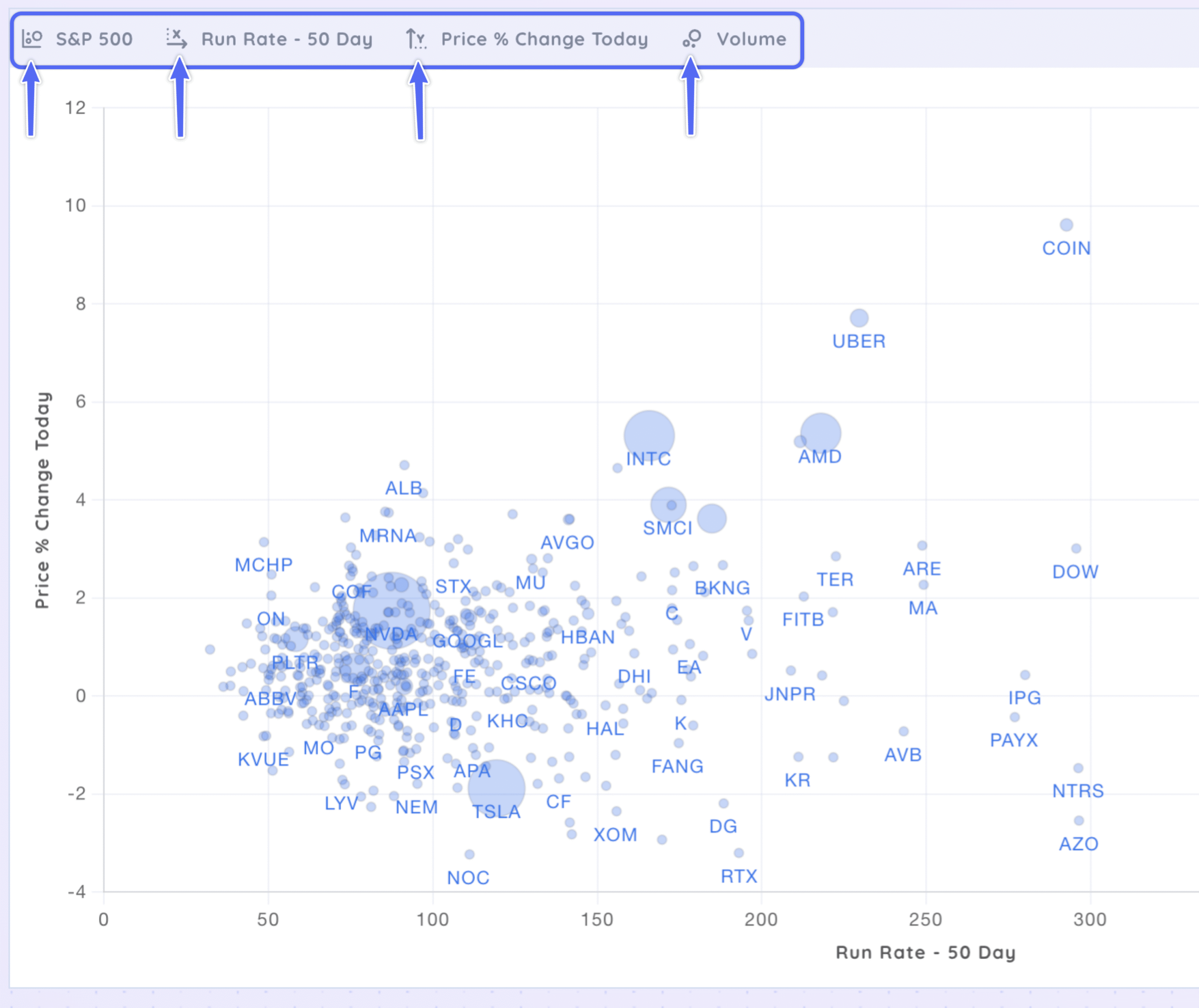
There are four drop-down menus to help you customize any Heat Map to cater to your individual trading needs.
Basket Of Stocks
- Screener
- Screener Presets
- Watchlists
- Watchlist Presets
Displayed Value – X and Y-Axis
- RMV
- Daily Closing Ranve
- Price % and $ Change
- RS Rating
Bubble Sizing
- ATR and ADR
- Run Rate
- Group and Industry Rank
- Market Cap
Experiment with the different data available to customize a Heatmap for your personal needs. Every data point can be assigned to either the displayed value or the box sizes.
Key Takeaways
Bubble charts provide a quick and easy way to identify trends and find strong-performing stocks within the overall market.
Deepvue offers fully customizable bubble charts to reflect your personal trading style.
Narrow down the basket of stocks that you are looking at by selecting your favorite watchlist, screener, or any preset available. Adjust the values displayed and modify the size of the bubbles by changing the available data provided.
Go beyond the basic market visuals that look at only one index and market cap. Deepvue’s bubble charts let you personalize your view while concentrating on the stocks and data points that align with your trading style.


